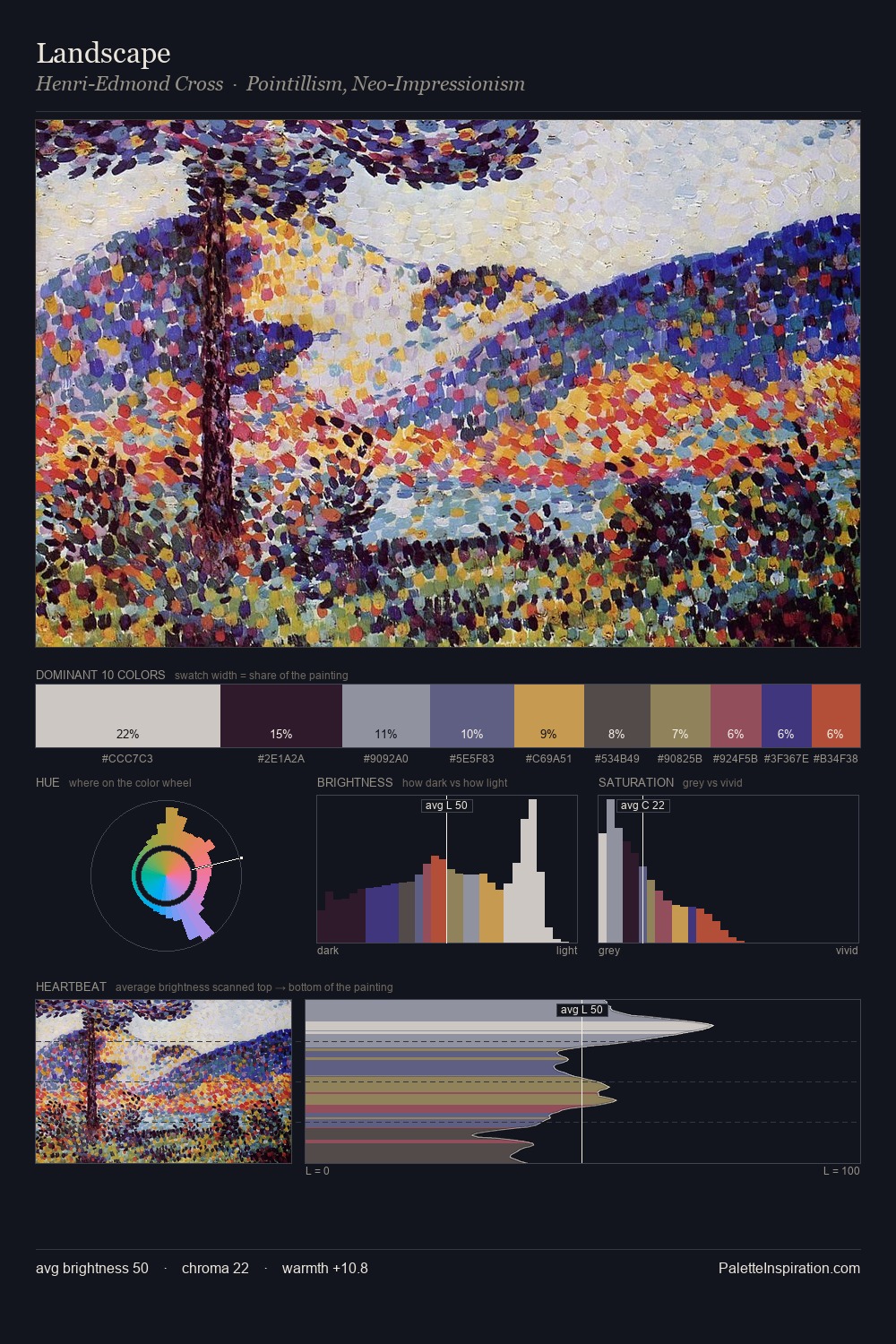
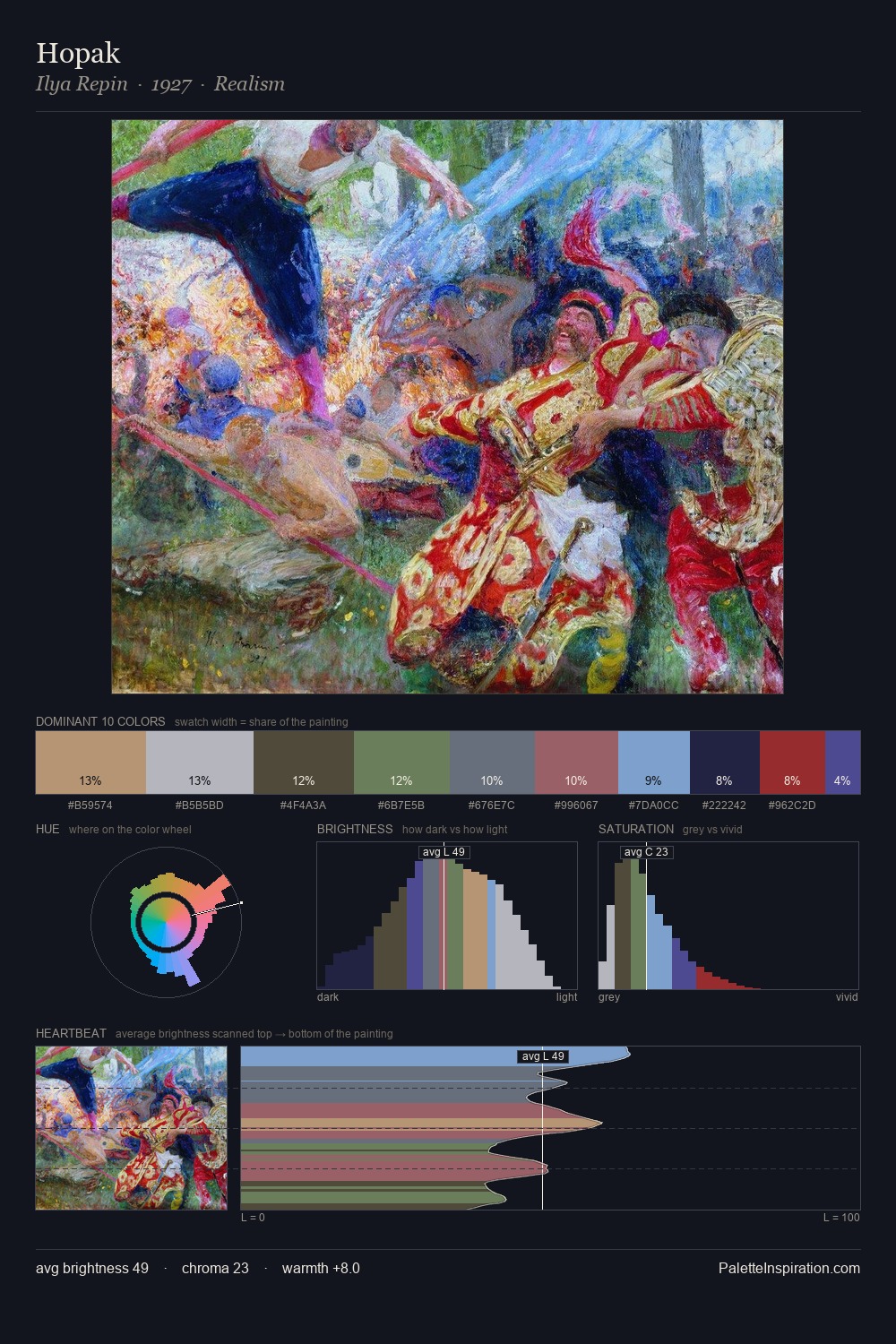
Post-Impressionism Palette 23
Dimmed Stone
Dimmed Moderate shadow - values pulled toward mid-dark, as if a light source has been reduced.
Stone Neutral warm gray - the color of uncut limestone or granite, balanced and earthy.

Palette Analysis
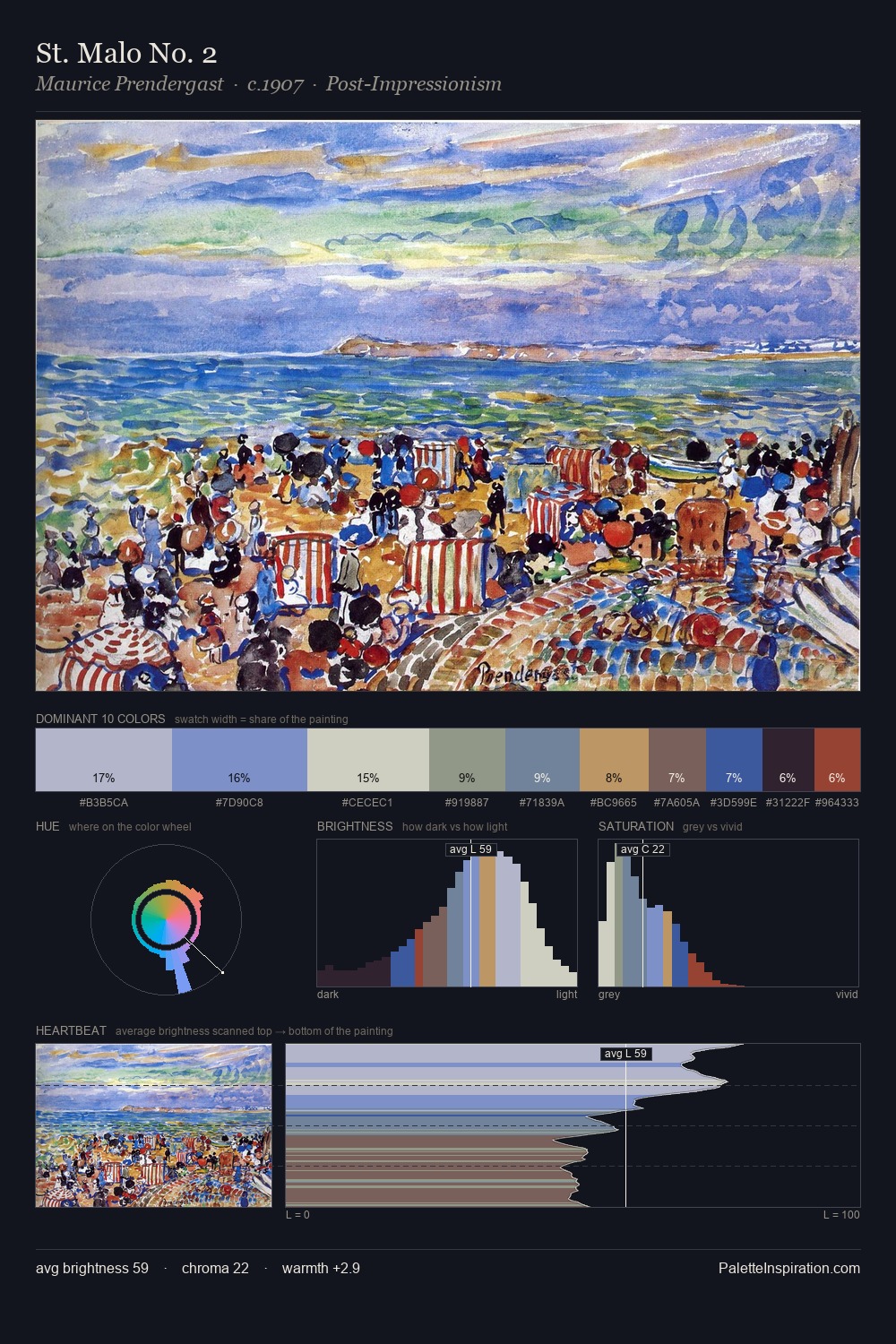
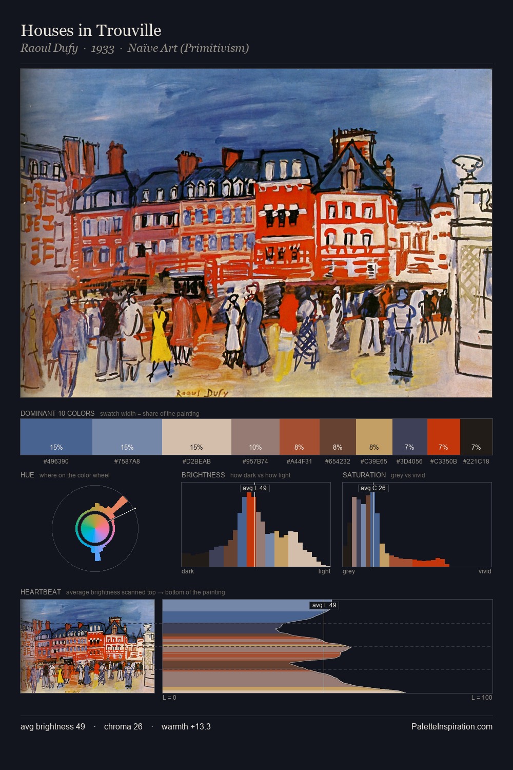
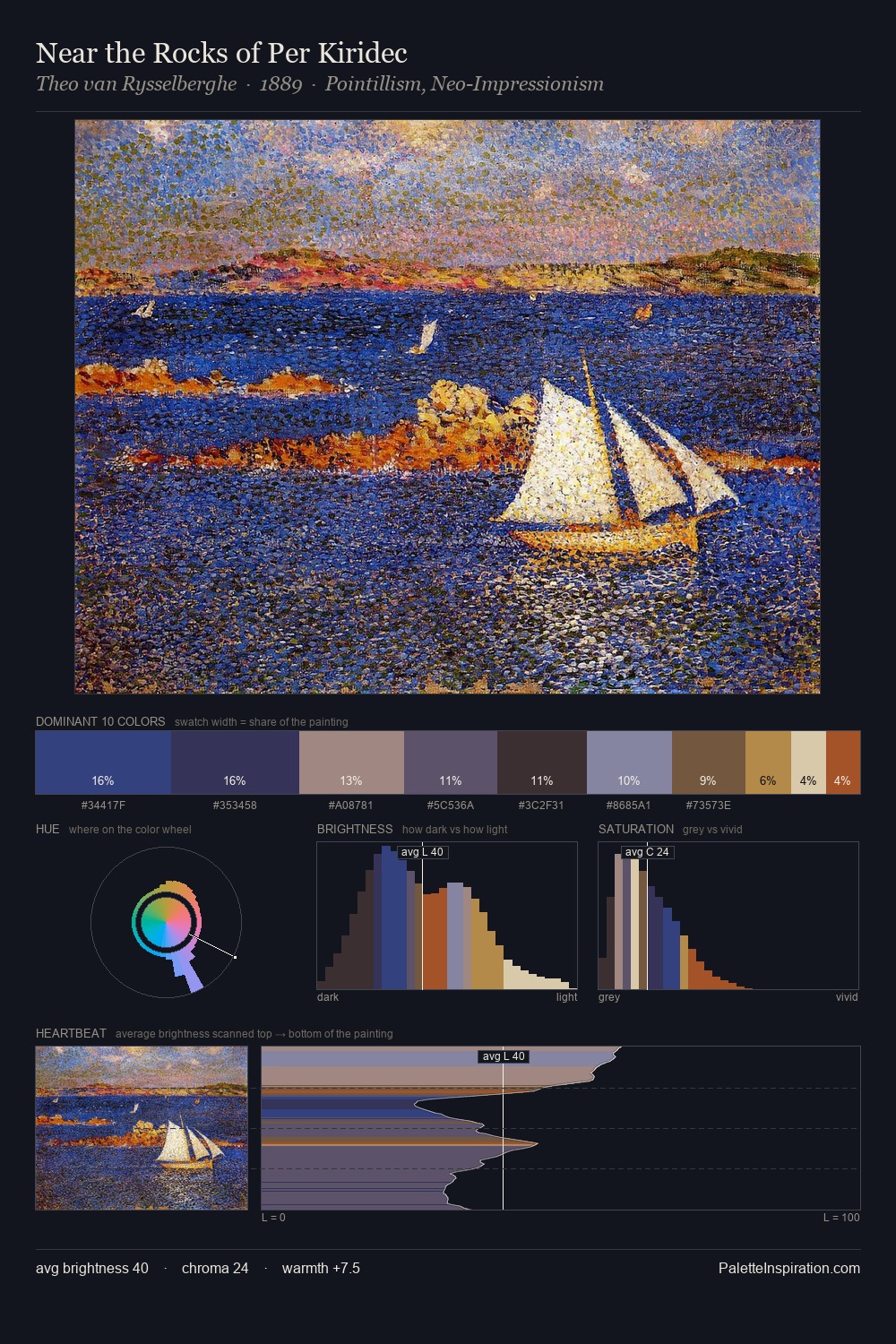
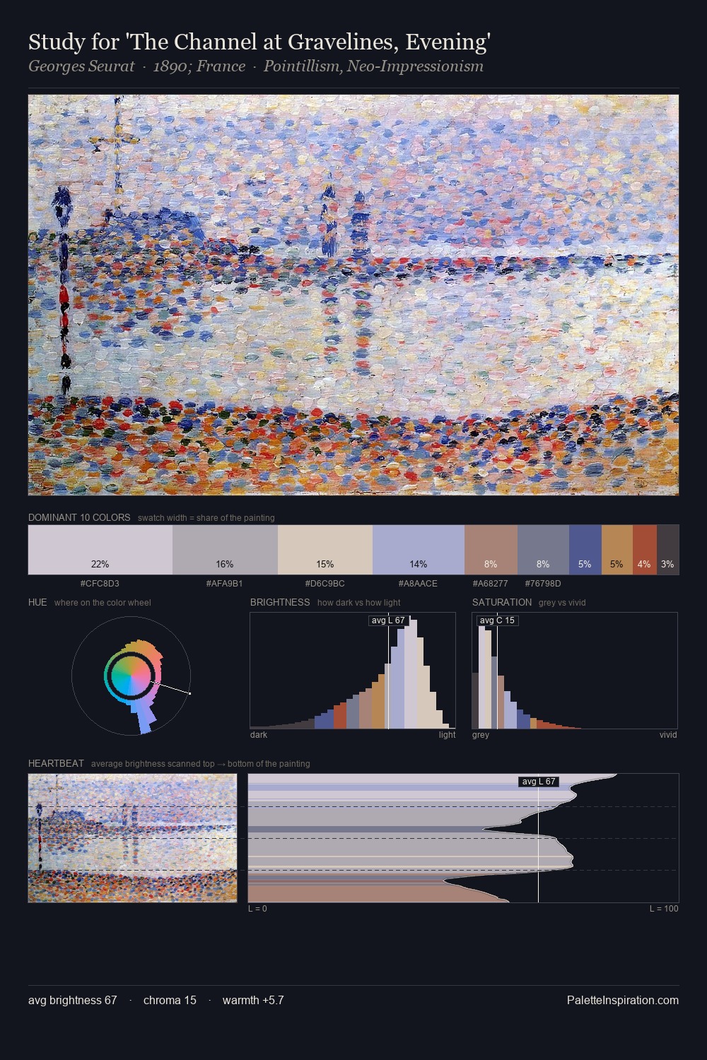
Post-Impressionism occupies the comfortable middle of the value scale, avoiding both extremes to hold the eye in a sustained middle grey. Built on cool foundations: the palette favours the blue-cyan-green arc. Saturation is deliberately withheld - the beauty here lies in the near-monochromatic gradations rather than colour difference. #A33E2D functions as the palette's exclamation mark: highest chroma, lowest percentage (4.0%). Value range is moderate at 52 units - enough contrast for legibility, not so much as to fragment the tonal unity. The mid-to-high key, cool bias, and moderate chroma point to outdoor observation - sky and diffused daylight as the dominant light source.
Example use cases
- healthcare
- wellness apps
- biotech
- pharmaceuticals
- research institutions
I Love This!
Use This Palette
Copy, export, or download for your project
Copy, export, or download for your project
Copy:
Download:
Share: