Post-Impressionism Palette 24

Palette Analysis
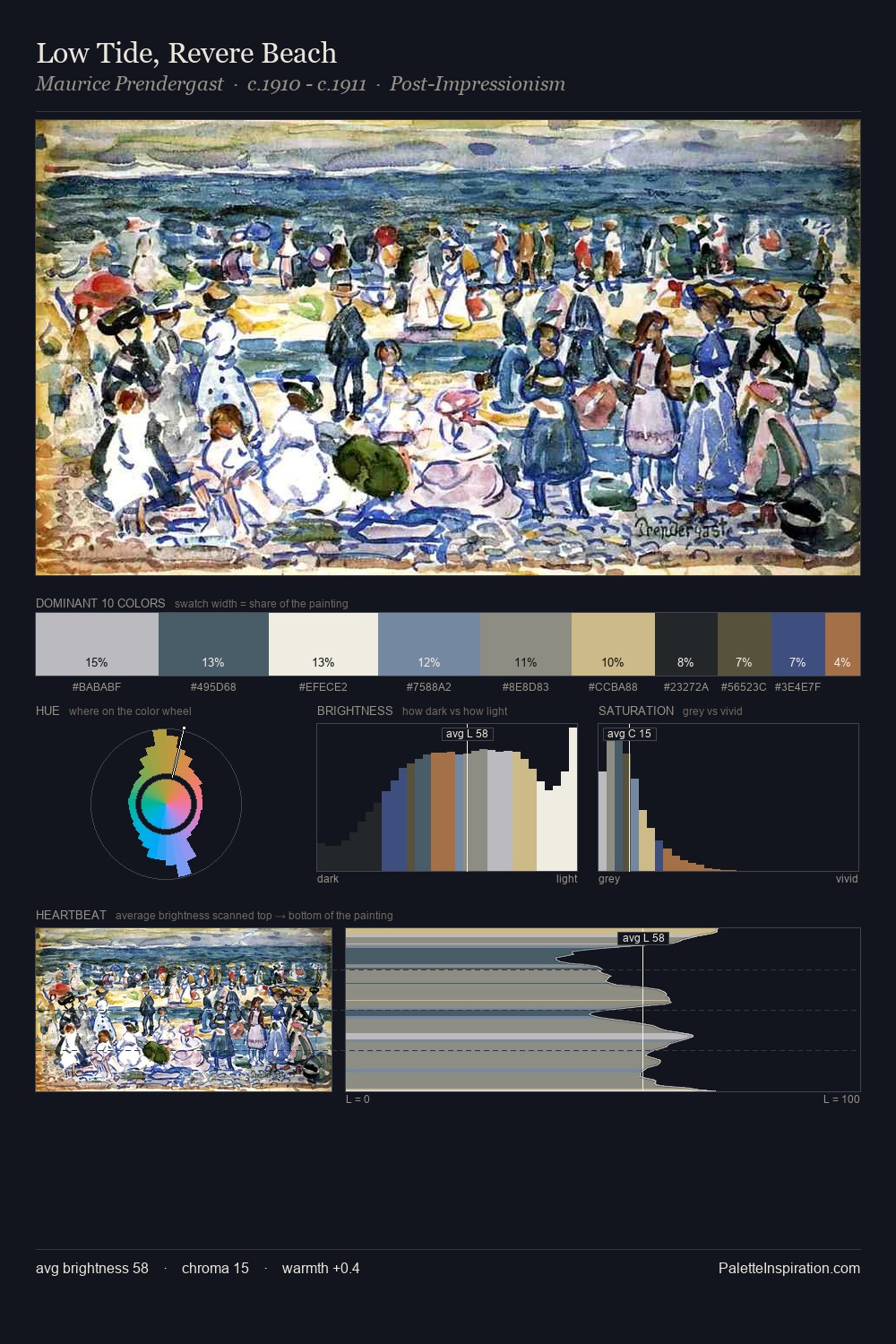
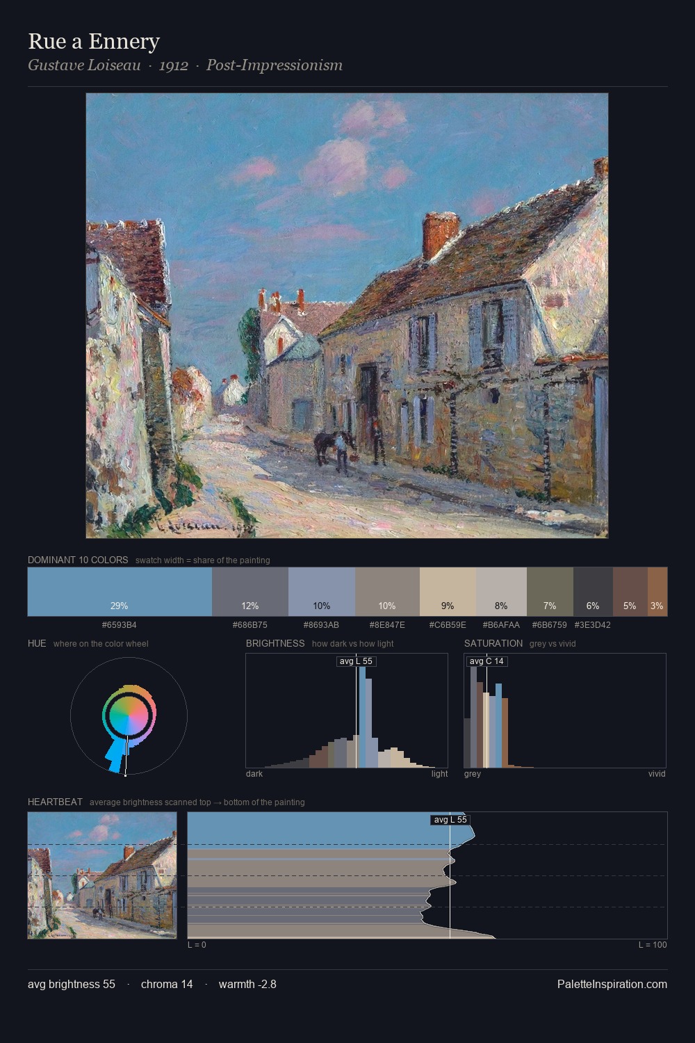
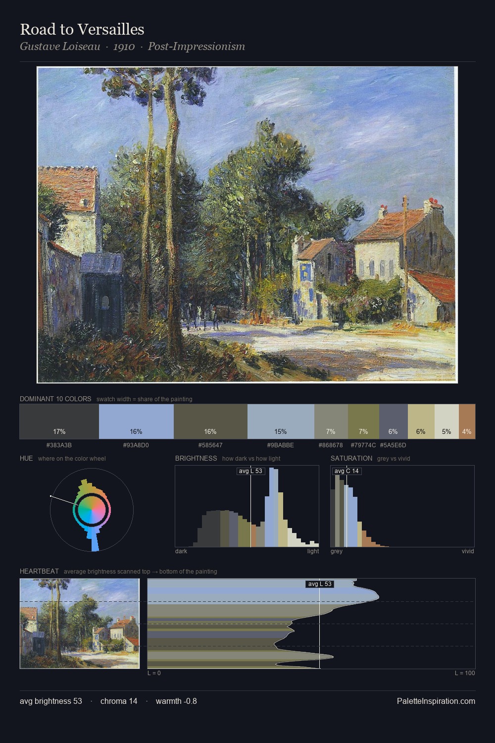
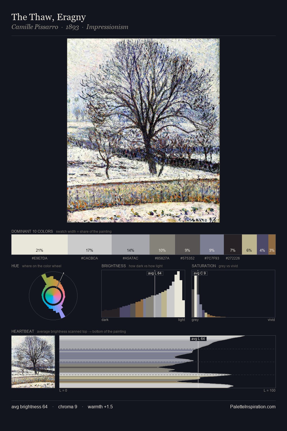
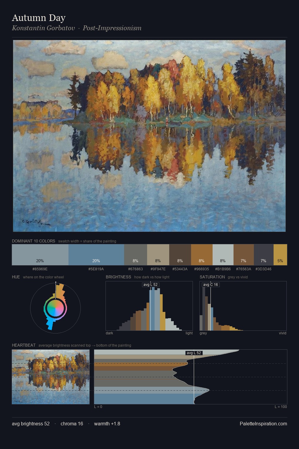
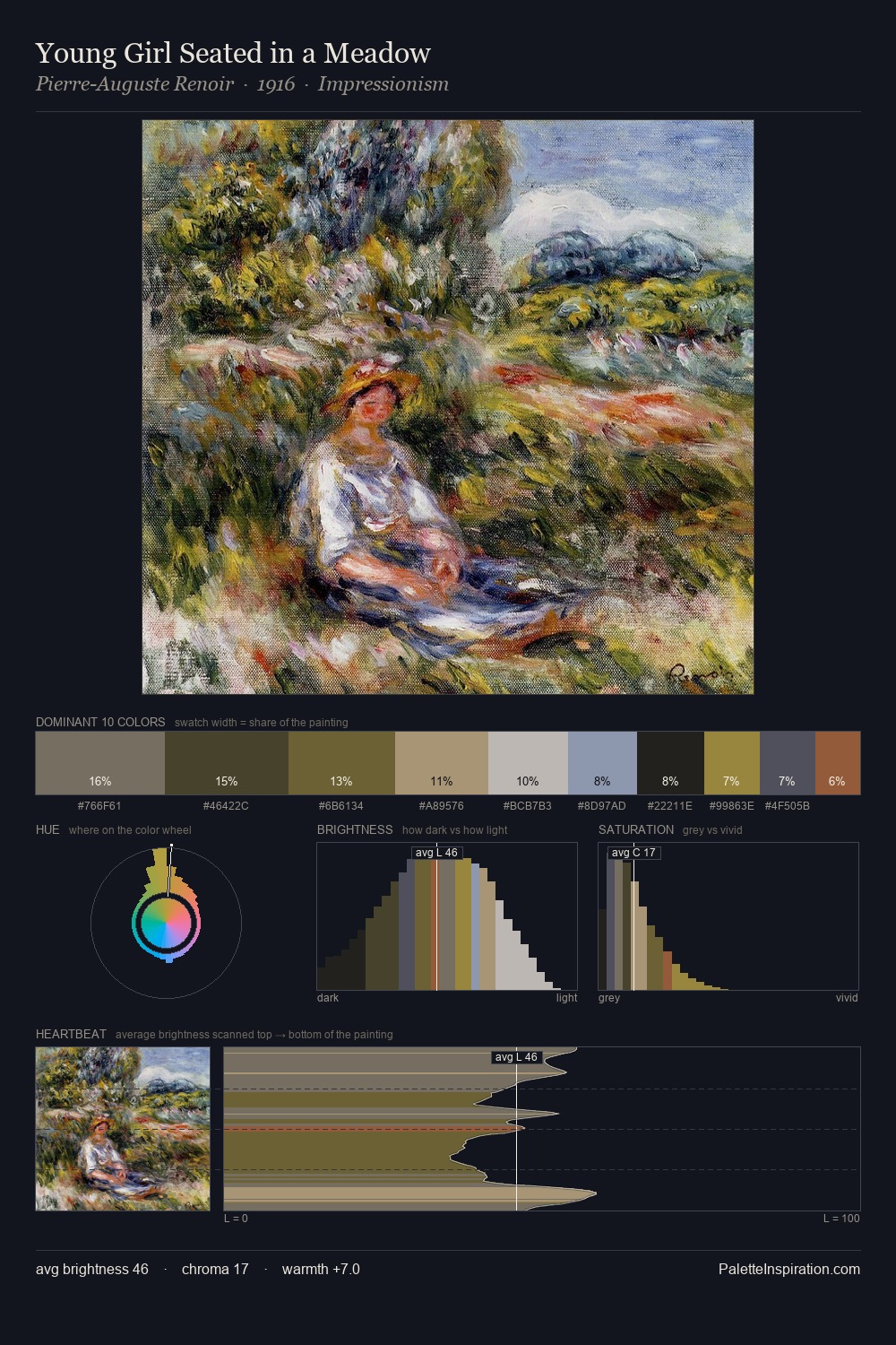
Values in Post-Impressionism rest in the mid-range - neither dramatically lit nor steeped in shadow. A distinctly cool atmosphere runs through this palette: sky, water, and mist given colour form. Every colour is desaturated; the palette proceeds through near-neutrals and gently-coloured greys. 25.7% of the palette belongs to #2E3133, a concentration that makes it the unmistakable visual centre. The highest-chroma note - #B1A47F - appears at just 5.3%, deployed as a precision accent against the quieter ground. At 51 units across the value scale, the palette keeps contrast readable without letting it dominate. The mid-to-high key, cool bias, and moderate chroma point to outdoor observation - sky and diffused daylight as the dominant light source.
Example use cases
- publishing
- corporate identity
- consumer apps
- hospitality
- design agencies
I Love This!
Copy, export, or download for your project