Post-Impressionism Palette 12
Veiled Bisque
Veiled Partially obscured light - mid-dark with a hazy, scrim-filtered quality.
Bisque Pale warm beige - soft, slightly pinkish neutral, the color of unglazed ceramic.

Palette Analysis
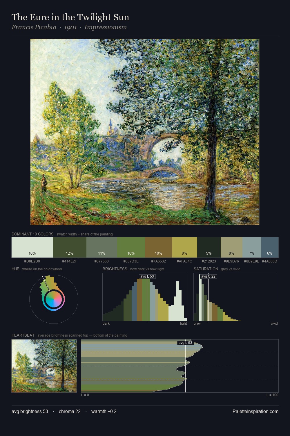
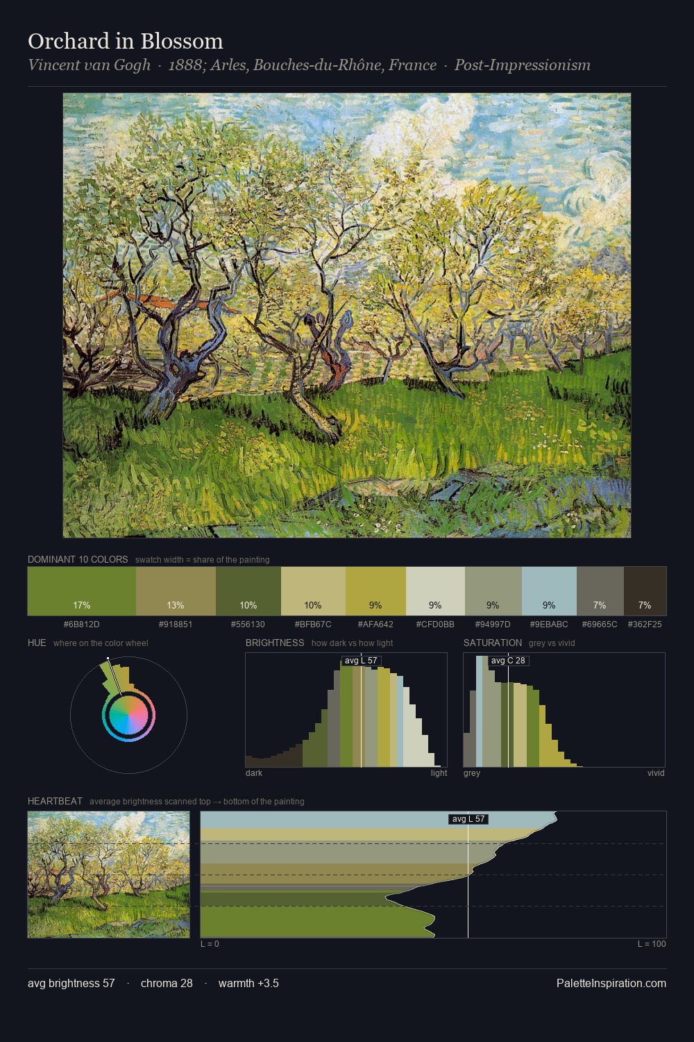
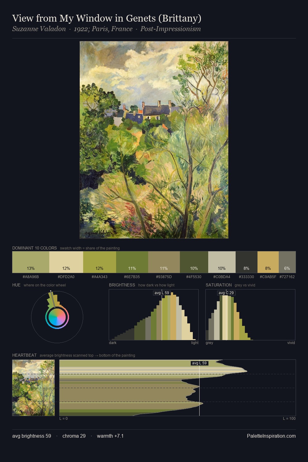
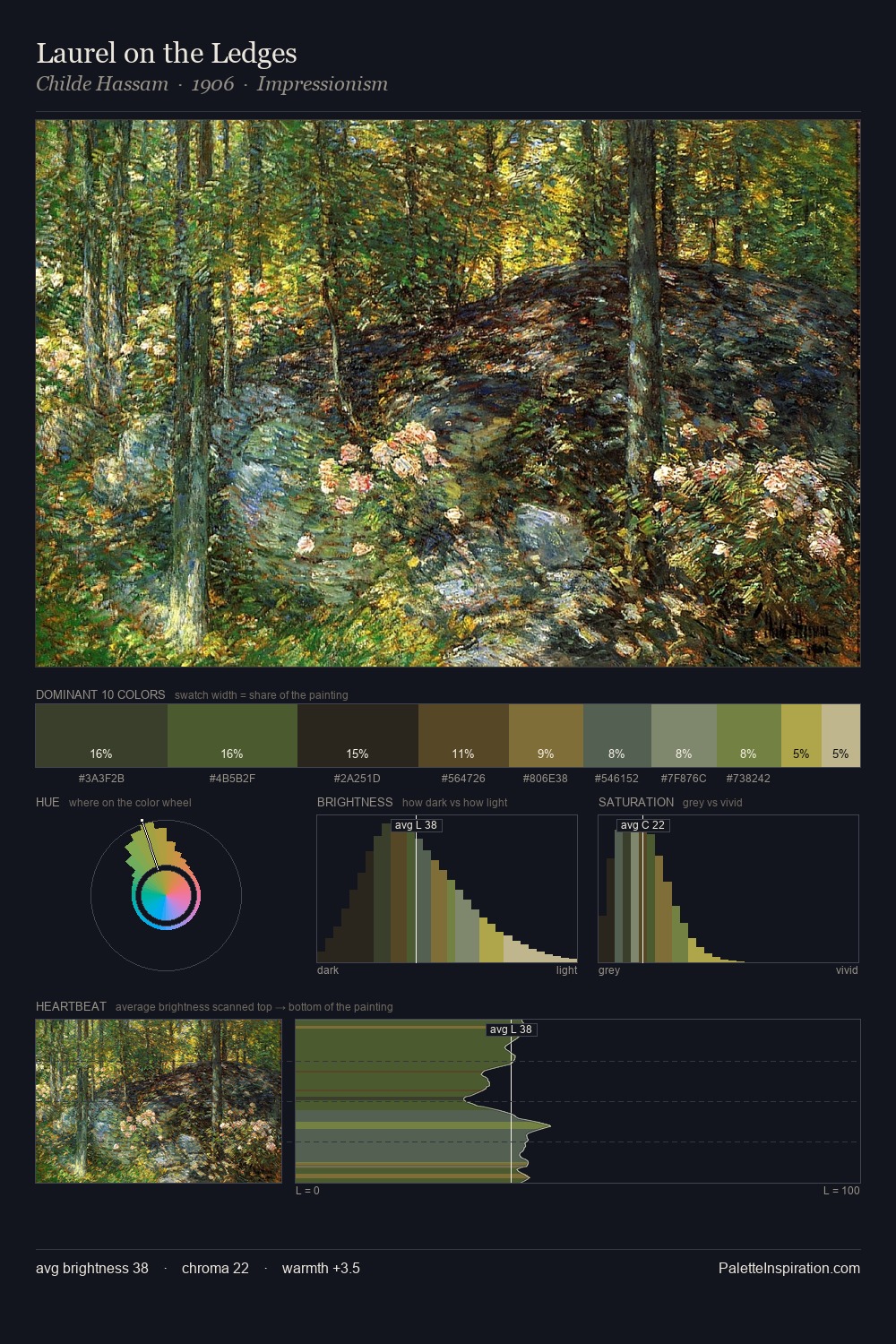
Post-Impressionism distributes its values across the middle register, creating harmony without high contrast. Temperature is cool-dominant, with blue and green families claiming the largest areas. Mid-saturation across the board: the palette has colour character without chromatic excess. #806C37 delivers the chromatic peak at only 9.2% - a small shot of colour with outsized visual impact. The value range of 53 units sits in the comfortable middle: enough depth, enough light, neither extreme. The mid-to-high key, cool bias, and moderate chroma point to outdoor observation - sky and diffused daylight as the dominant light source.
Example use cases
- publishing
- corporate identity
- consumer apps
- hospitality
- design agencies
I Love This!
Use This Palette
Copy, export, or download for your project
Copy, export, or download for your project
Copy:
Download:
Share: