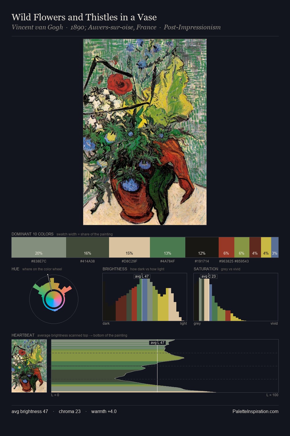
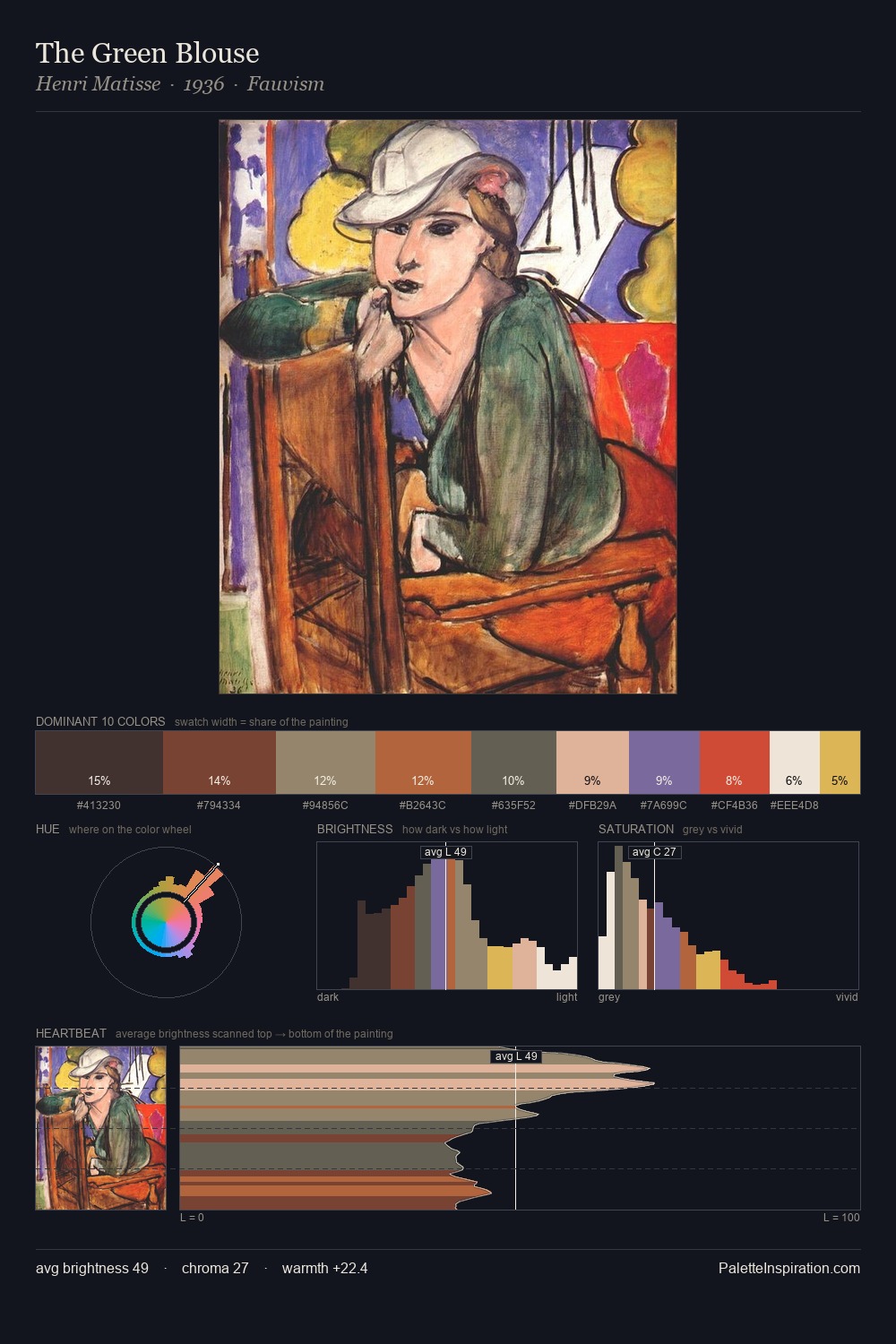
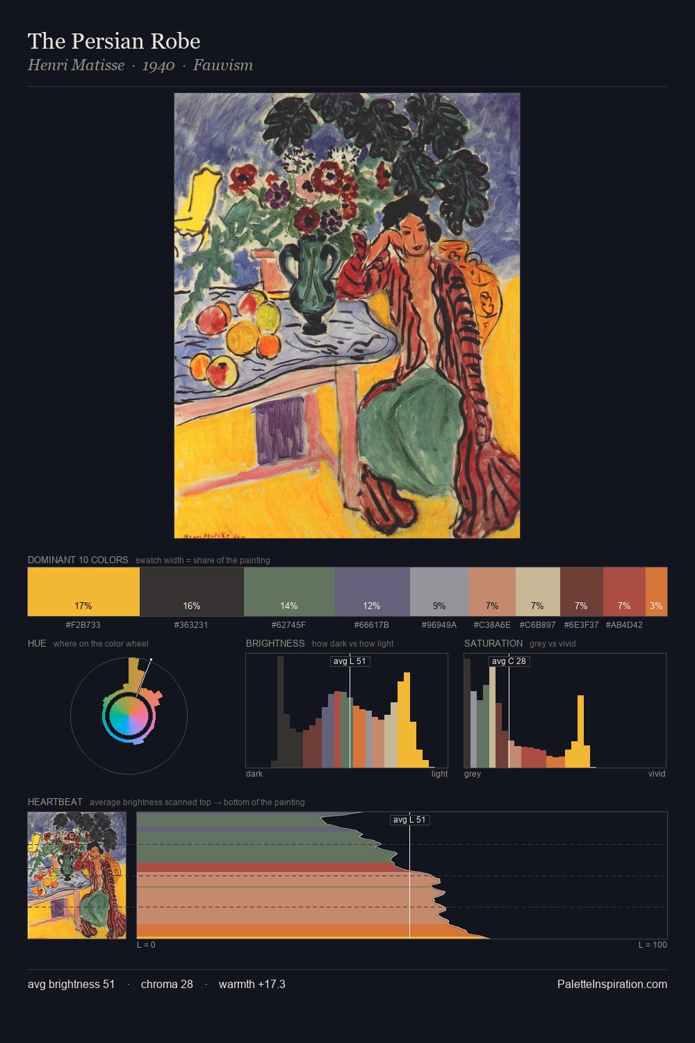
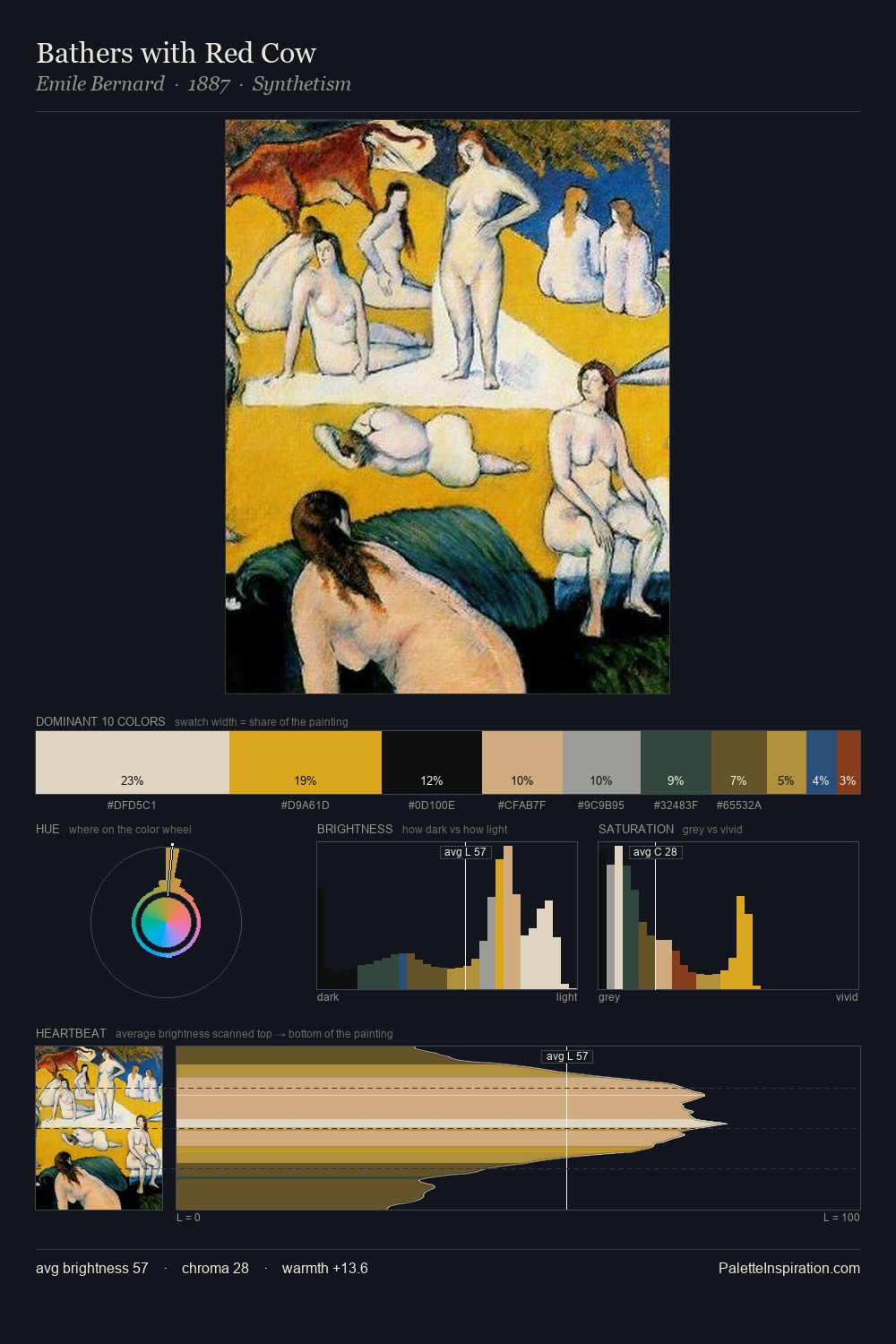
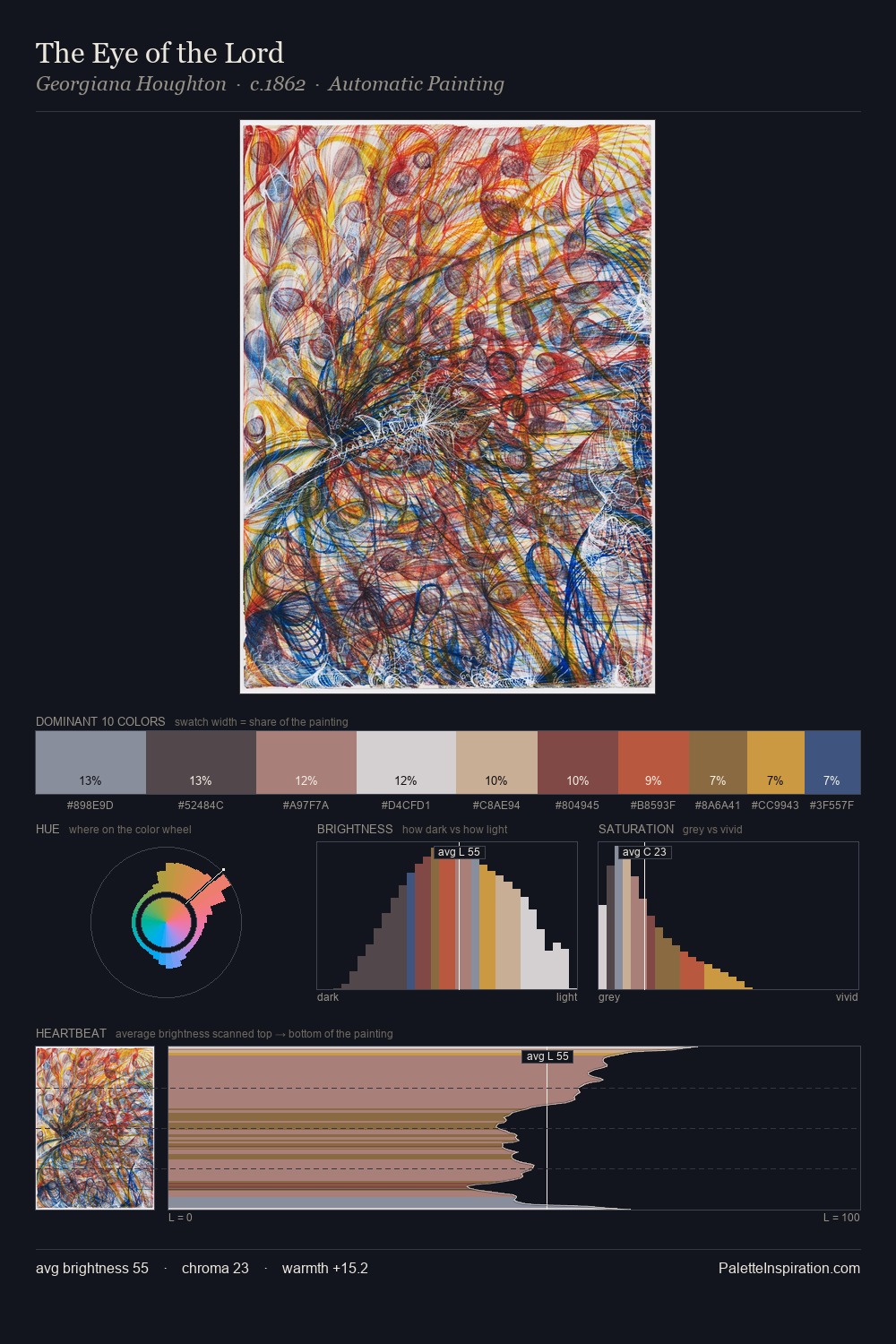
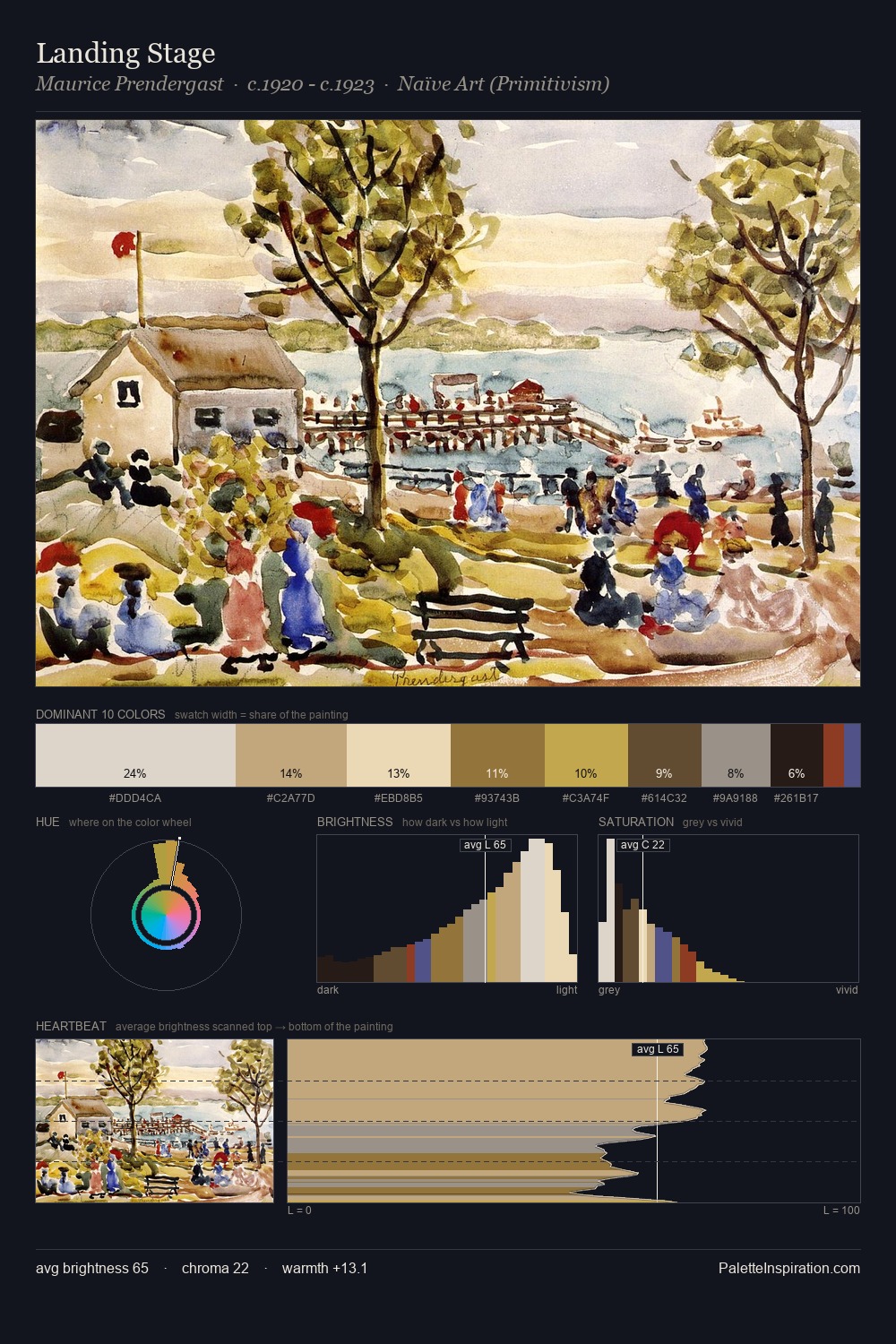
Post-Impressionism Palette 2
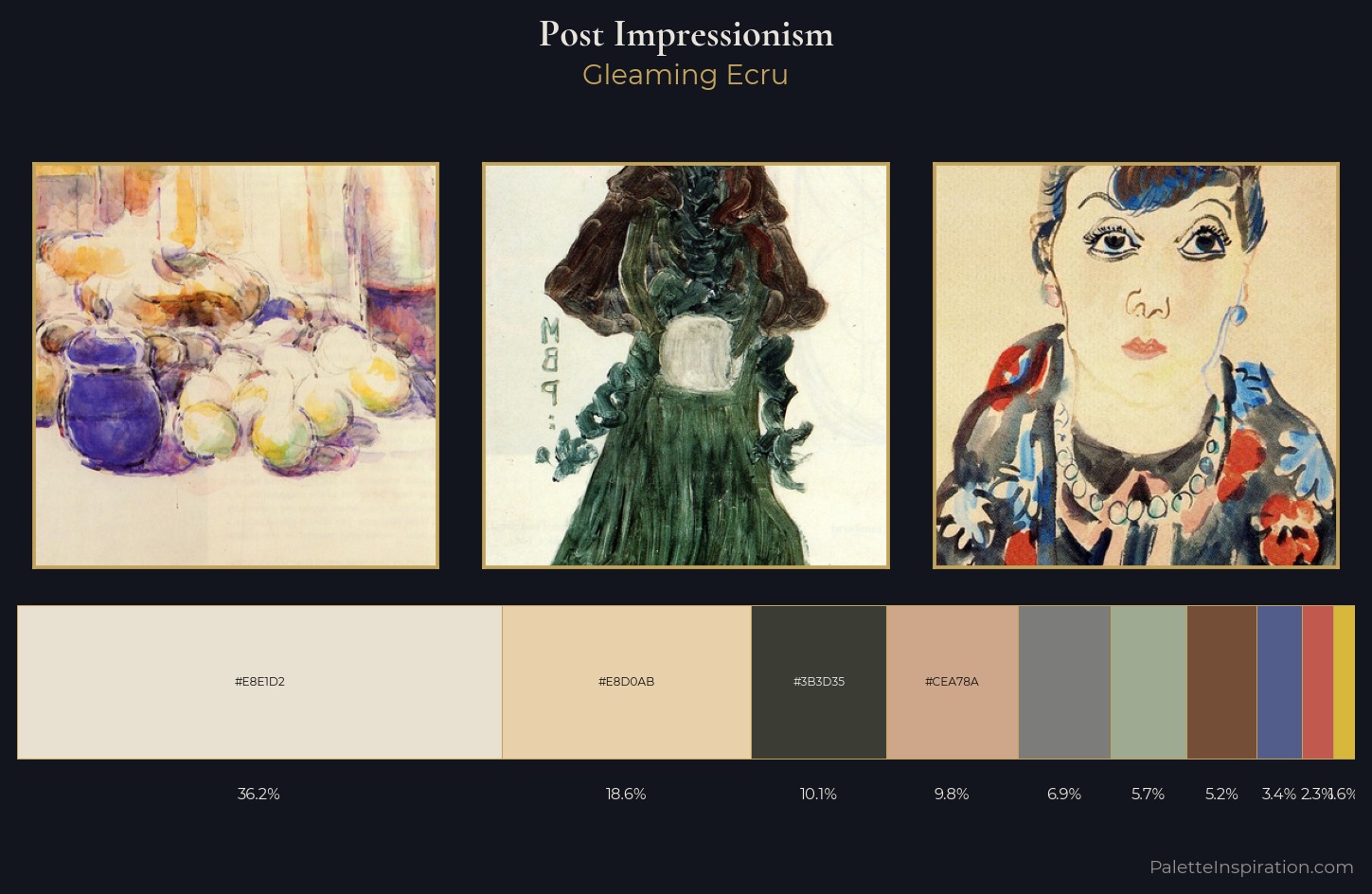
Palette Analysis
Post-Impressionism works in the upper reaches of the value scale, creating an atmosphere of brightness and expansiveness. Built on cool foundations: the palette favours the blue-cyan-green arc. Every colour is desaturated; the palette proceeds through near-neutrals and gently-coloured greys. At 36.2%, #E8E1D2 functions less as a colour accent and more as a complete atmospheric environment. #CEA78A functions as the palette's exclamation mark: highest chroma, lowest percentage (9.8%). The value range spans 55 units across the palette, providing the full gamut from deep shadow to near-white and ensuring clear tonal hierarchy. The palette has the character of outdoor light: cool, mid-bright, with colour rendered faithfully rather than expressively.
Example use cases
- craft & artisan brands
- specialty coffee
- home goods
- lifestyle retail
- ceramics & pottery
I Love This!
Copy, export, or download for your project