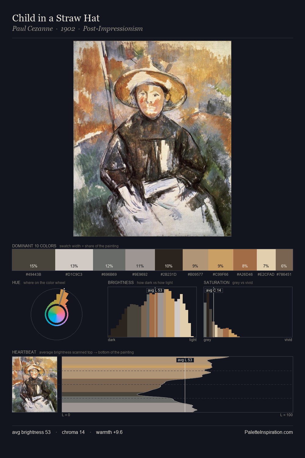
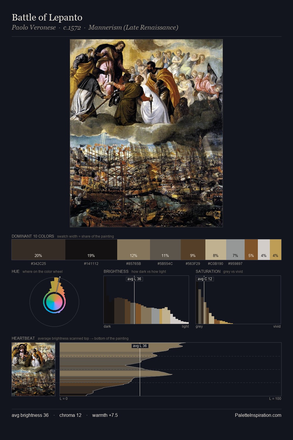
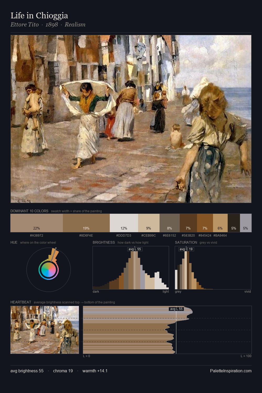
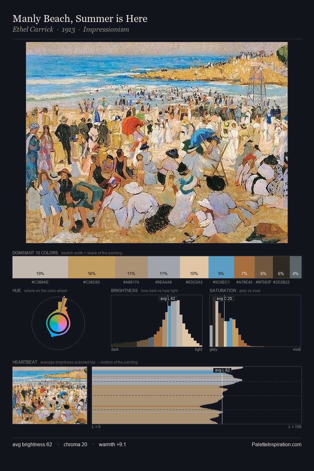
Impressionism Master Palette
Veiled Tawny
Veiled Partially obscured light - mid-dark with a hazy, scrim-filtered quality.
Tawny Warm orange-brown - a traditional term for the color of tanned leather or lion fur.

Palette Analysis
Across the Impressionism movement, certain palette qualities recur - this distillation makes them visible at a glance. Impressionism distributes its values across the middle register, creating harmony without high contrast. The palette balances warm and cool with remarkable evenness, giving the composition its characteristic vibrancy. All colours lean toward grey, building depth through value rather than colour punch. The saturated accent, #BE9C5D, registers at 5.8% - sparse enough to feel like a deliberate surprise. The full value range is 57 units: broad enough to build convincing three-dimensional form. The Impressionism movement spoke in this palette's vocabulary.
Example use cases
- exhibition design
- foundation branding
- estate management
- art education
- museums & galleries
I Love This!
Use This Palette
Copy, export, or download for your project
Copy, export, or download for your project
Copy:
Download:
Share: