Impressionism Palette 31
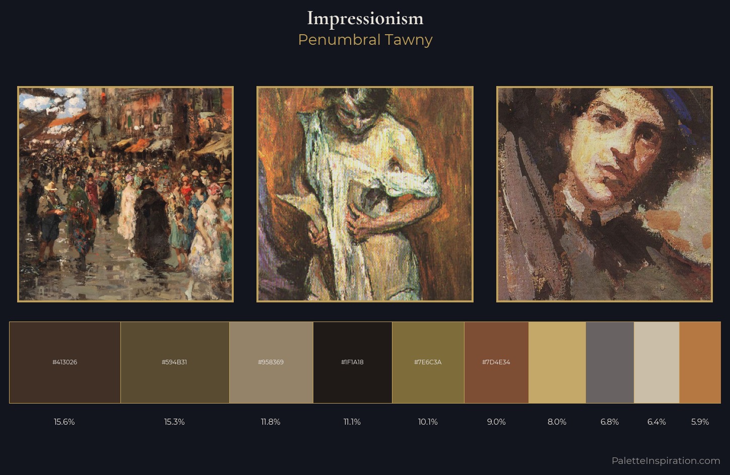
Penumbral Tawny
Penumbral Partial shadow - the transitional zone between light and full dark, soft-edged.
Tawny Warm orange-brown - a traditional term for the color of tanned leather or lion fur.
Palette Analysis
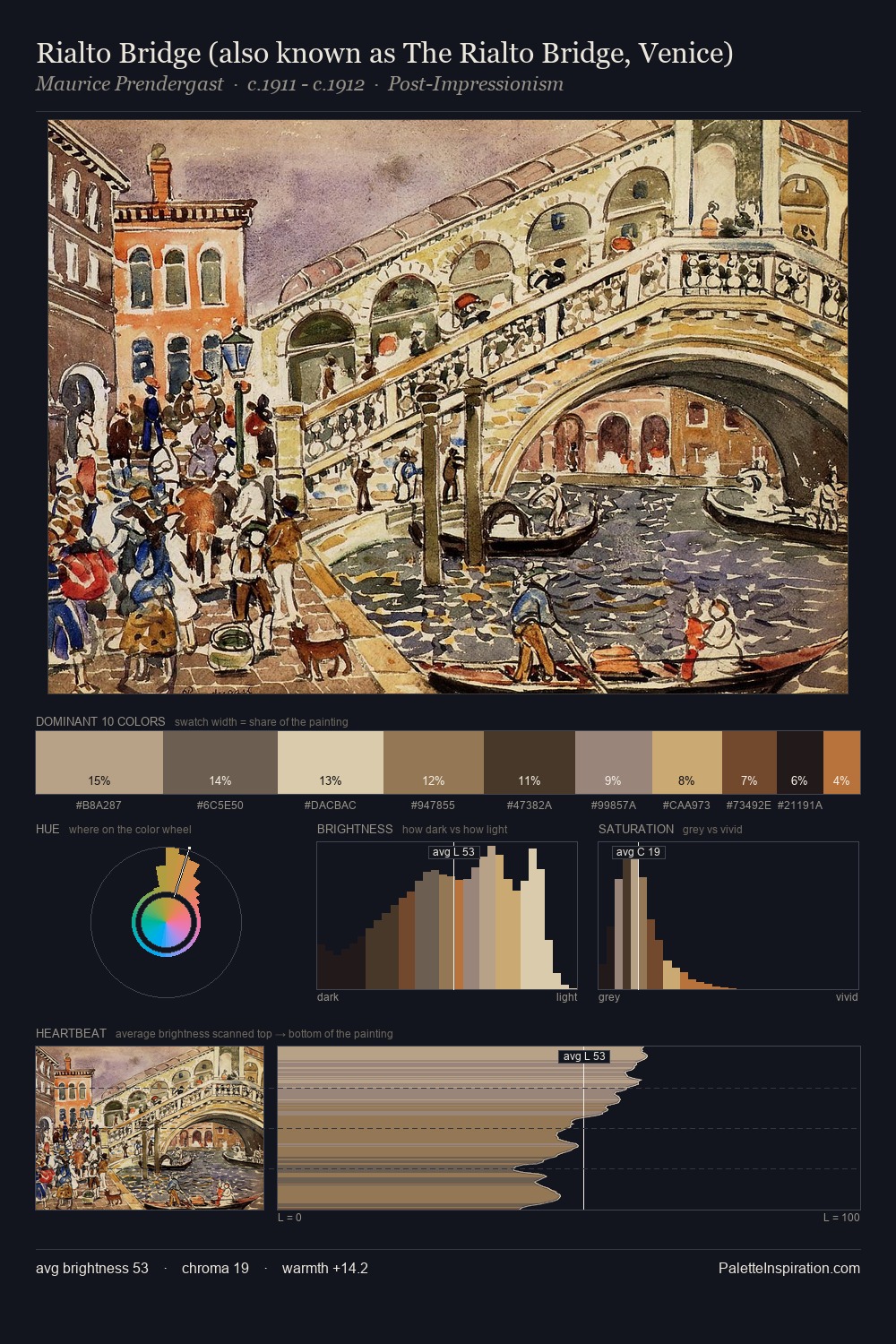
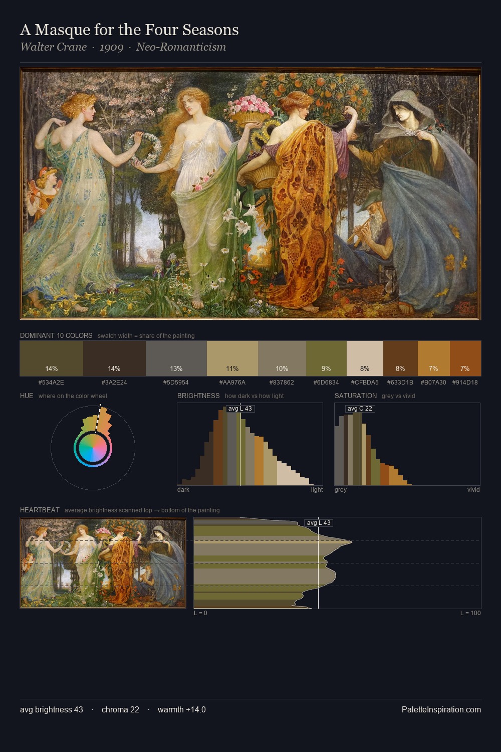
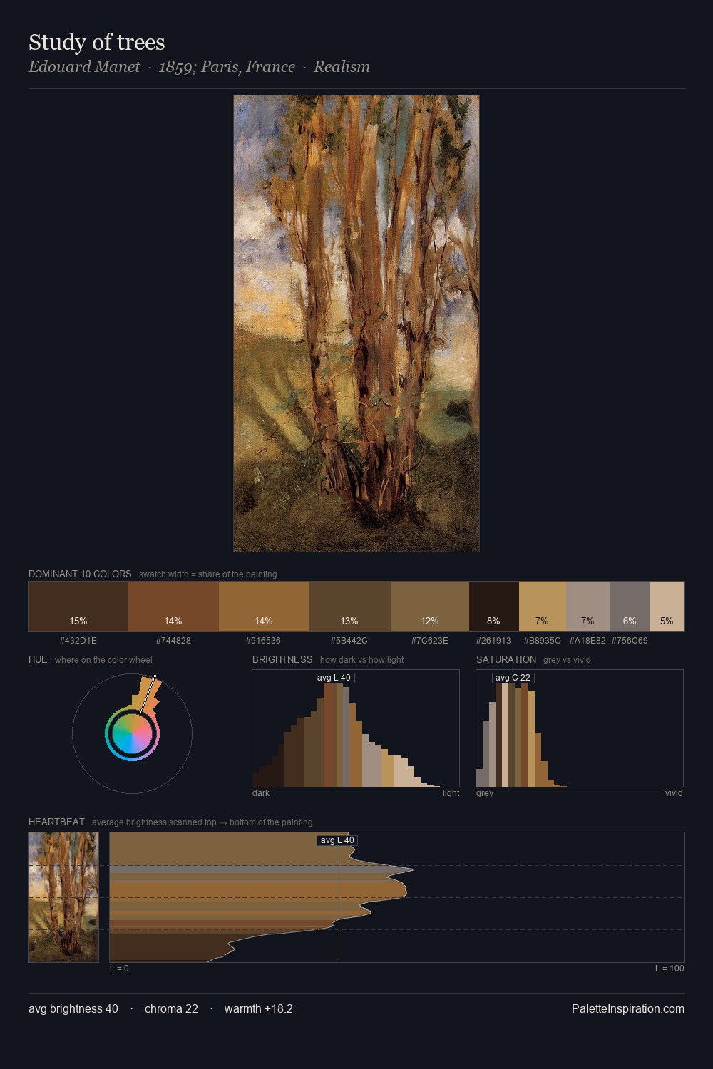
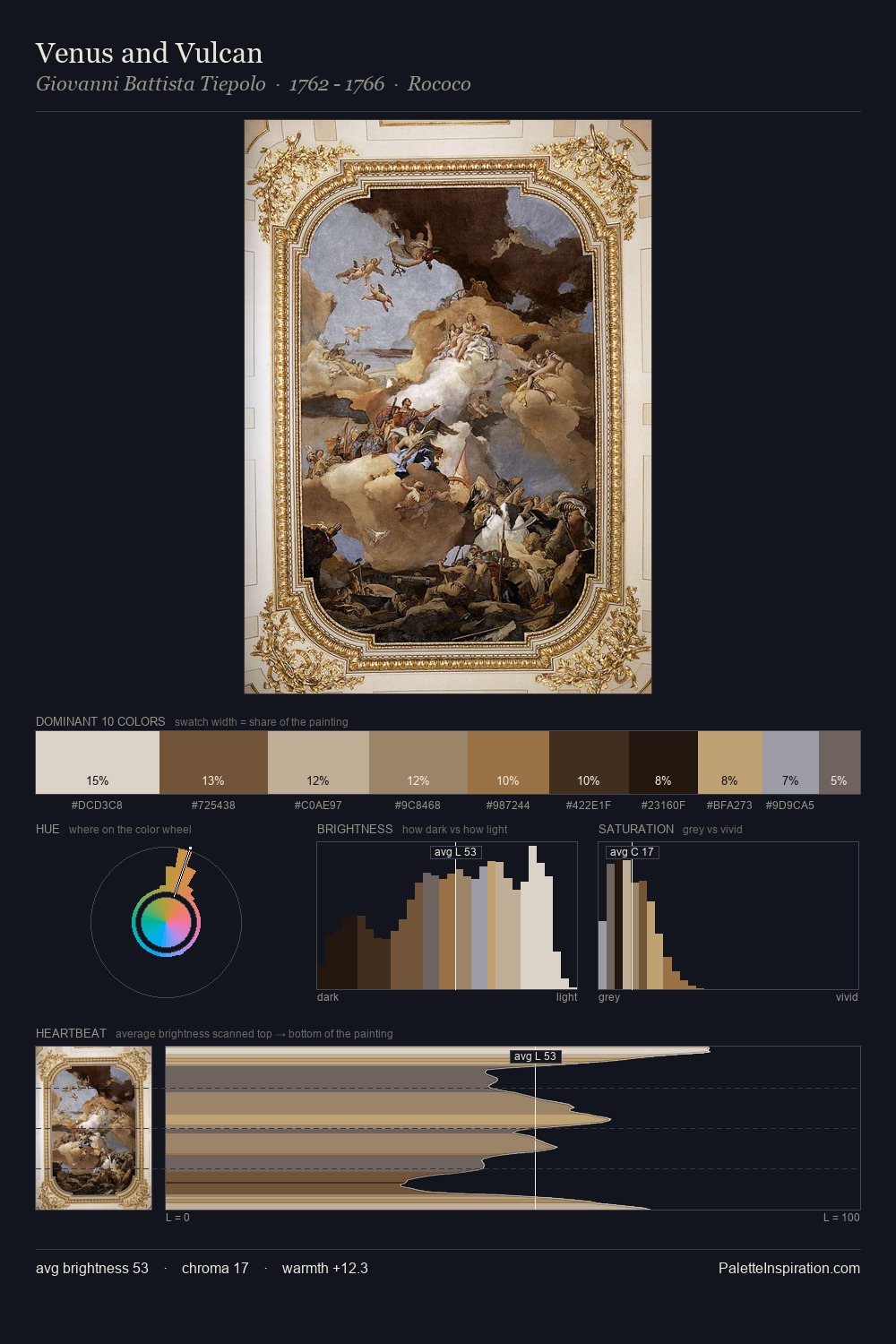
Impressionism occupies the comfortable middle of the value scale, avoiding both extremes to hold the eye in a sustained middle grey. Warm and cool are kept in productive tension, creating the kind of chromatic harmony that sustains the eye. Muted throughout, the palette achieves its effects through value and temperature rather than chromatic force. #7D4E34 functions as the palette's exclamation mark: highest chroma, lowest percentage (9.0%). At 59 units of value range, the palette has the tonal breadth to sustain complex spatial readings.
Example use cases
- theater design
- jewelry brands
- tobacco-adjacent retail
- event branding
- film & entertainment
I Love This!
Use This Palette
Copy, export, or download for your project
Copy, export, or download for your project
Copy:
Download:
Share: