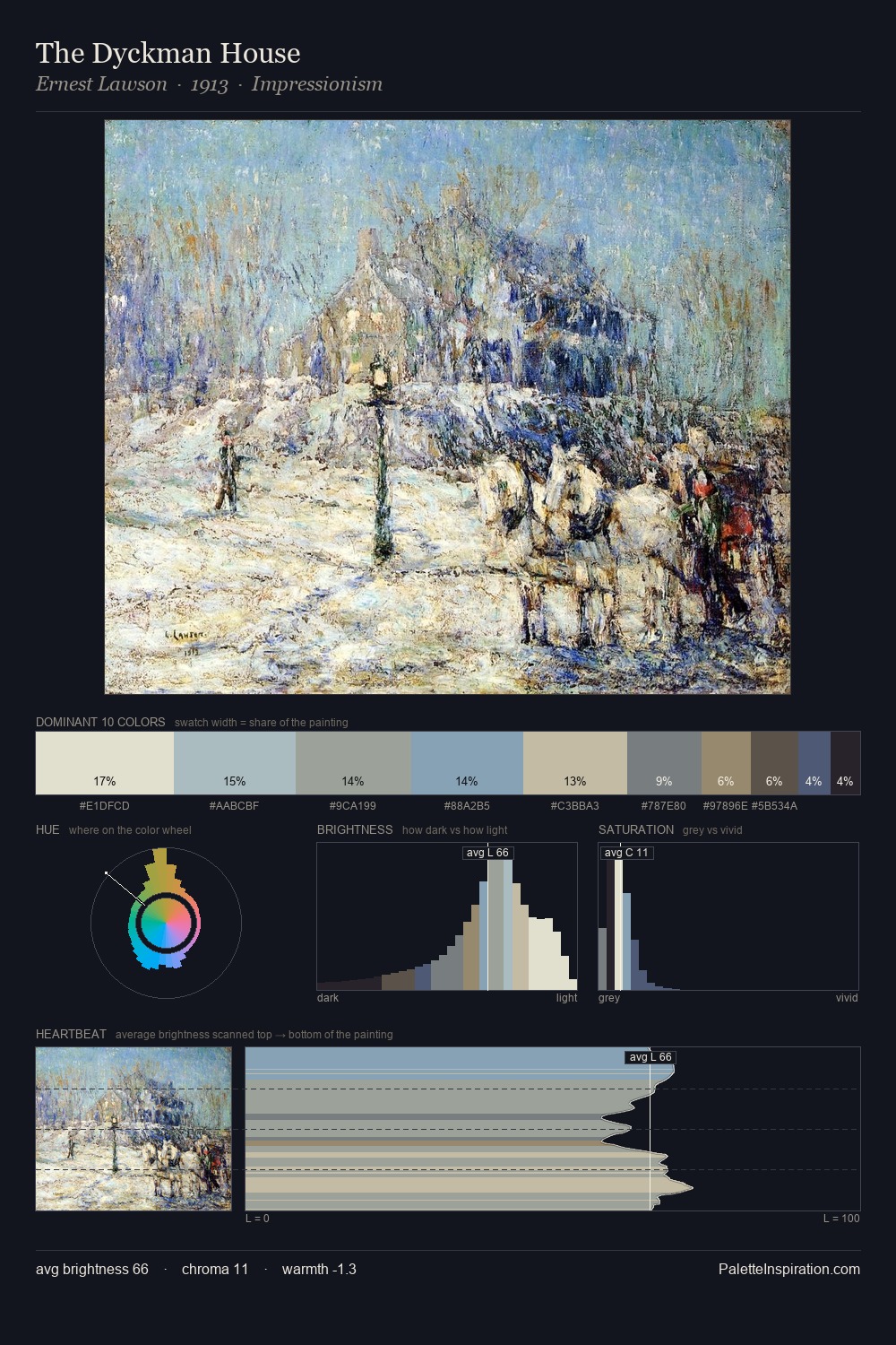
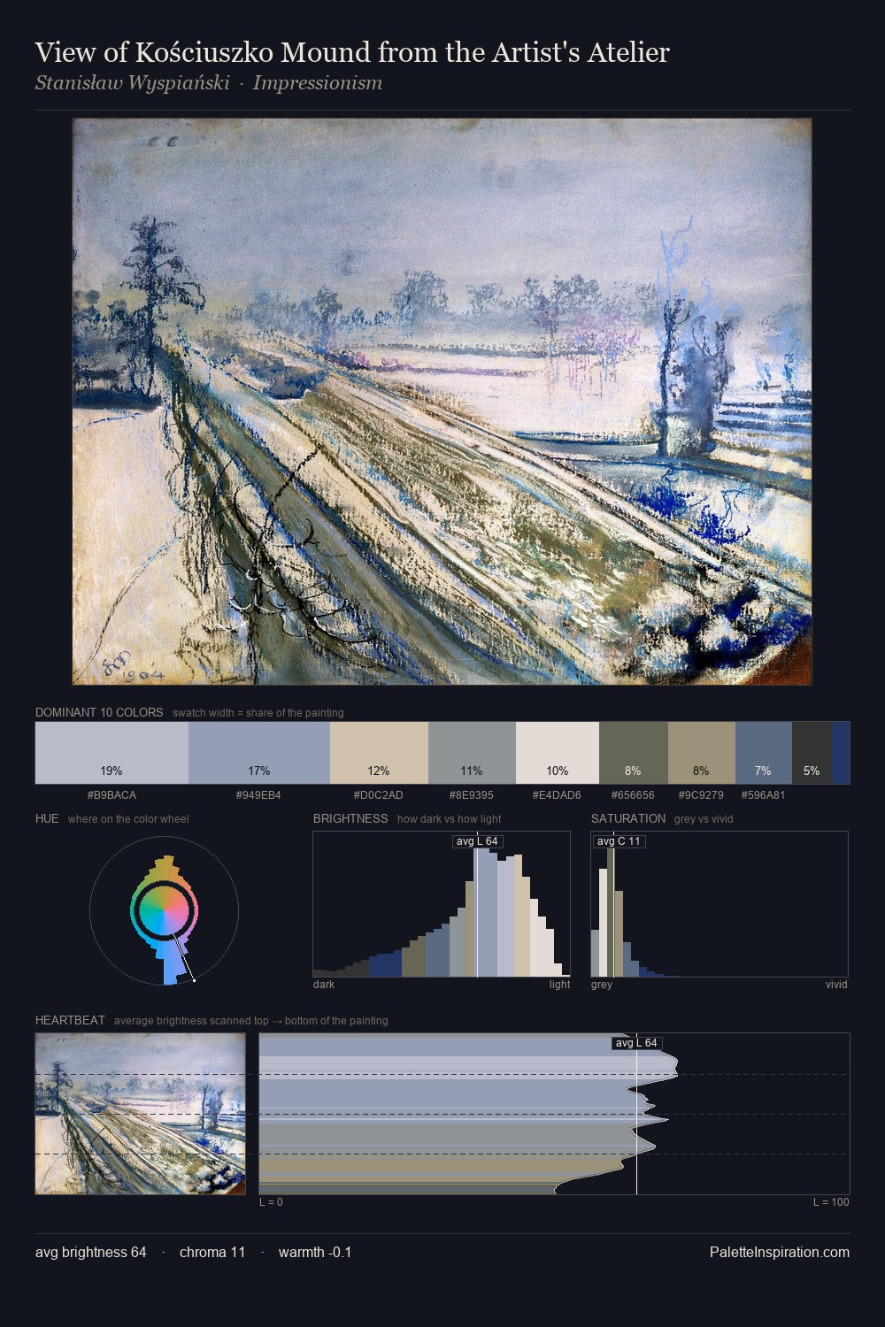
Impressionism Palette 3
Soft Alabaster
Soft Low-contrast, gentle chroma - mid-key values and low saturation, approachable and calm.
Alabaster Warm off-white - creamy stone white, luminous and slightly translucent.

Palette Analysis
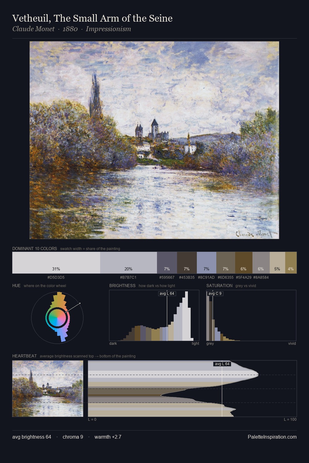
Impressionism works in the upper reaches of the value scale, creating an atmosphere of brightness and expansiveness. Temperature is cool-dominant, with blue and green families claiming the largest areas. Every colour is desaturated; the palette proceeds through near-neutrals and gently-coloured greys. The saturated accent, #C7BAA4, registers at 12.3% - sparse enough to feel like a deliberate surprise. 59 units of value range underpin the palette's structural clarity: the eye always knows where light falls. The mid-to-high key, cool bias, and moderate chroma point to outdoor observation - sky and diffused daylight as the dominant light source.
Example use cases
- florist branding
- event design
- real estate
- jewelry retail
- hospitality branding
I Love This!
Use This Palette
Copy, export, or download for your project
Copy, export, or download for your project
Copy:
Download:
Share: