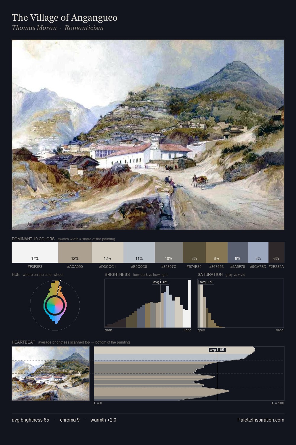
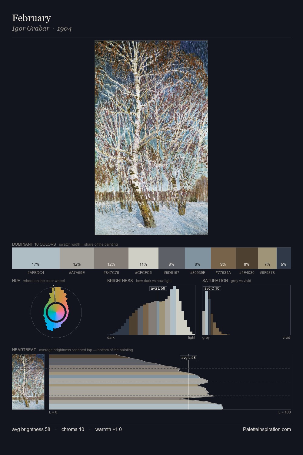
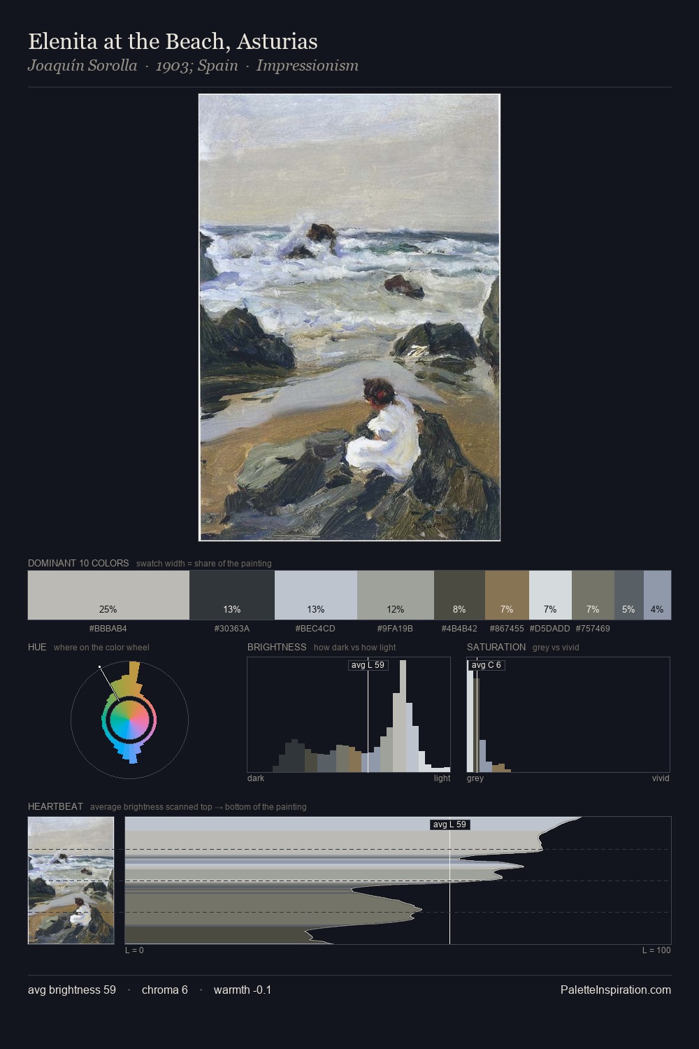
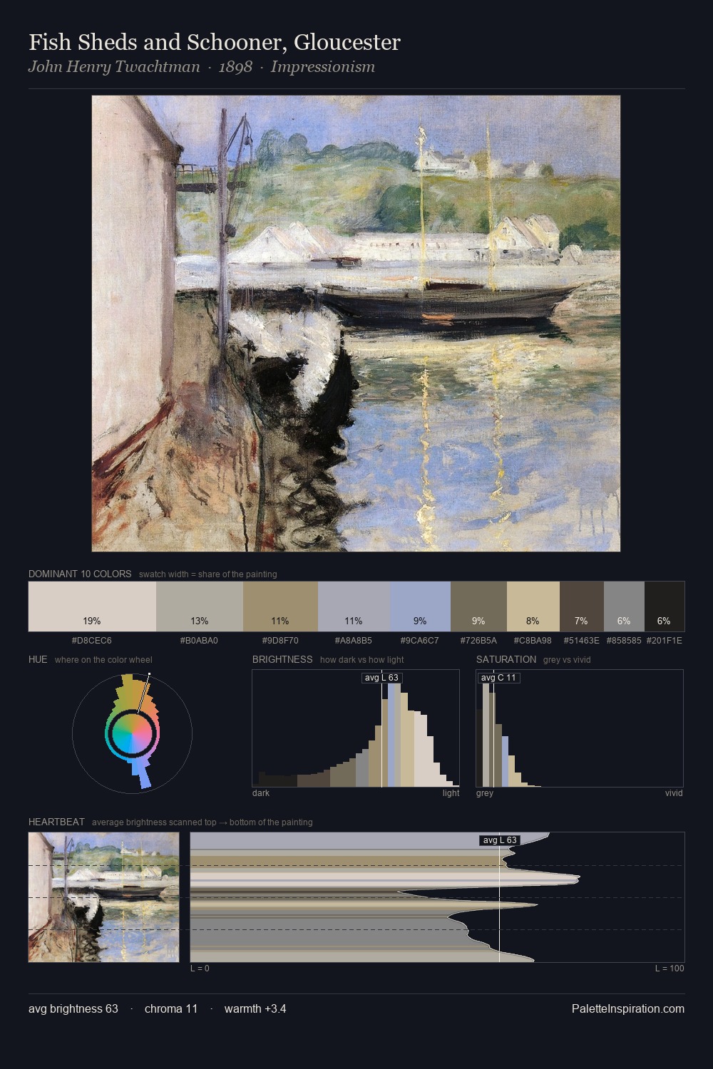
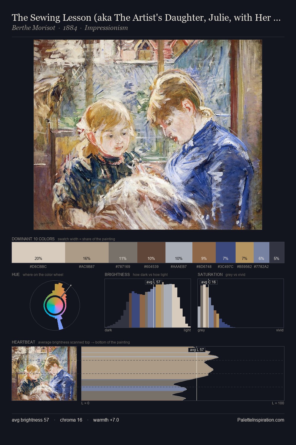
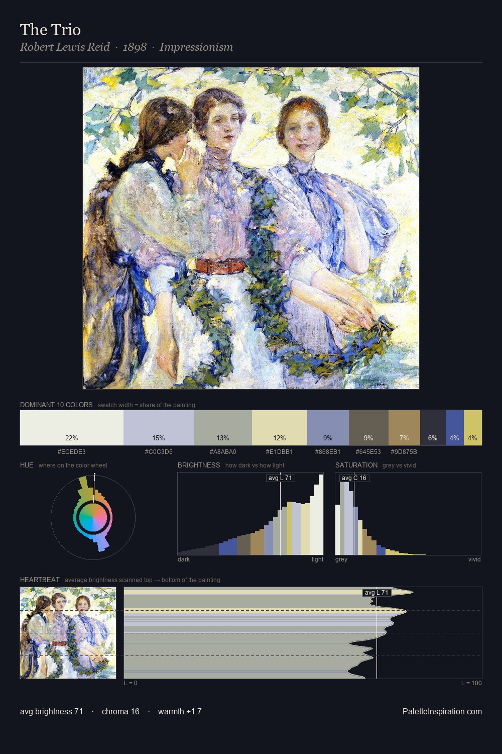
Impressionism Palette 2
Gleaming Alabaster
Gleaming Bright and polished - high-key, often warm, suggesting reflective or luminous surfaces.
Alabaster Warm off-white - creamy stone white, luminous and slightly translucent.
Palette Analysis
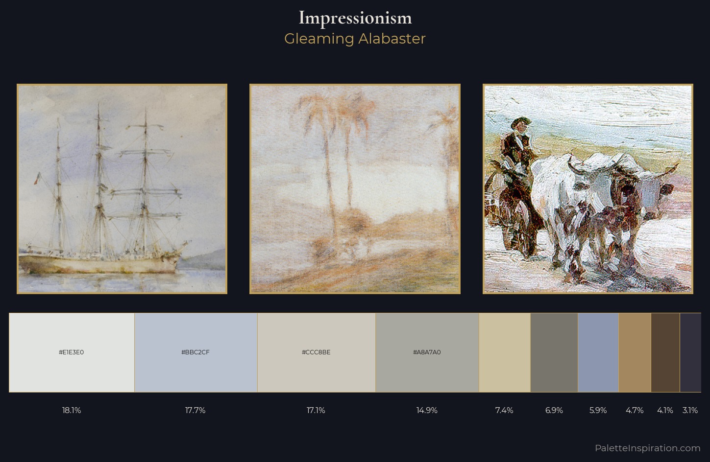
Impressionism is high-key - luminous, open, and weighted toward light. A distinctly cool atmosphere runs through this palette: sky, water, and mist given colour form. All colours lean toward grey, building depth through value rather than colour punch. The saturated accent, #554433, registers at 4.1% - sparse enough to feel like a deliberate surprise. From deepest dark to palest light, the palette traverses 59 units of the value scale - a span that creates natural depth. The mid-to-high key, cool bias, and moderate chroma point to outdoor observation - sky and diffused daylight as the dominant light source.
Example use cases
- florist branding
- event design
- real estate
- jewelry retail
- hospitality branding
I Love This!
Use This Palette
Copy, export, or download for your project
Copy, export, or download for your project
Copy:
Download:
Share: