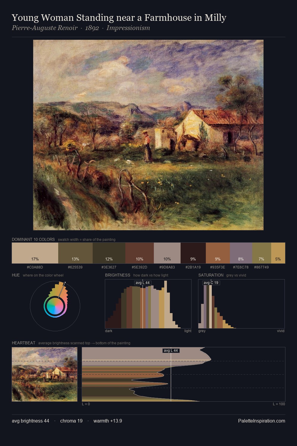
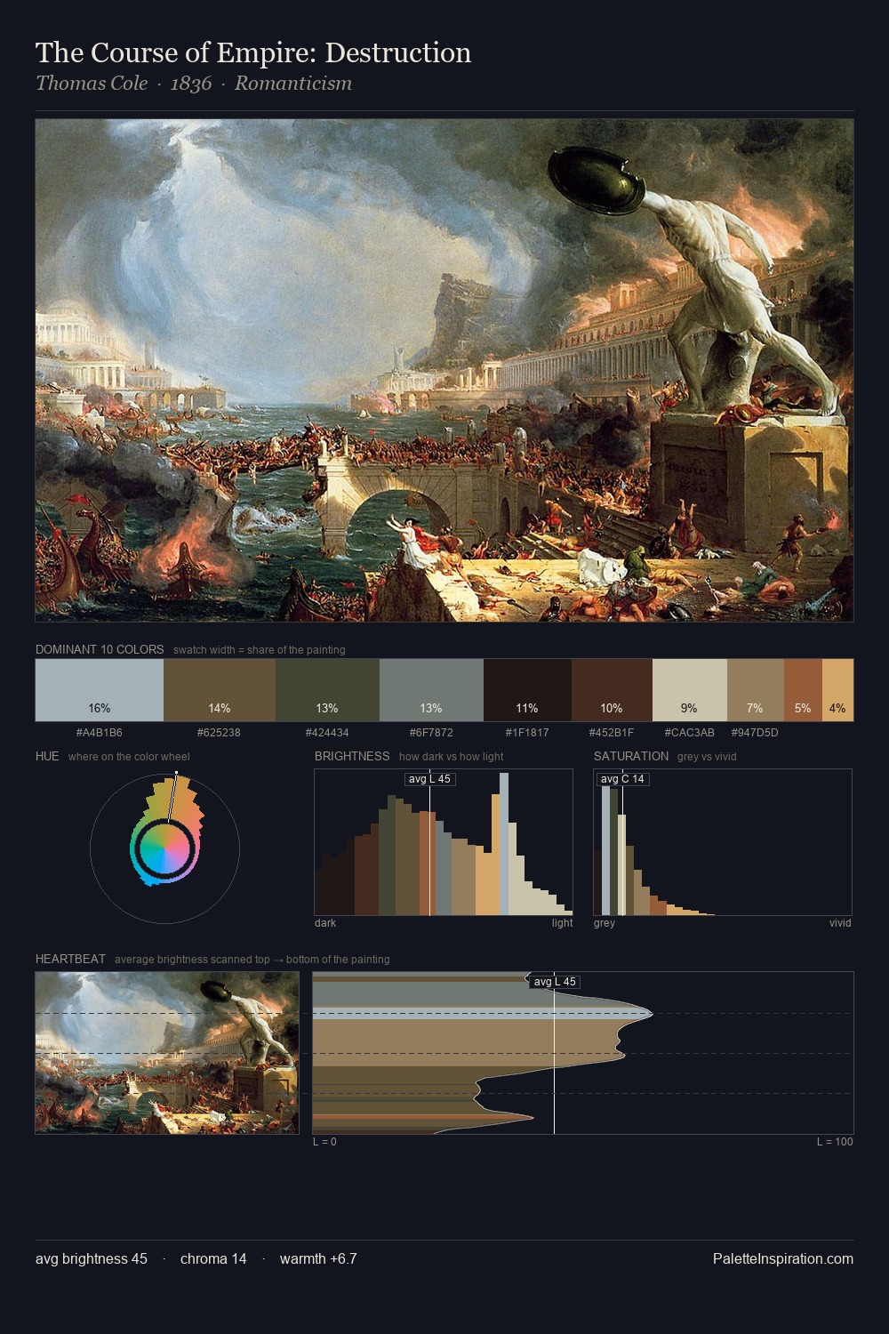
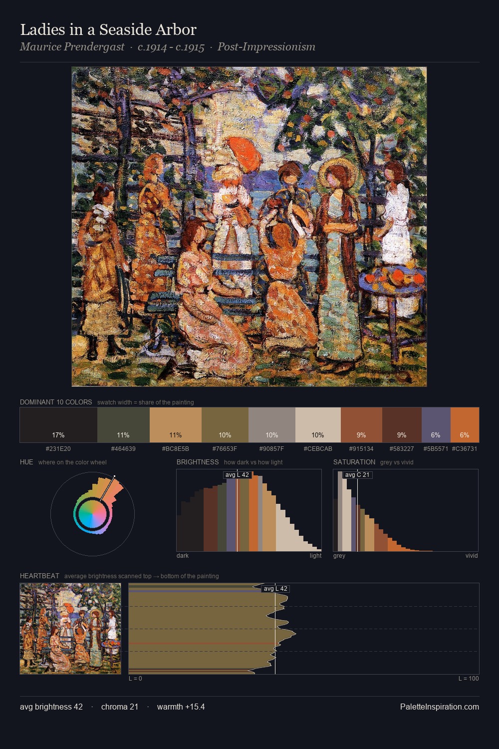
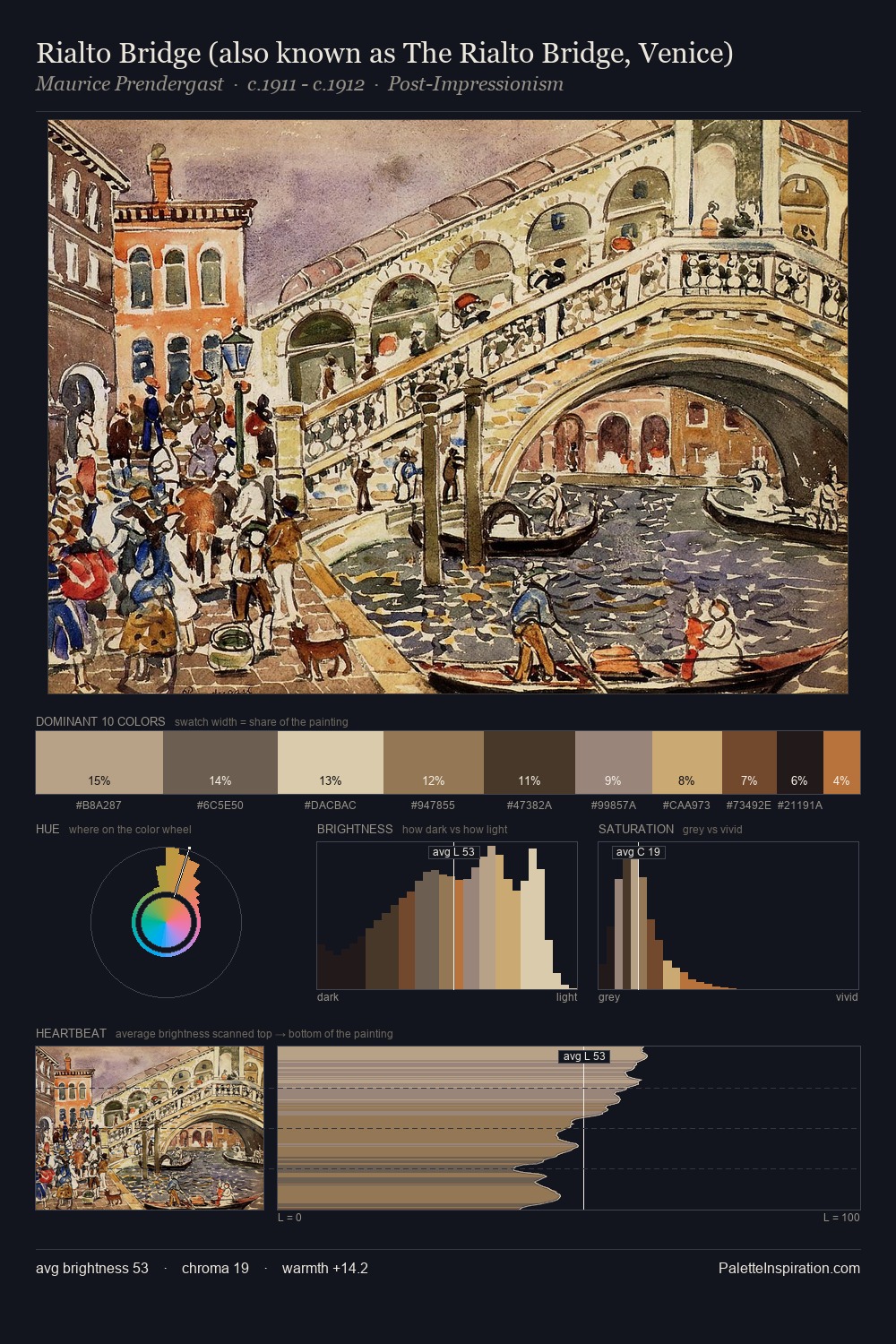
Impressionism Palette 27
Veiled Tawny
Veiled Partially obscured light - mid-dark with a hazy, scrim-filtered quality.
Tawny Warm orange-brown - a traditional term for the color of tanned leather or lion fur.

Palette Analysis
The value structure of Impressionism is mid-key: quiet, controlled, and cohesive. Heat pervades this palette; warm chromatic identities outweigh cool ones at almost every weight. Saturation is deliberately withheld - the beauty here lies in the near-monochromatic gradations rather than colour difference. The highest-chroma note - #4B3027 - appears at just 9.8%, deployed as a precision accent against the quieter ground. From deepest dark to palest light, the palette traverses 58 units of the value scale - a span that creates natural depth.
Example use cases
- craft & artisan brands
- specialty coffee
- home goods
- lifestyle retail
- ceramics & pottery
I Love This!
Use This Palette
Copy, export, or download for your project
Copy, export, or download for your project
Copy:
Download:
Share: