Impressionism Palette 24
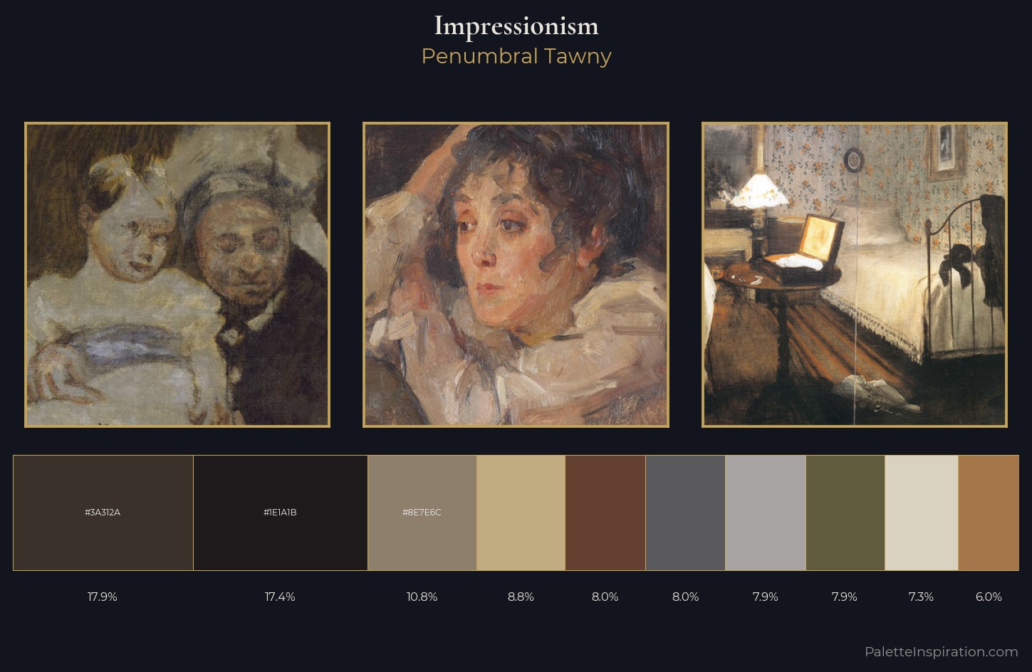
Penumbral Tawny
Penumbral Partial shadow - the transitional zone between light and full dark, soft-edged.
Tawny Warm orange-brown - a traditional term for the color of tanned leather or lion fur.
Palette Analysis
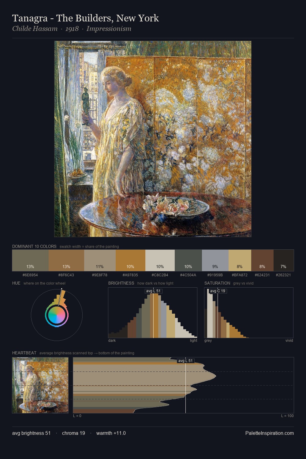
Values in Impressionism rest in the mid-range - neither dramatically lit nor steeped in shadow. Warm hues command this palette; it favours the reds, oranges, and yellows of firelight and earth. The absence of saturated colour is itself an expressive choice: this is a palette of restraint and atmosphere. The most saturated colour, #A4764A, is reserved to 6.0% of the surface, where it acts as a focal punctuation. 65 units of value range underpin the palette's structural clarity: the eye always knows where light falls.
Example use cases
- film & entertainment
- fine dining
- spirits branding
- menswear
- theater design
I Love This!
Use This Palette
Copy, export, or download for your project
Copy, export, or download for your project
Copy:
Download:
Share: