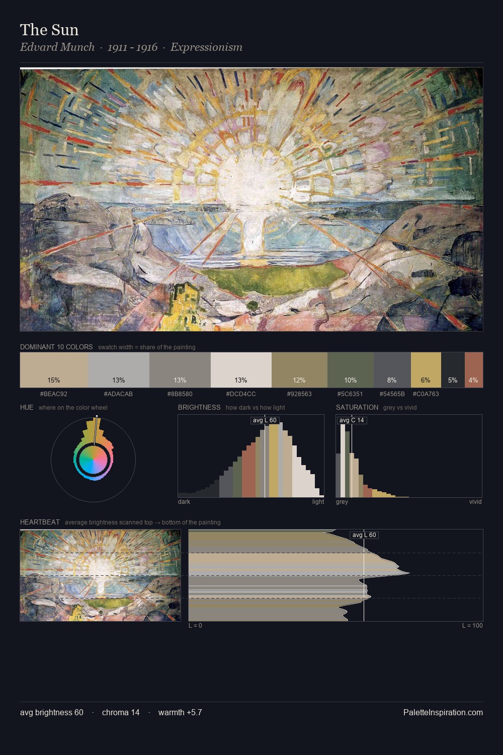
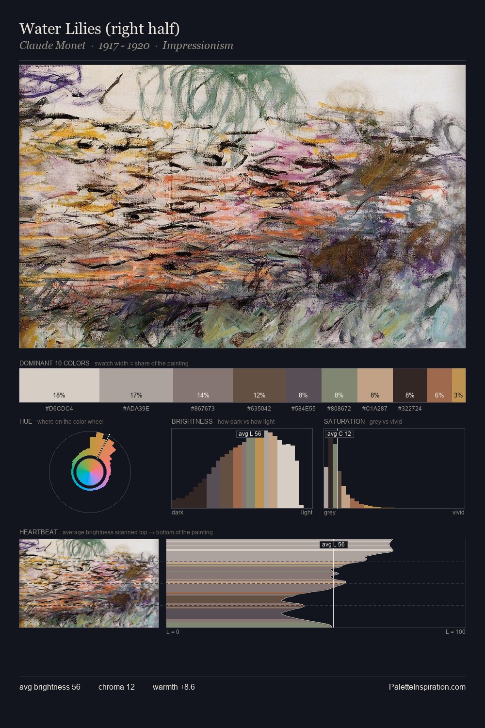
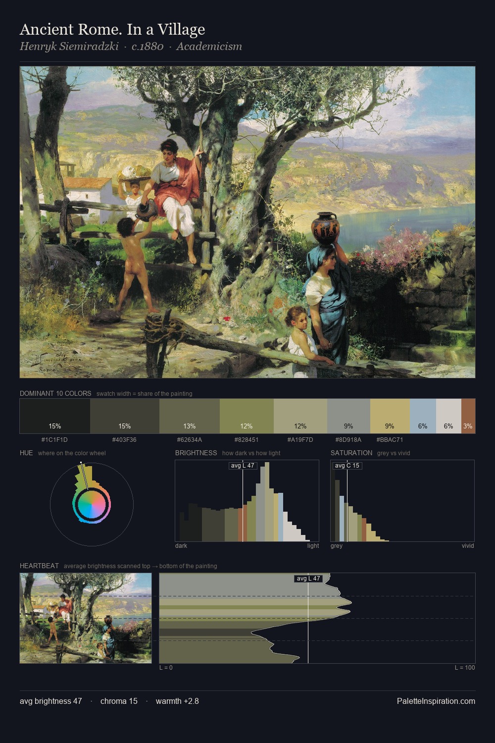
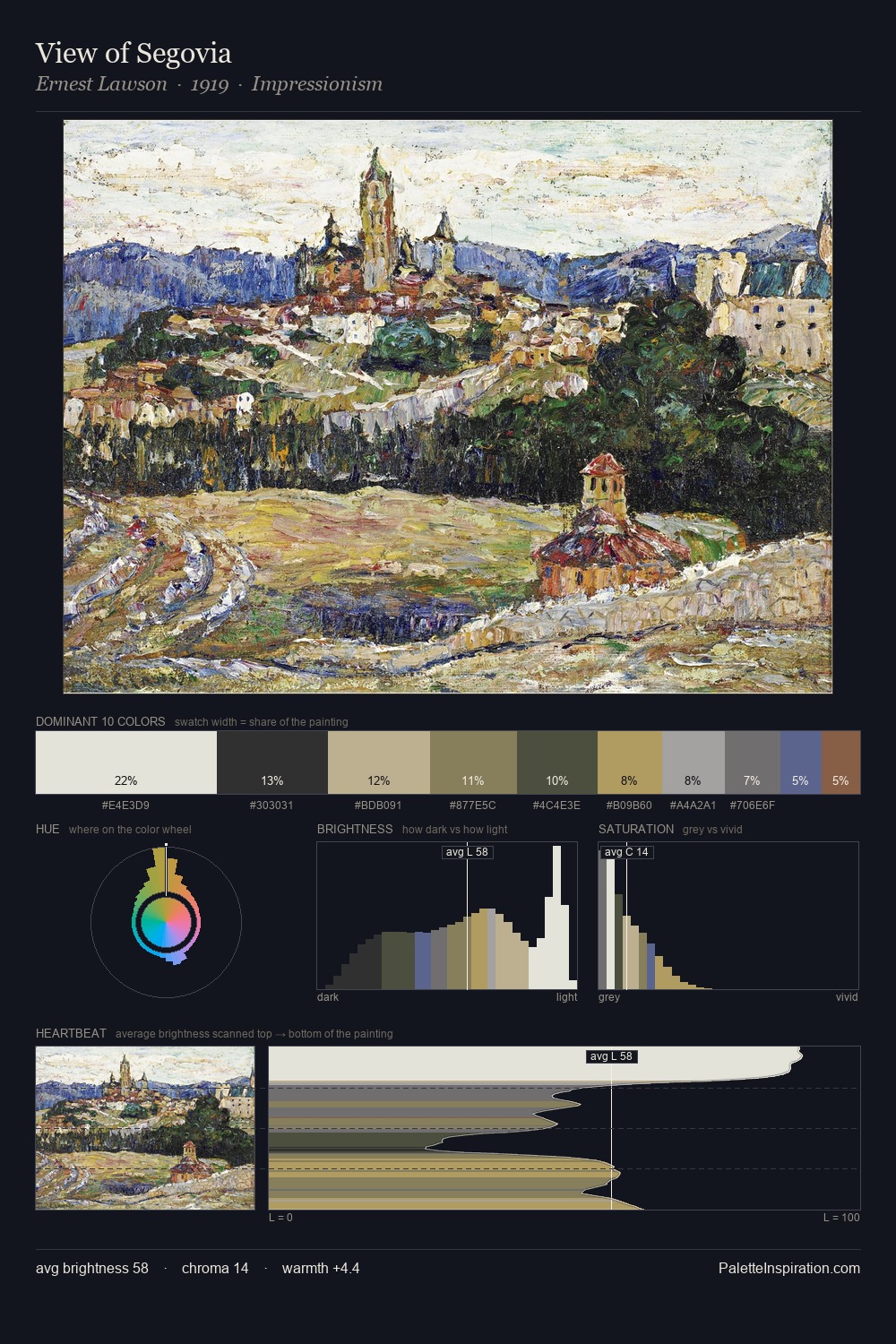
Impressionism Palette 12
Gleaming Linen
Gleaming Bright and polished - high-key, often warm, suggesting reflective or luminous surfaces.
Linen Warm light neutral - the color of natural linen, slightly warm beige.

Palette Analysis
Values in Impressionism tilt decisively toward white, giving the palette its luminous character. Temperature is cool-dominant, with blue and green families claiming the largest areas. Every colour is desaturated; the palette proceeds through near-neutrals and gently-coloured greys. The dominant colour, #E6E3D6, takes 35.1% of the total area, establishing the overall mood before any other hue is introduced. #A06040 delivers the chromatic peak at only 1.9% - a small shot of colour with outsized visual impact. At 68 units of value range, the palette has the tonal breadth to sustain complex spatial readings. The palette has the character of outdoor light: cool, mid-bright, with colour rendered faithfully rather than expressively.
Example use cases
- florist branding
- event design
- real estate
- jewelry retail
- hospitality branding
I Love This!
Use This Palette
Copy, export, or download for your project
Copy, export, or download for your project
Copy:
Download:
Share: