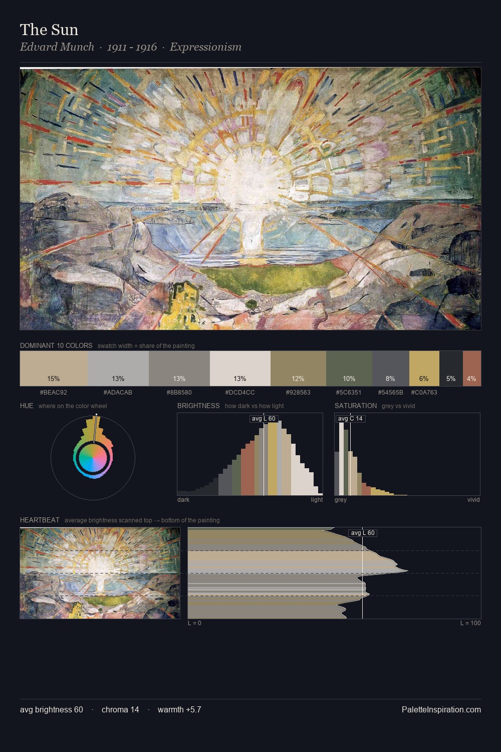
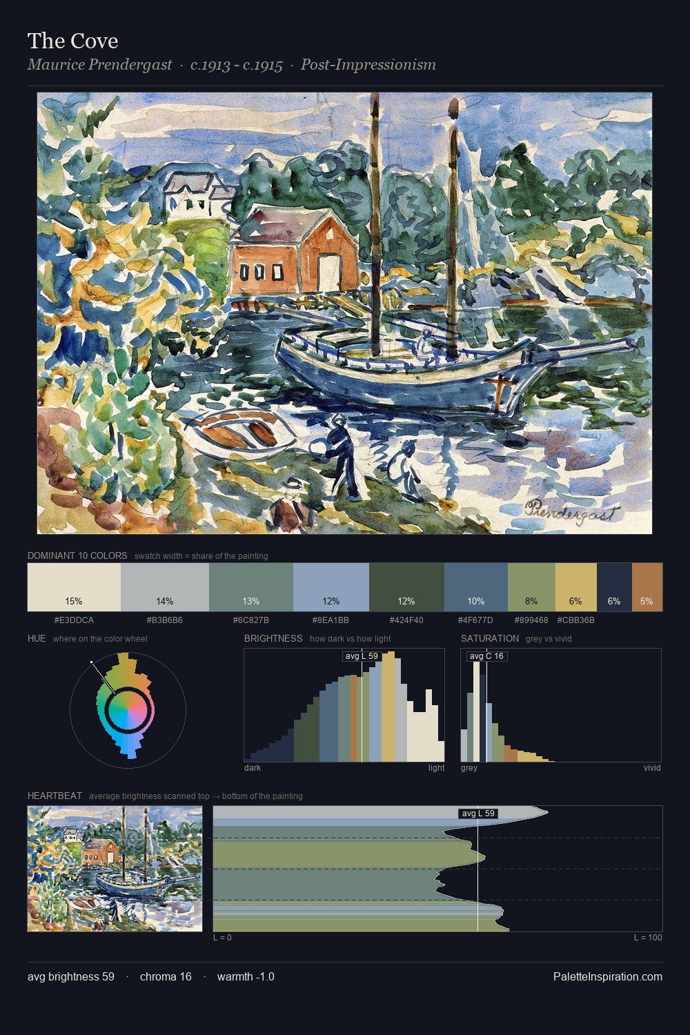
Impressionism Palette 1
Gleaming Linen
Gleaming Bright and polished - high-key, often warm, suggesting reflective or luminous surfaces.
Linen Warm light neutral - the color of natural linen, slightly warm beige.
Palette Analysis
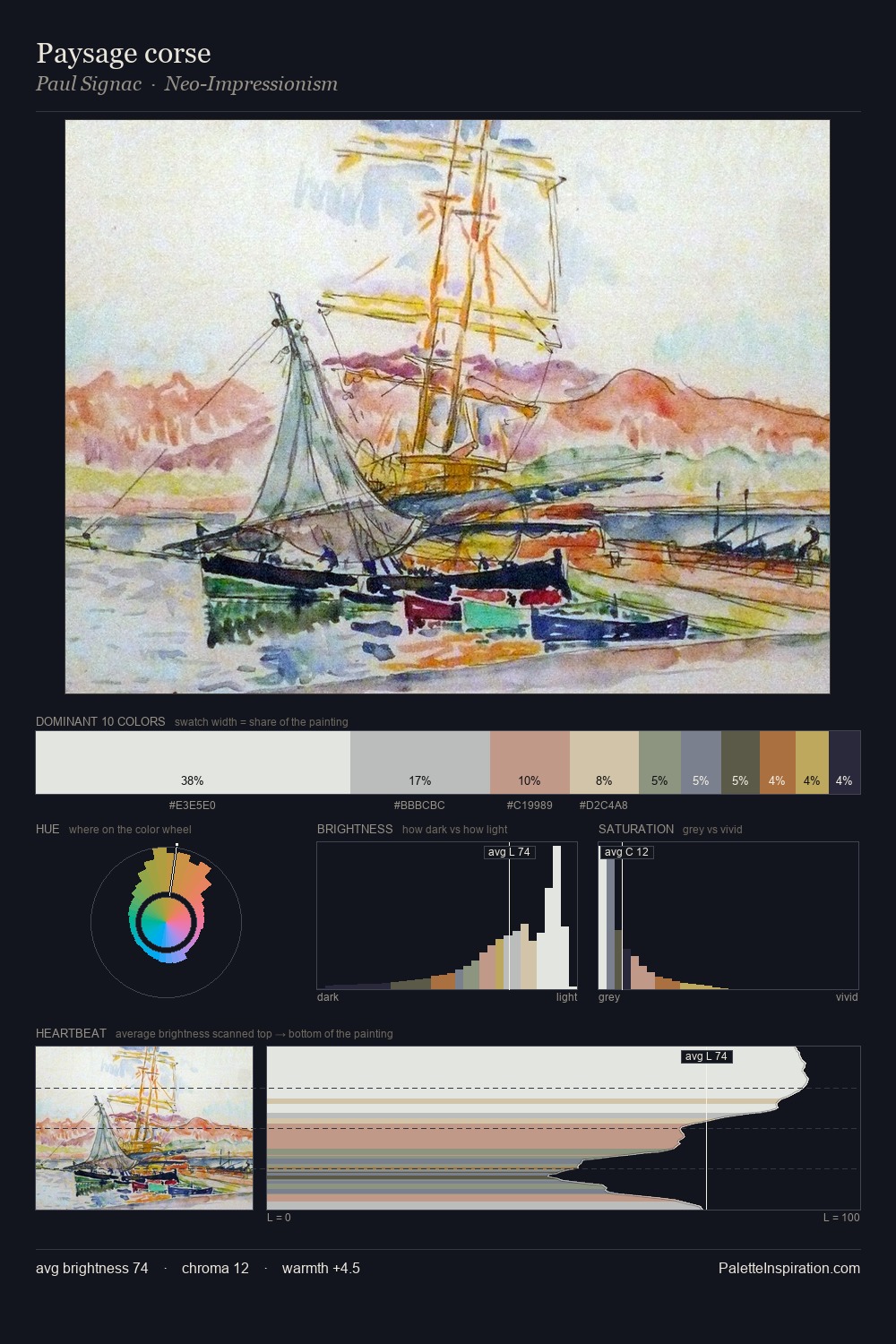
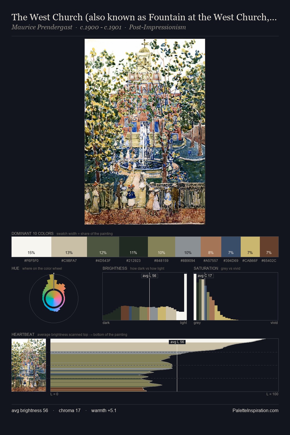
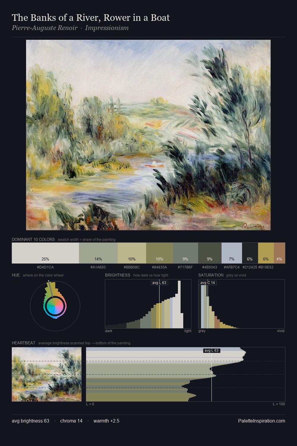
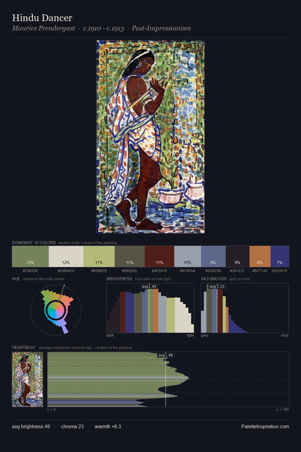
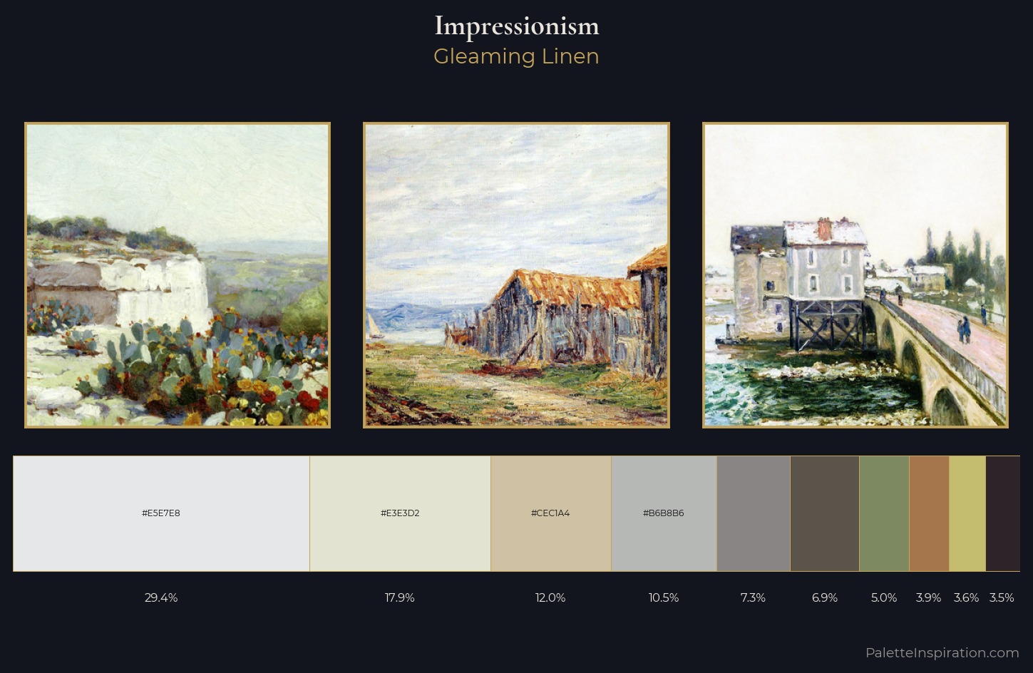
Light floods Impressionism; the palette keeps values pale and airy across its range. Temperature is cool-dominant, with blue and green families claiming the largest areas. The absence of saturated colour is itself an expressive choice: this is a palette of restraint and atmosphere. The dominant colour, #E5E7E8, takes 29.4% of the total area, establishing the overall mood before any other hue is introduced. The saturated accent, #A5754C, registers at 3.9% - sparse enough to feel like a deliberate surprise. The full value range is 66 units: broad enough to build convincing three-dimensional form. The palette has the character of outdoor light: cool, mid-bright, with colour rendered faithfully rather than expressively.
Example use cases
- florist branding
- event design
- real estate
- jewelry retail
- hospitality branding
I Love This!
Use This Palette
Copy, export, or download for your project
Copy, export, or download for your project
Copy:
Download:
Share: