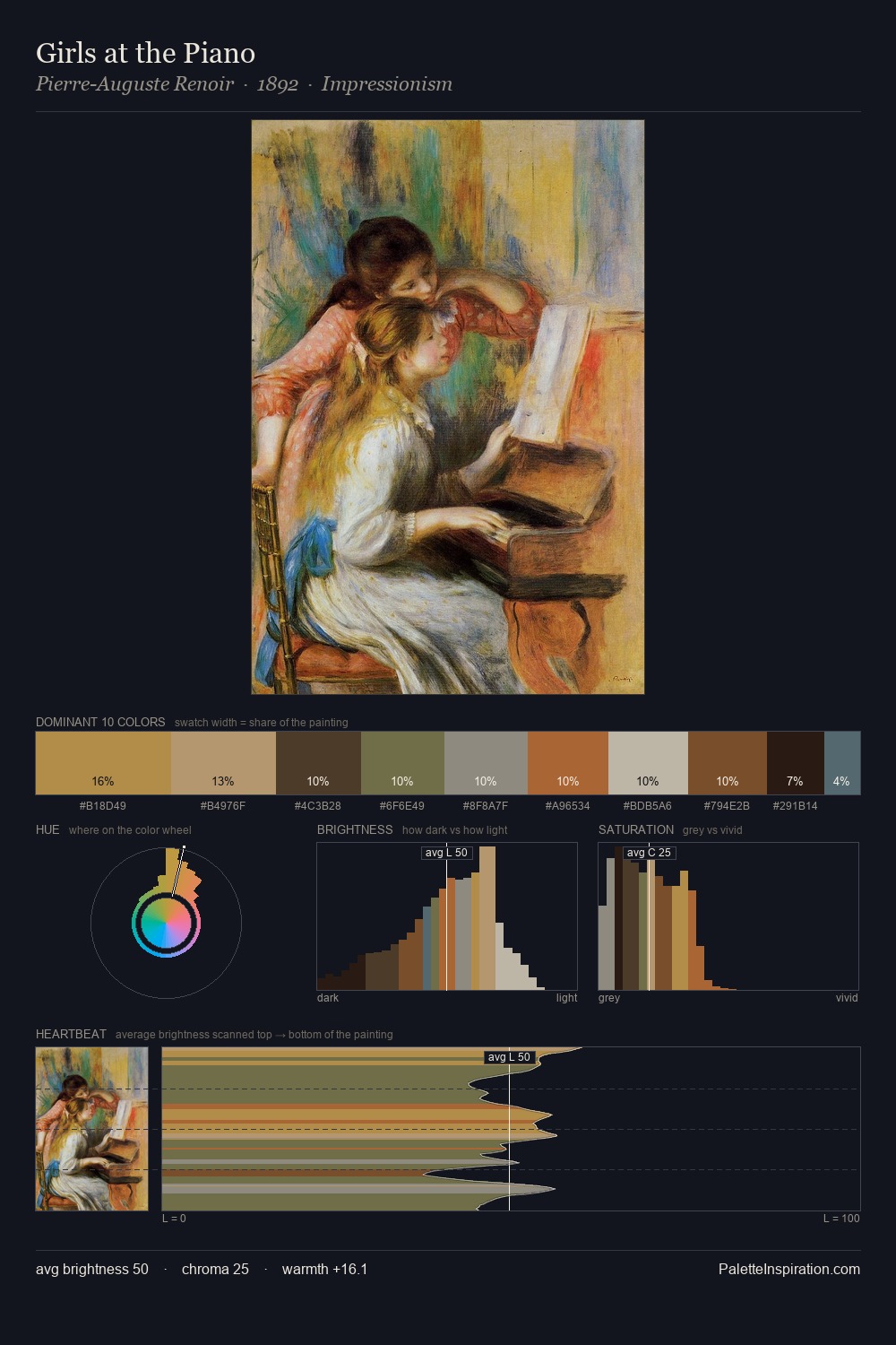
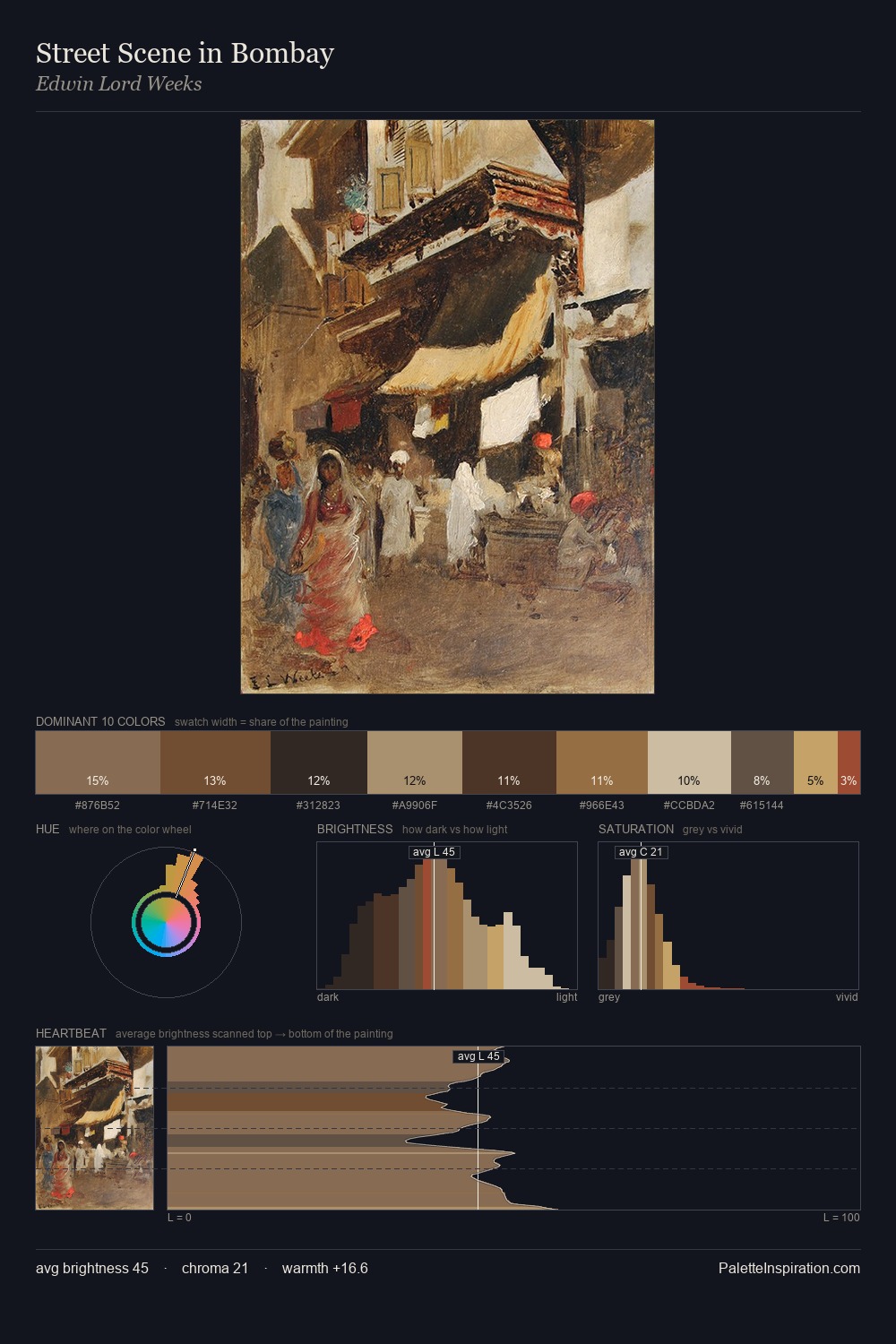
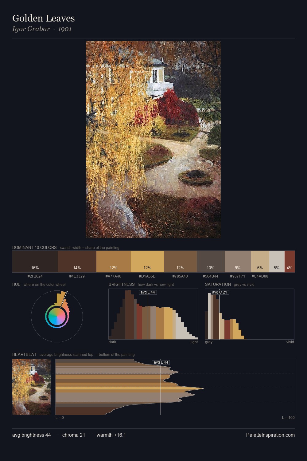
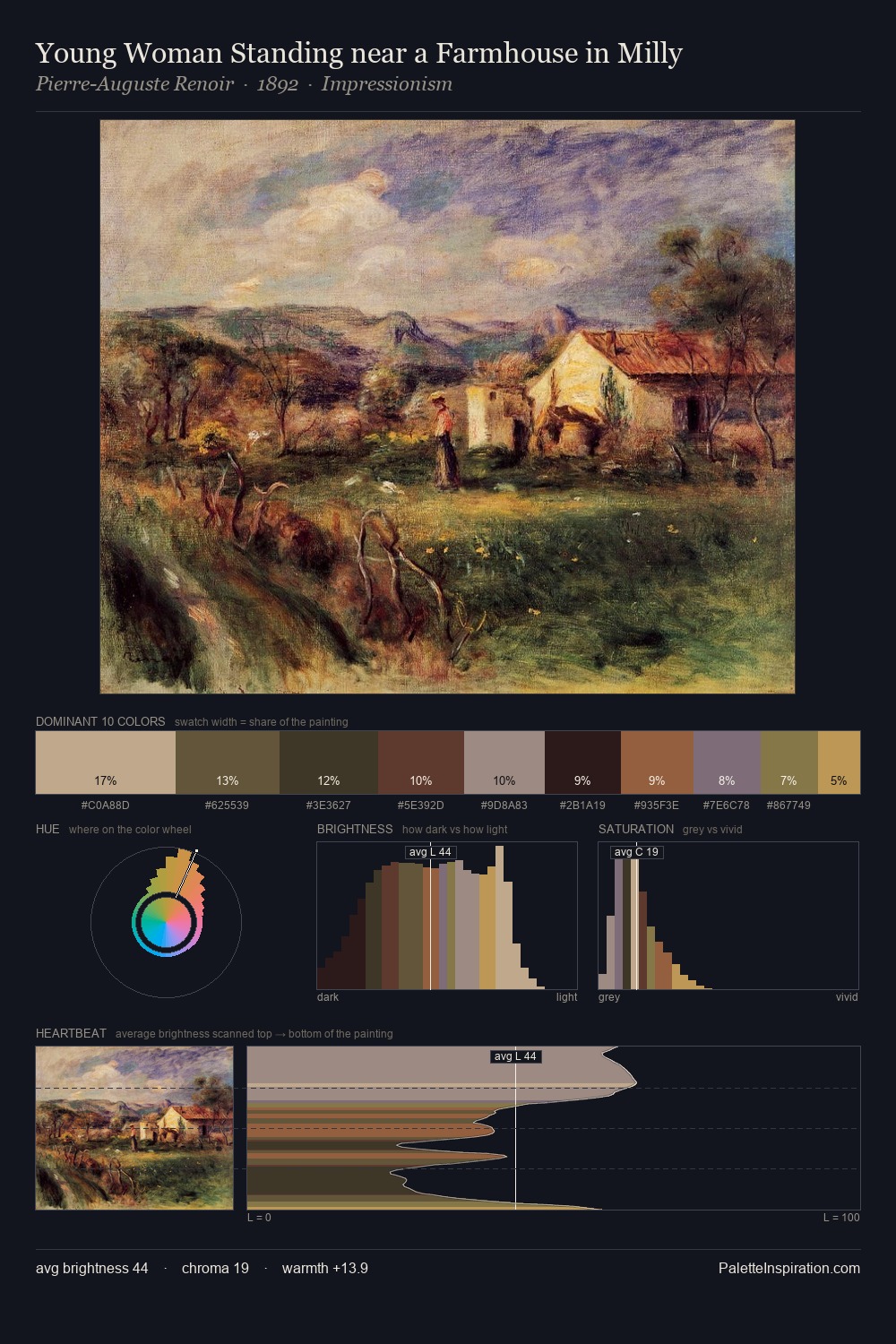
Impressionism Palette 29
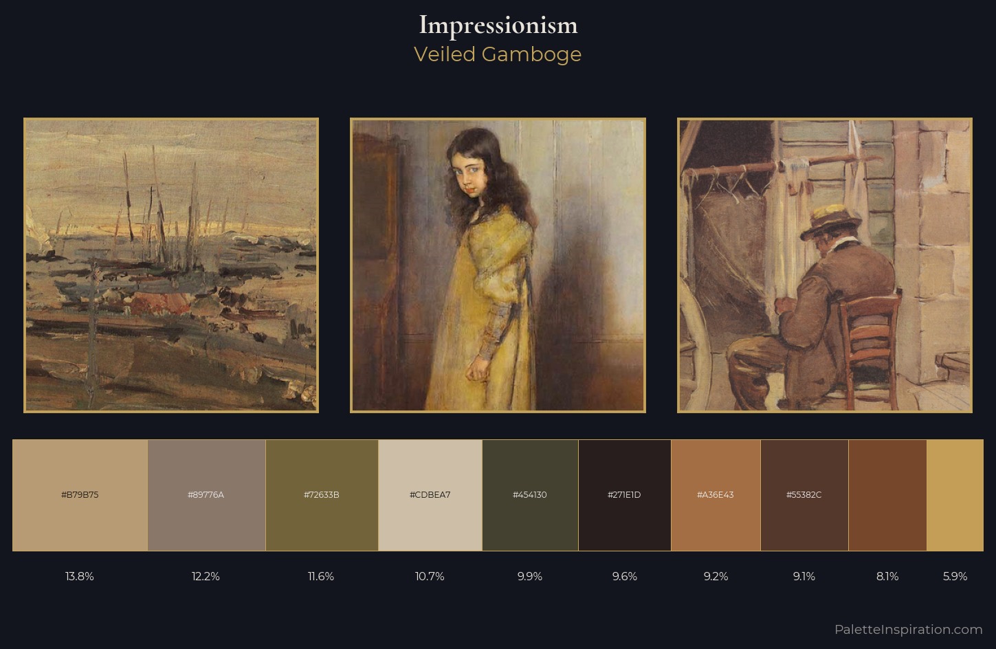
Veiled Gamboge
Veiled Partially obscured light - mid-dark with a hazy, scrim-filtered quality.
Gamboge Deep golden yellow - a traditional warm pigment, rich amber-gold.
Palette Analysis
Impressionism distributes its values across the middle register, creating harmony without high contrast. The palette orchestrates warmth above all else - reds, ambers, and siennas take the lead. Every colour is desaturated; the palette proceeds through near-neutrals and gently-coloured greys. #76472B functions as the palette's exclamation mark: highest chroma, lowest percentage (8.1%). 56 units of value range underpin the palette's structural clarity: the eye always knows where light falls.
Example use cases
- ceramics & pottery
- boutique hospitality
- menswear
- heritage food brands
- craft & artisan brands
I Love This!
Use This Palette
Copy, export, or download for your project
Copy, export, or download for your project
Copy:
Download:
Share: