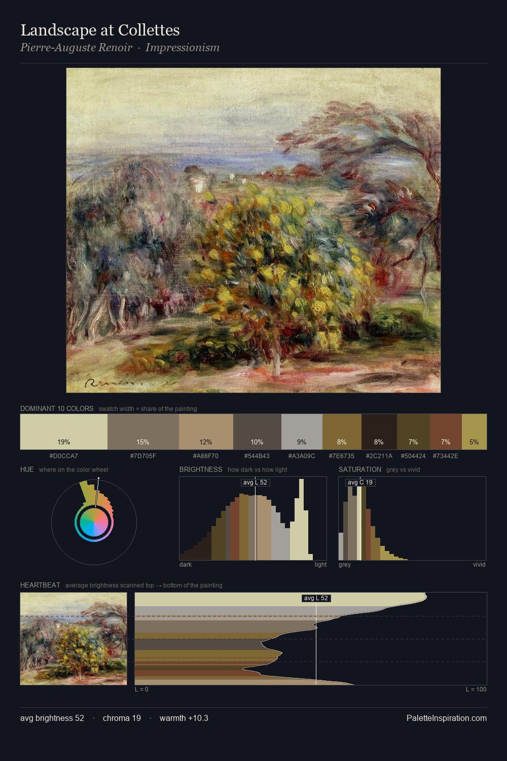
Impressionism Palette 22
Veiled Bisque
Veiled Partially obscured light - mid-dark with a hazy, scrim-filtered quality.
Bisque Pale warm beige - soft, slightly pinkish neutral, the color of unglazed ceramic.

Palette Analysis
Impressionism distributes its values across the middle register, creating harmony without high contrast. A distinctly cool atmosphere runs through this palette: sky, water, and mist given colour form. Every colour is desaturated; the palette proceeds through near-neutrals and gently-coloured greys. Only 8.0% is devoted to #BAA053, yet that small allocation delivers the palette's entire chromatic tension. At 52 units across the value scale, the palette keeps contrast readable without letting it dominate. The mid-to-high key, cool bias, and moderate chroma point to outdoor observation - sky and diffused daylight as the dominant light source.
Example use cases
- theater design
- jewelry brands
- tobacco-adjacent retail
- event branding
- film & entertainment
I Love This!
Use This Palette
Copy, export, or download for your project
Copy, export, or download for your project
Copy:
Download:
Share: