Tenebrism Palette 21
Abyssal Bister
Abyssal Deepest shadow - values near absolute black, suggesting the bottom of an abyss.
Bister Dark warm brown - a traditional ink and wash pigment made from wood soot.

Palette Analysis
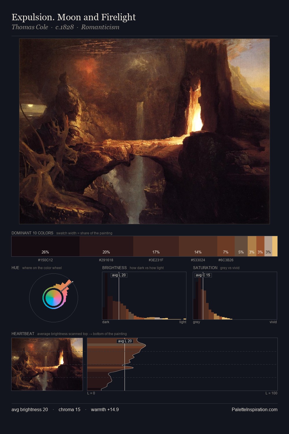
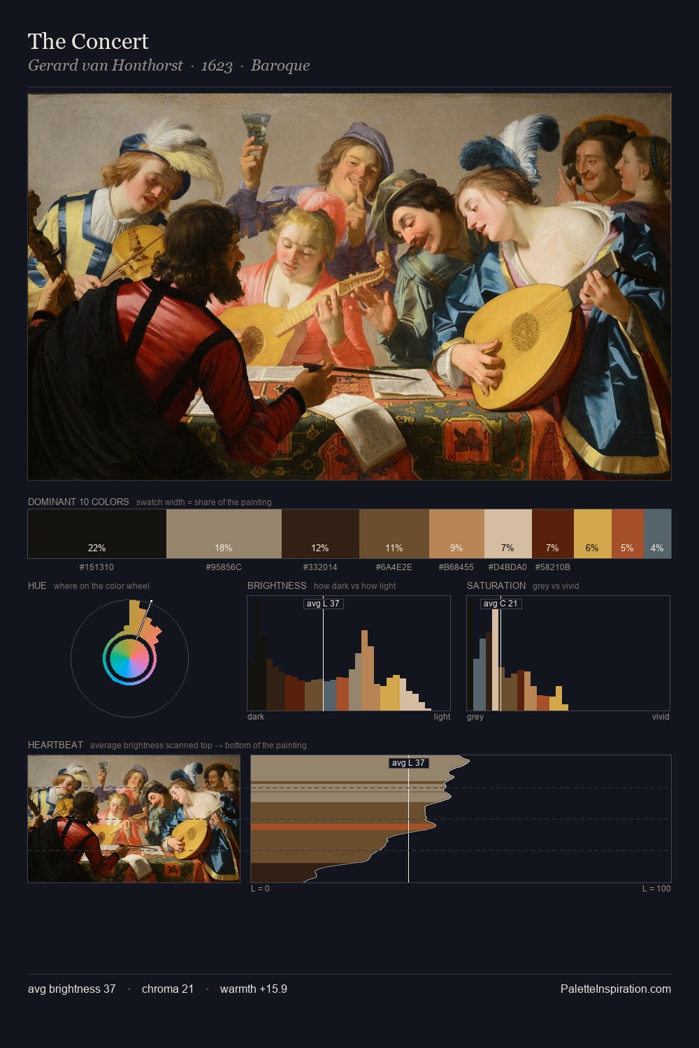
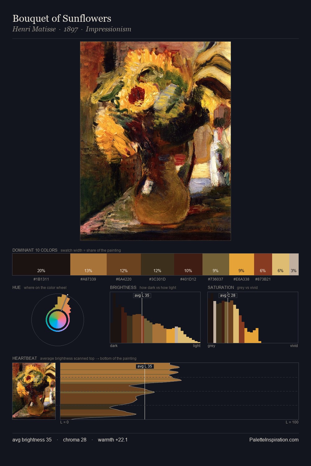
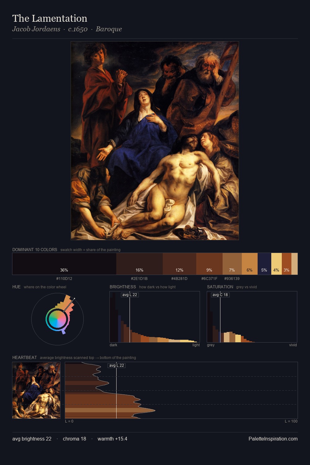
Tenebrism works almost entirely in the lower half of the value scale, privileging depth over brilliance. Warm hues command this palette; it favours the reds, oranges, and yellows of firelight and earth. All colours lean toward grey, building depth through value rather than colour punch. #090507 claims 38.1% of the surface, functioning as the work's tonal foundation. Only 1.4% is devoted to #DEBA67, yet that small allocation delivers the palette's entire chromatic tension. At 68 units of value range, the palette has the tonal breadth to sustain complex spatial readings. Together these qualities place the palette firmly in the tonal tradition - concerned with mood and atmosphere rather than chromatic display.
Example use cases
- theater design
- jewelry brands
- tobacco-adjacent retail
- event branding
- film & entertainment
I Love This!
Use This Palette
Copy, export, or download for your project
Copy, export, or download for your project
Copy:
Download:
Share: