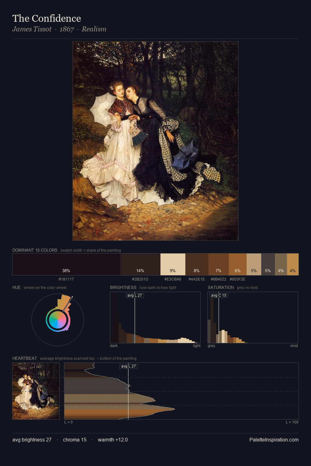
Tenebrism Palette 15

Palette Analysis
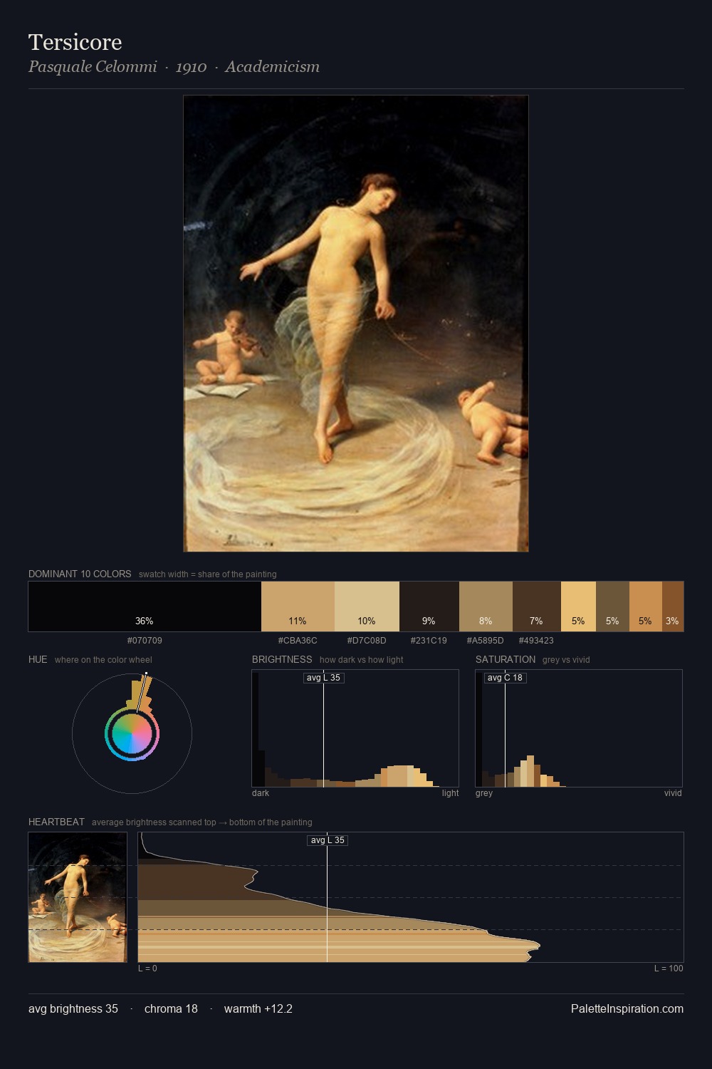
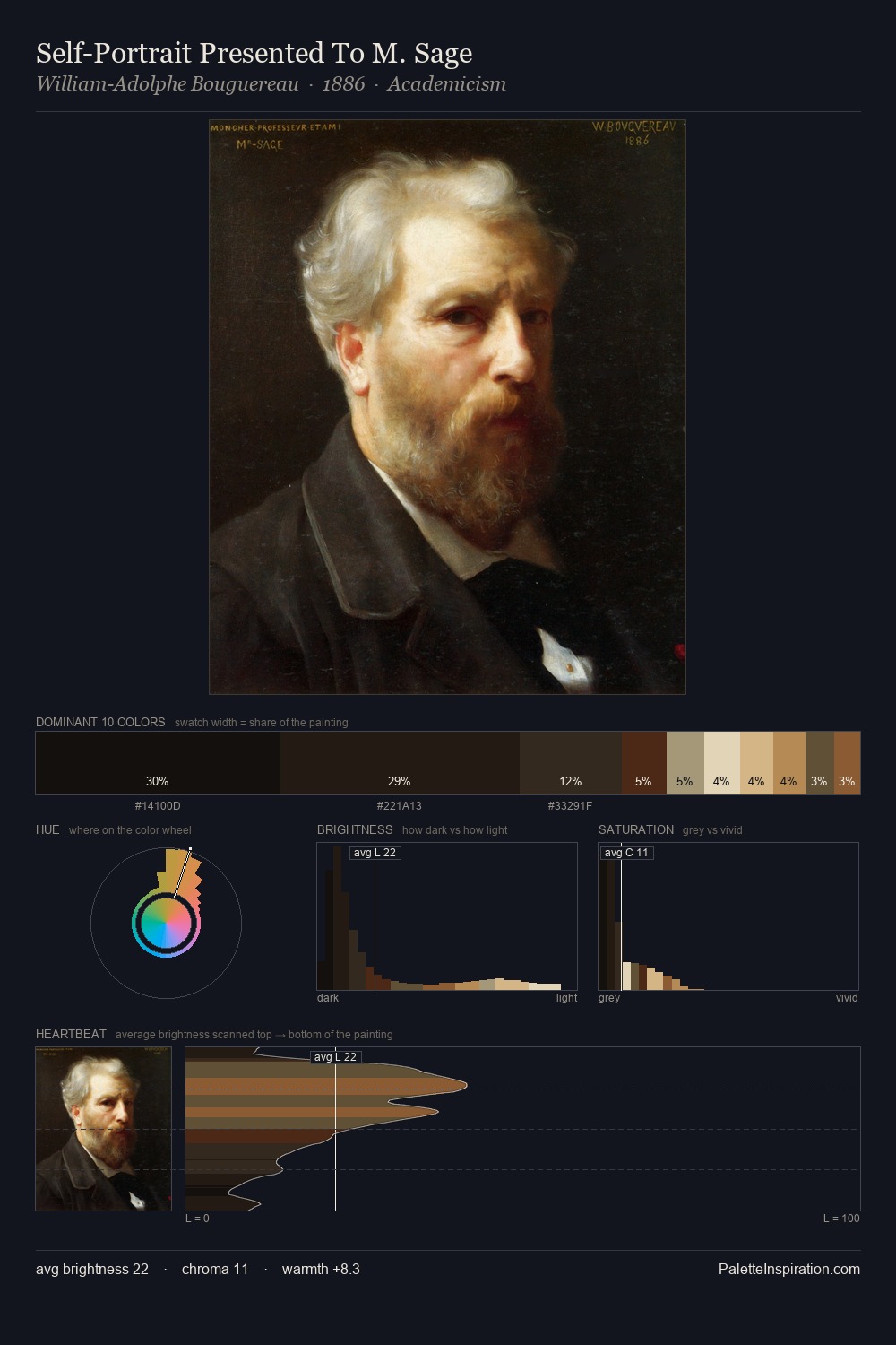
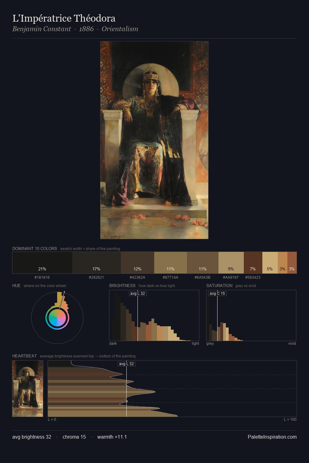
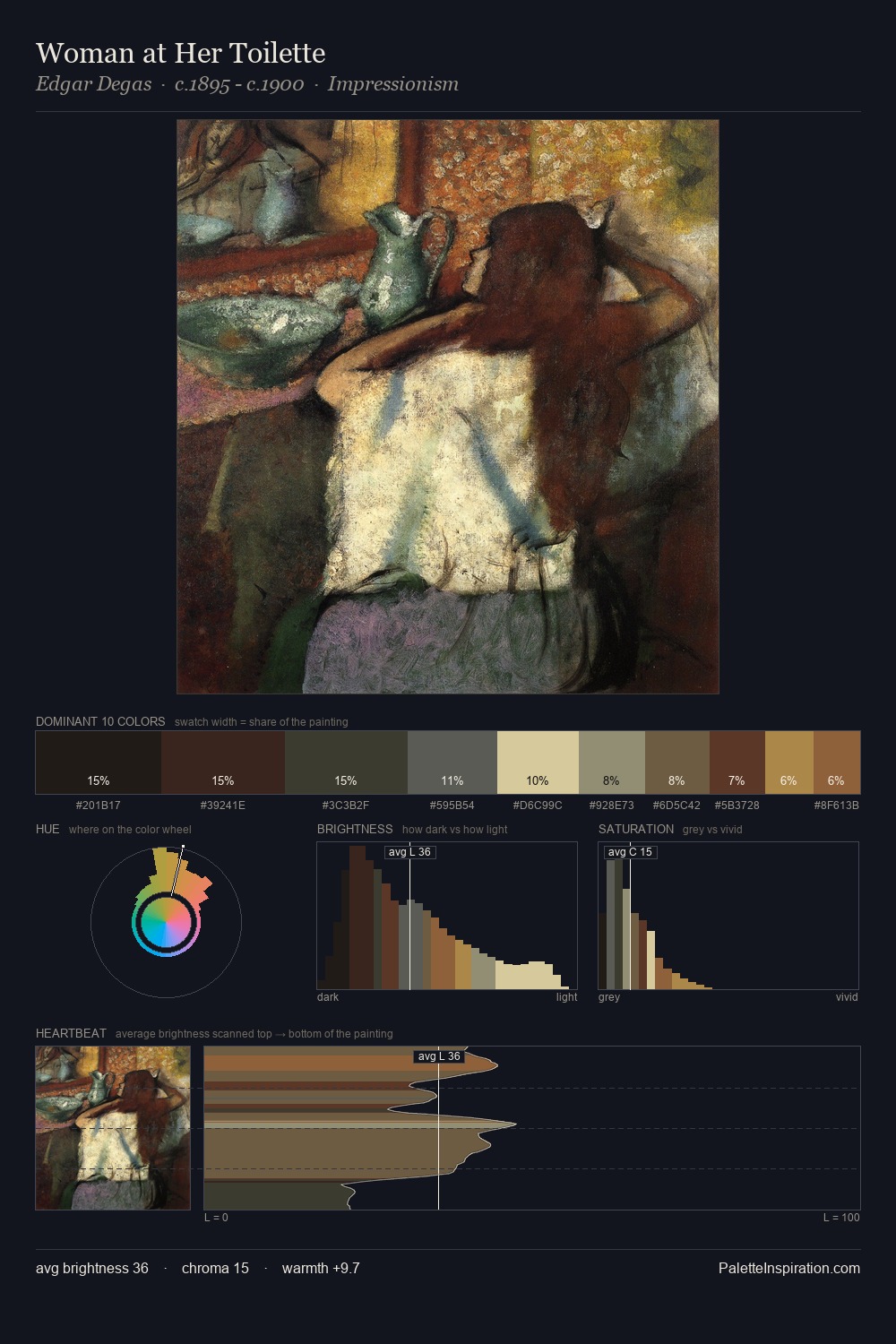
Darkness anchors Tenebrism; light is rationed, creating dramatic contrast rather than open air. Warm hues command this palette; it favours the reds, oranges, and yellows of firelight and earth. Muted throughout, the palette achieves its effects through value and temperature rather than chromatic force. The dominant colour, #1D1C19, takes 40.2% of the total area, establishing the overall mood before any other hue is introduced. The most saturated colour, #D8C490, is reserved to 1.2% of the surface, where it acts as a focal punctuation. 59 units of value range underpin the palette's structural clarity: the eye always knows where light falls. This tonal restraint is characteristic of the Tonalist sensibility: colour serves light, not the reverse.
Example use cases
- film & entertainment
- fine dining
- spirits branding
- menswear
- theater design
I Love This!
Copy, export, or download for your project