Tenebrism Palette 10
Tenebrous Bister
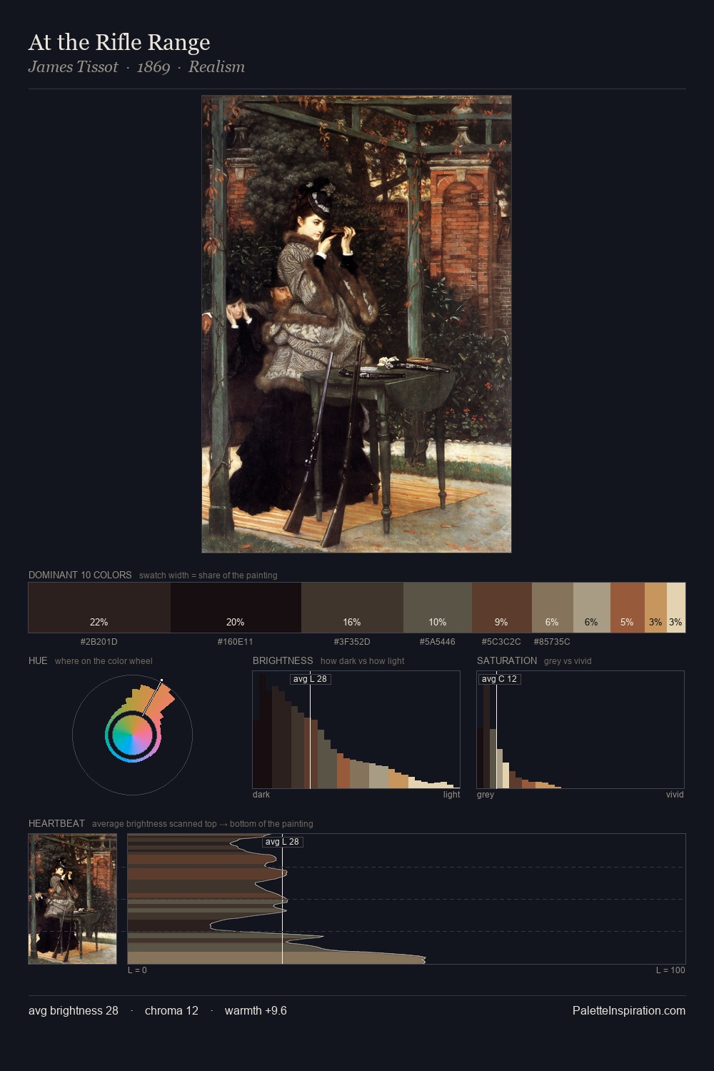
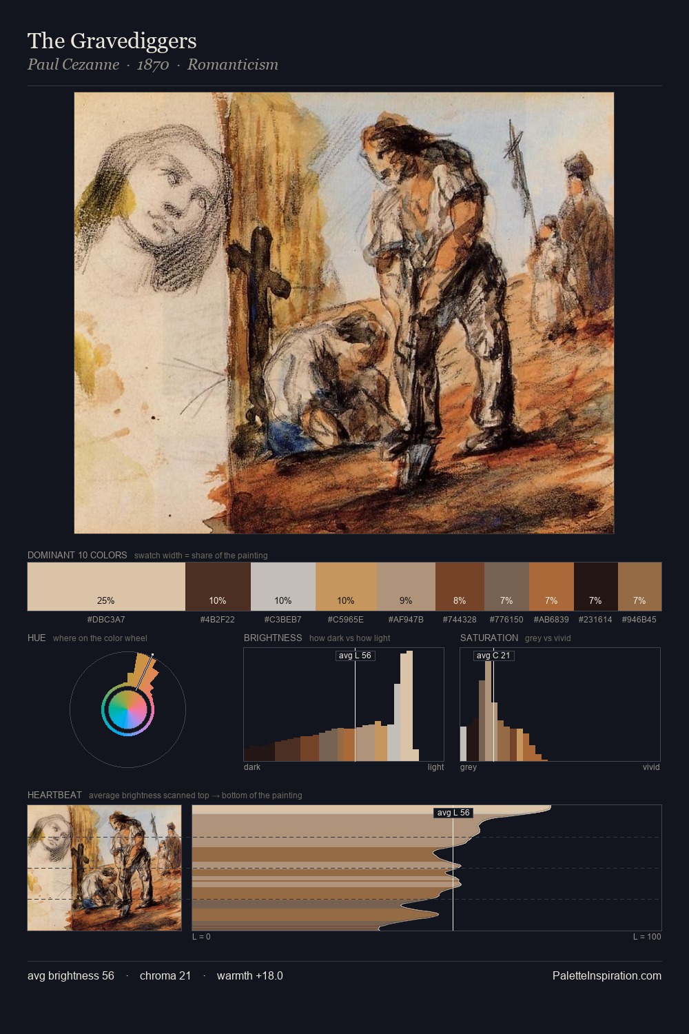
Tenebrous Dark and murky - low-key values with obscured form, Baroque in temperament.
Bister Dark warm brown - a traditional ink and wash pigment made from wood soot.

Palette Analysis
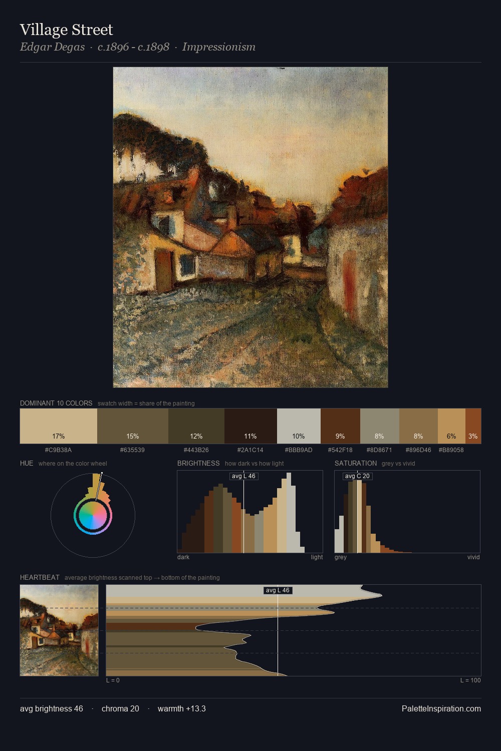
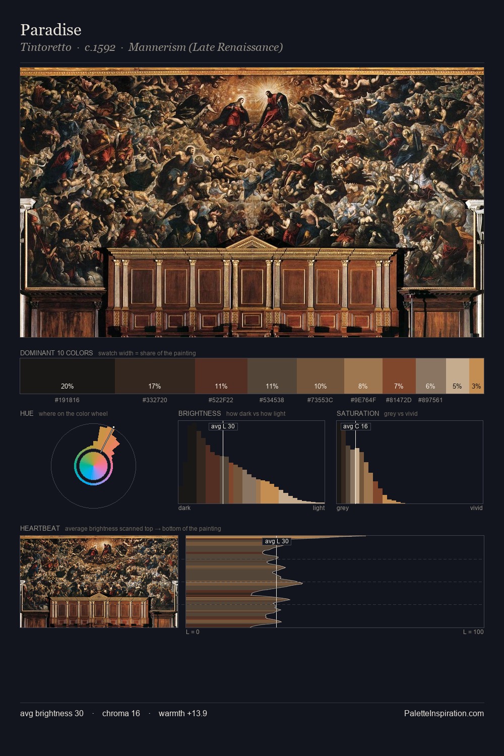
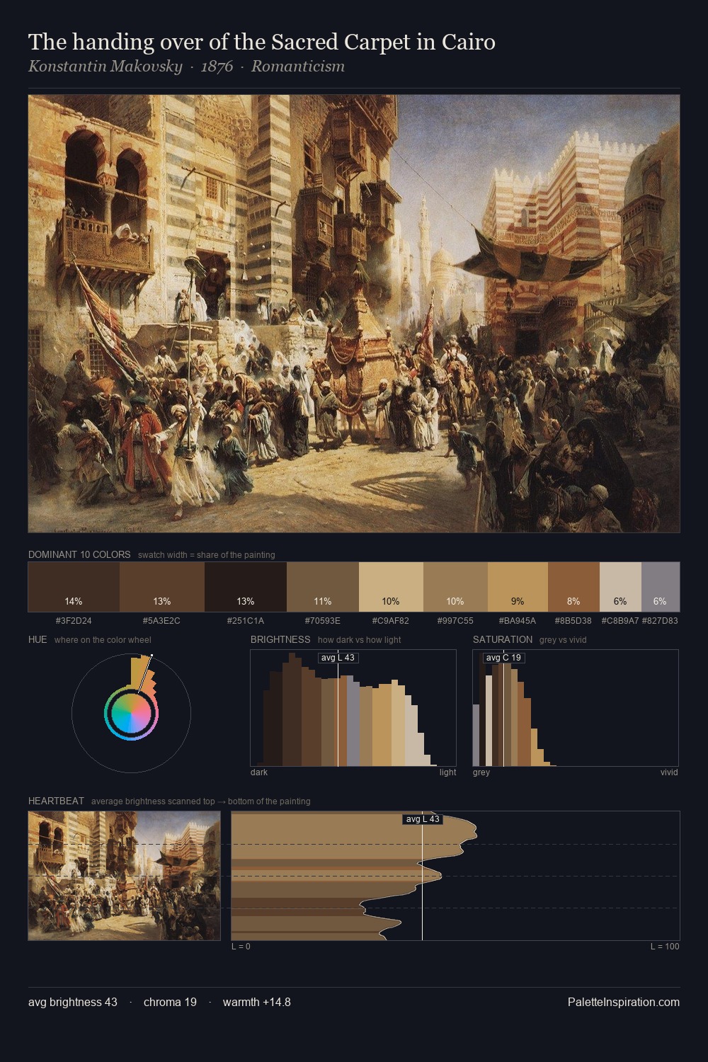
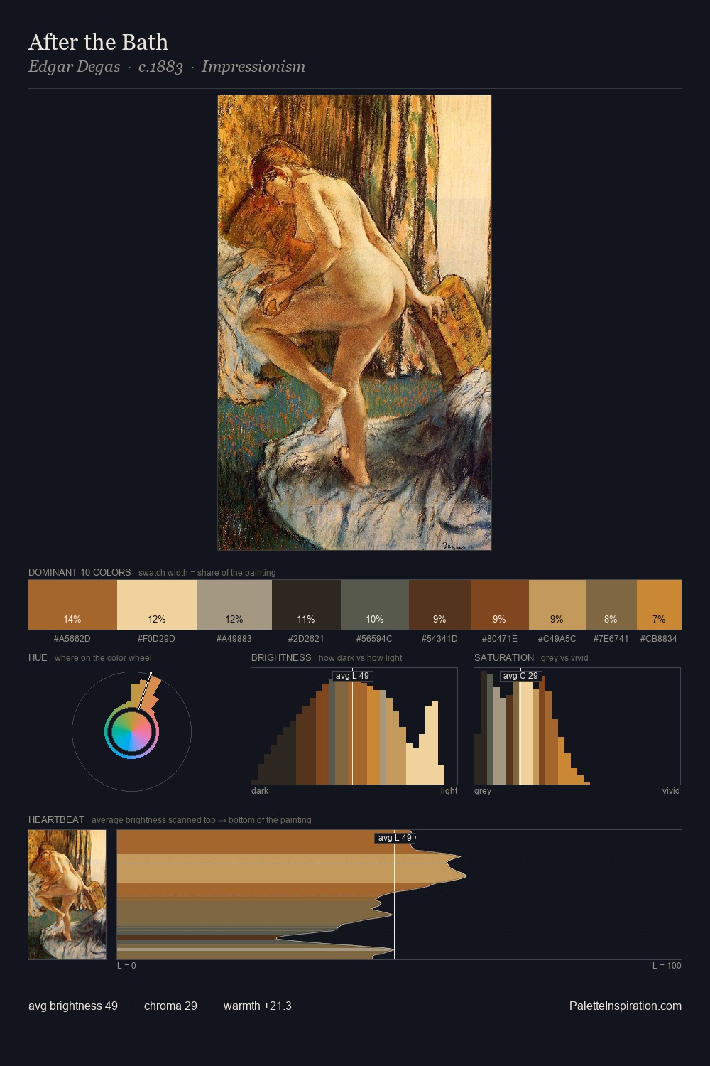
Mid-key values give Tenebrism its characteristic quietness - nothing blazes, nothing disappears. Warm hues command this palette; it favours the reds, oranges, and yellows of firelight and earth. Chroma hovers near zero; colour declares itself through subtle shifts in hue rather than outright saturation. The dominant colour, #1B1915, takes 33.2% of the total area, establishing the overall mood before any other hue is introduced. At 7.0%, #E0C69D carries the palette's sharpest chromatic charge: an accent that earns its place precisely because it is withheld. At 63 units of value range, the palette has the tonal breadth to sustain complex spatial readings.
Example use cases
- theater design
- jewelry brands
- tobacco-adjacent retail
- event branding
- film & entertainment
I Love This!
Use This Palette
Copy, export, or download for your project
Copy, export, or download for your project
Copy:
Download:
Share: