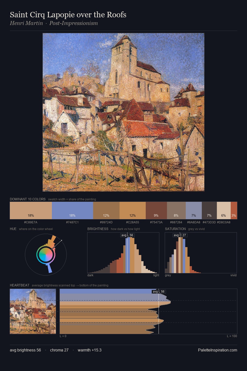
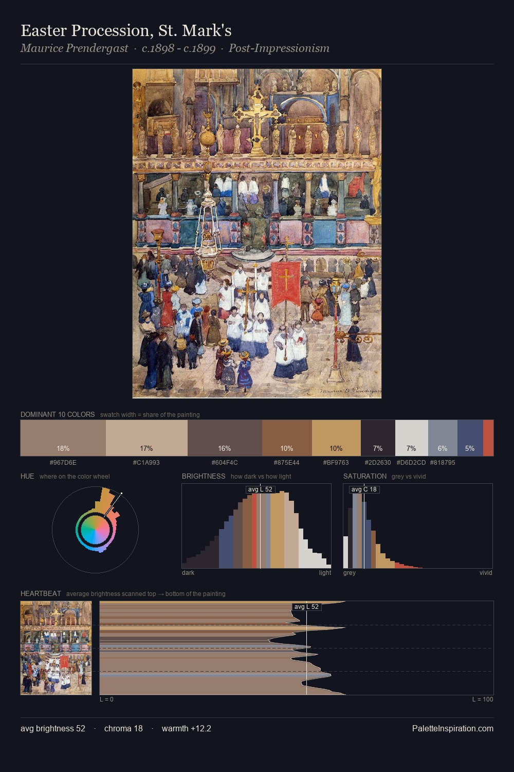
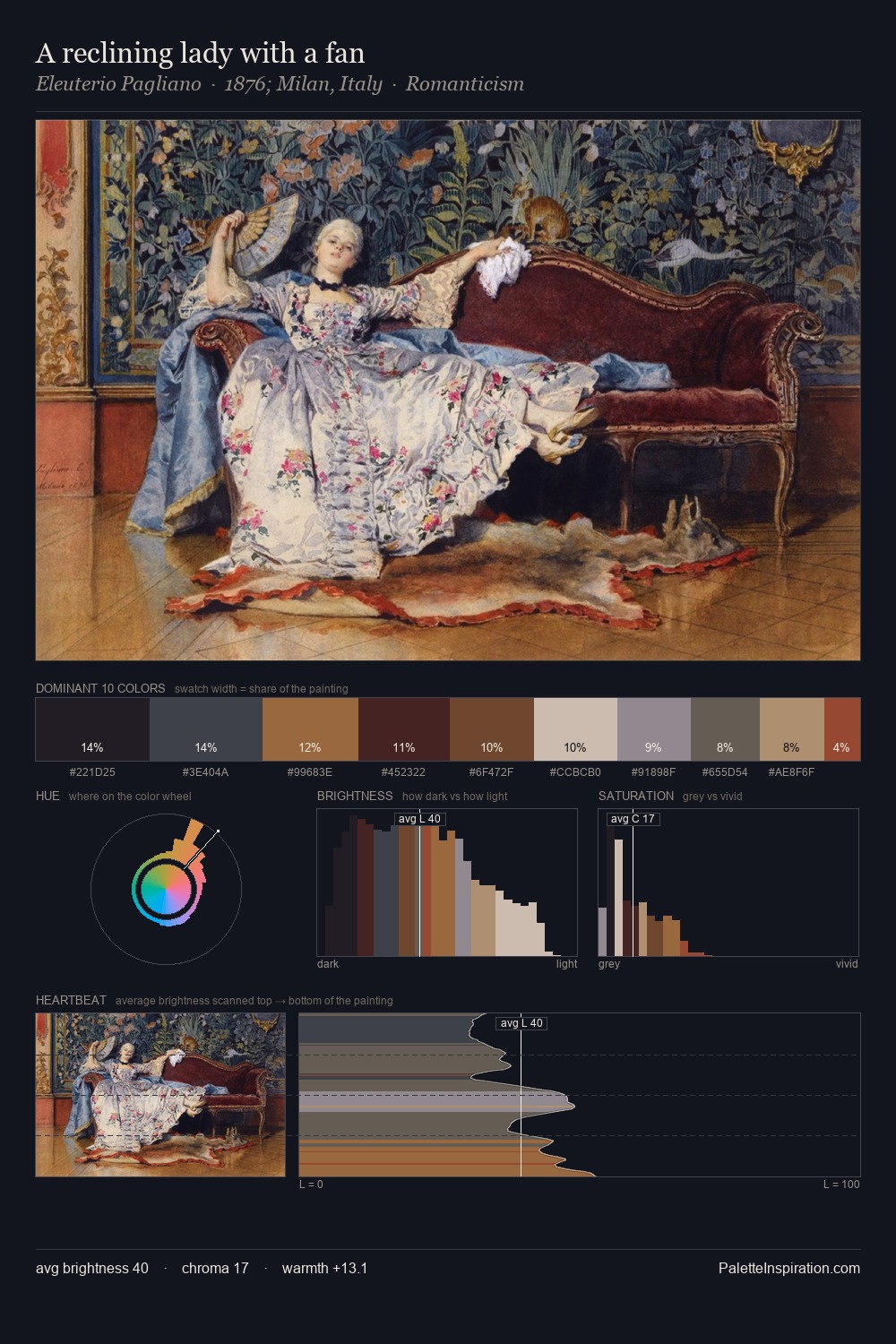
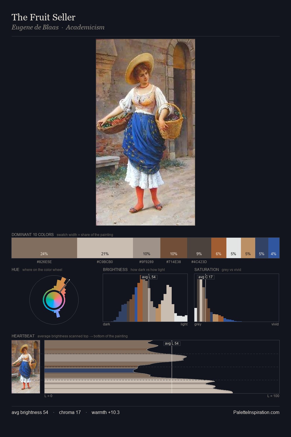
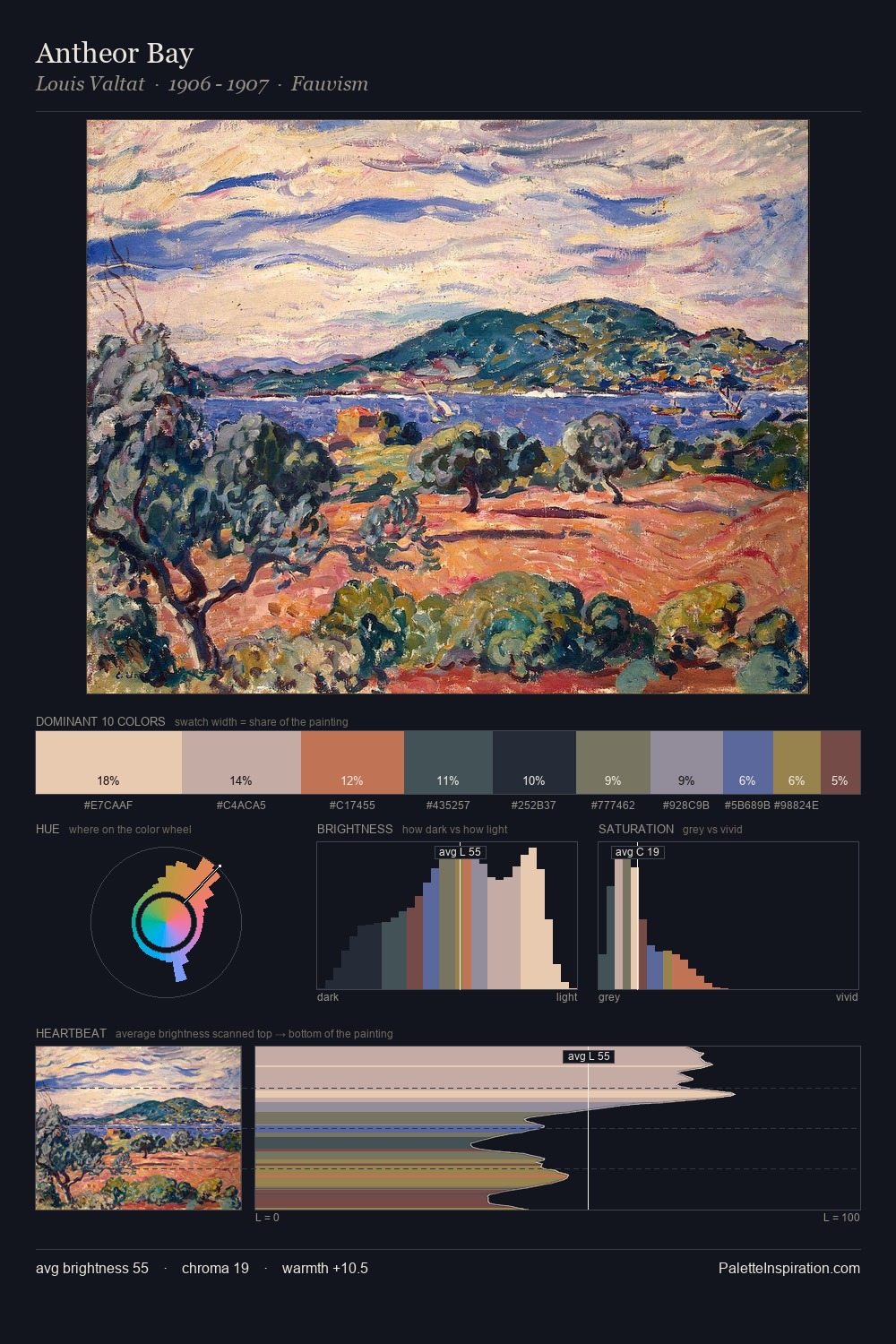
Proto Renaissance Palette 15
Muted Tawny
Muted Deliberately desaturated - chroma pulled toward gray, the restraint of tonal painting.
Tawny Warm orange-brown - a traditional term for the color of tanned leather or lion fur.

Palette Analysis
Proto Renaissance keeps values measured and balanced, a hallmark of tonal restraint. Warmth dominates - the palette leans heavily on the yellow-orange-red arc of the colour wheel. Every colour is desaturated; the palette proceeds through near-neutrals and gently-coloured greys. The highest-chroma note - #BCA06F - appears at just 8.1%, deployed as a precision accent against the quieter ground. The palette spans 45 value units: a measured range that delivers coherence over drama.
Example use cases
- interior design
- furniture brands
- cookbook publishing
- wine & spirits
- food packaging
I Love This!
Use This Palette
Copy, export, or download for your project
Copy, export, or download for your project
Copy:
Download:
Share: