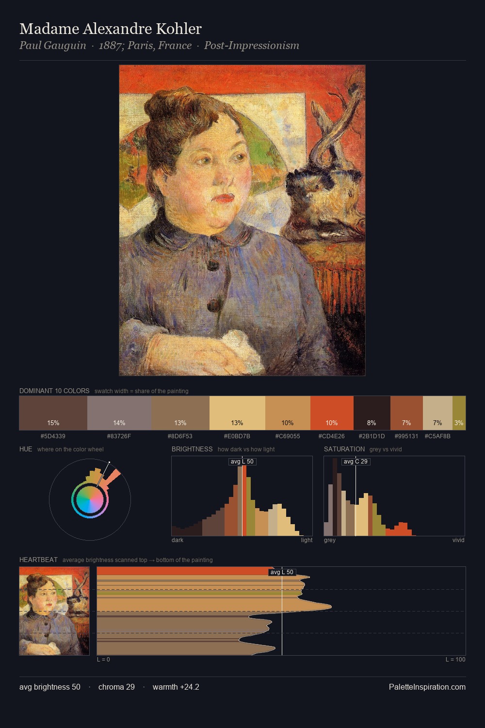
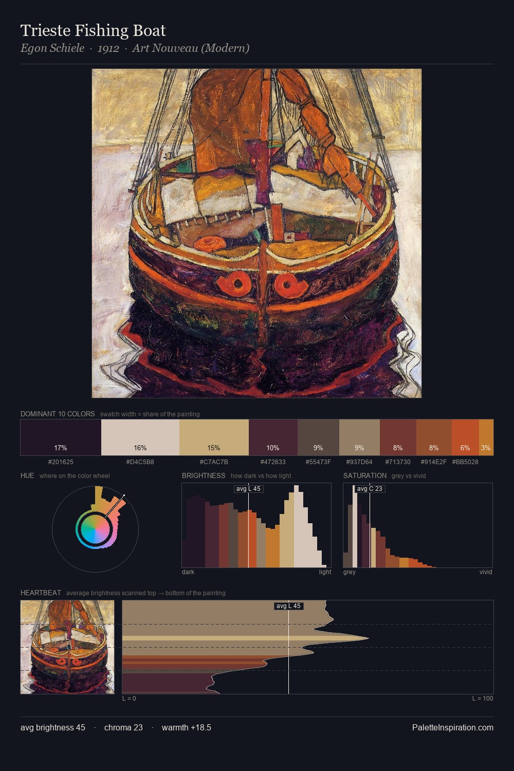
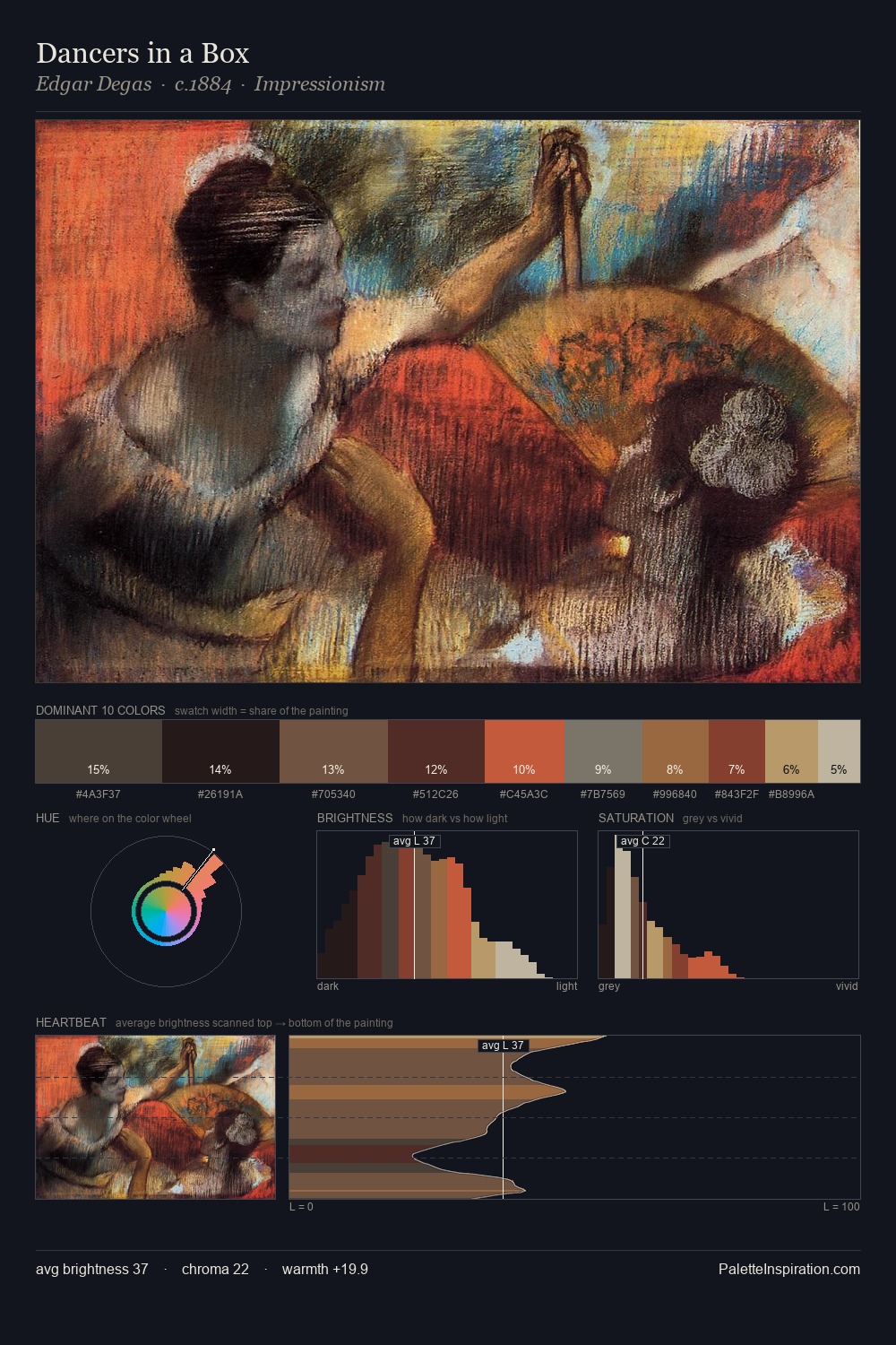
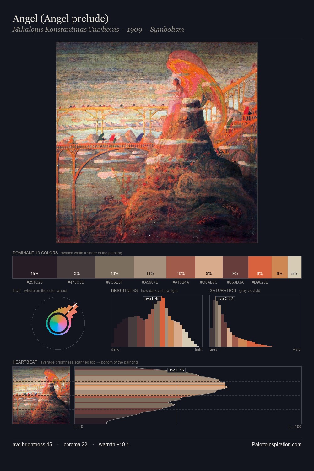
Proto Renaissance Palette 8
Shadowed Gamboge
Shadowed Low-key - values weighted toward shadow, the palette of dim interiors and overcast skies.
Gamboge Deep golden yellow - a traditional warm pigment, rich amber-gold.

Palette Analysis
Values in Proto Renaissance rest in the mid-range - neither dramatically lit nor steeped in shadow. Yellow, ochre, sienna: warm hues deployed as the palette's primary energy. Saturation is deliberately withheld - the beauty here lies in the near-monochromatic gradations rather than colour difference. #A2583E functions as the palette's exclamation mark: highest chroma, lowest percentage (6.7%). At 55 units of value range, the palette has the tonal breadth to sustain complex spatial readings.
Example use cases
- film & entertainment
- fine dining
- spirits branding
- menswear
- theater design
I Love This!
Use This Palette
Copy, export, or download for your project
Copy, export, or download for your project
Copy:
Download:
Share: