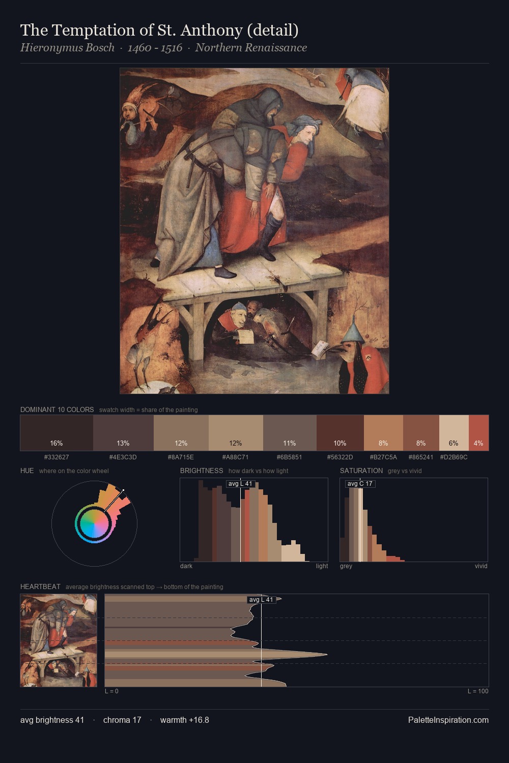
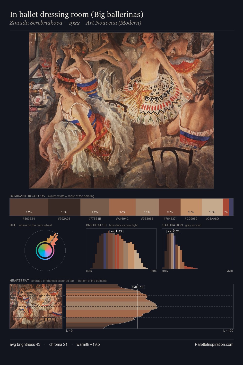
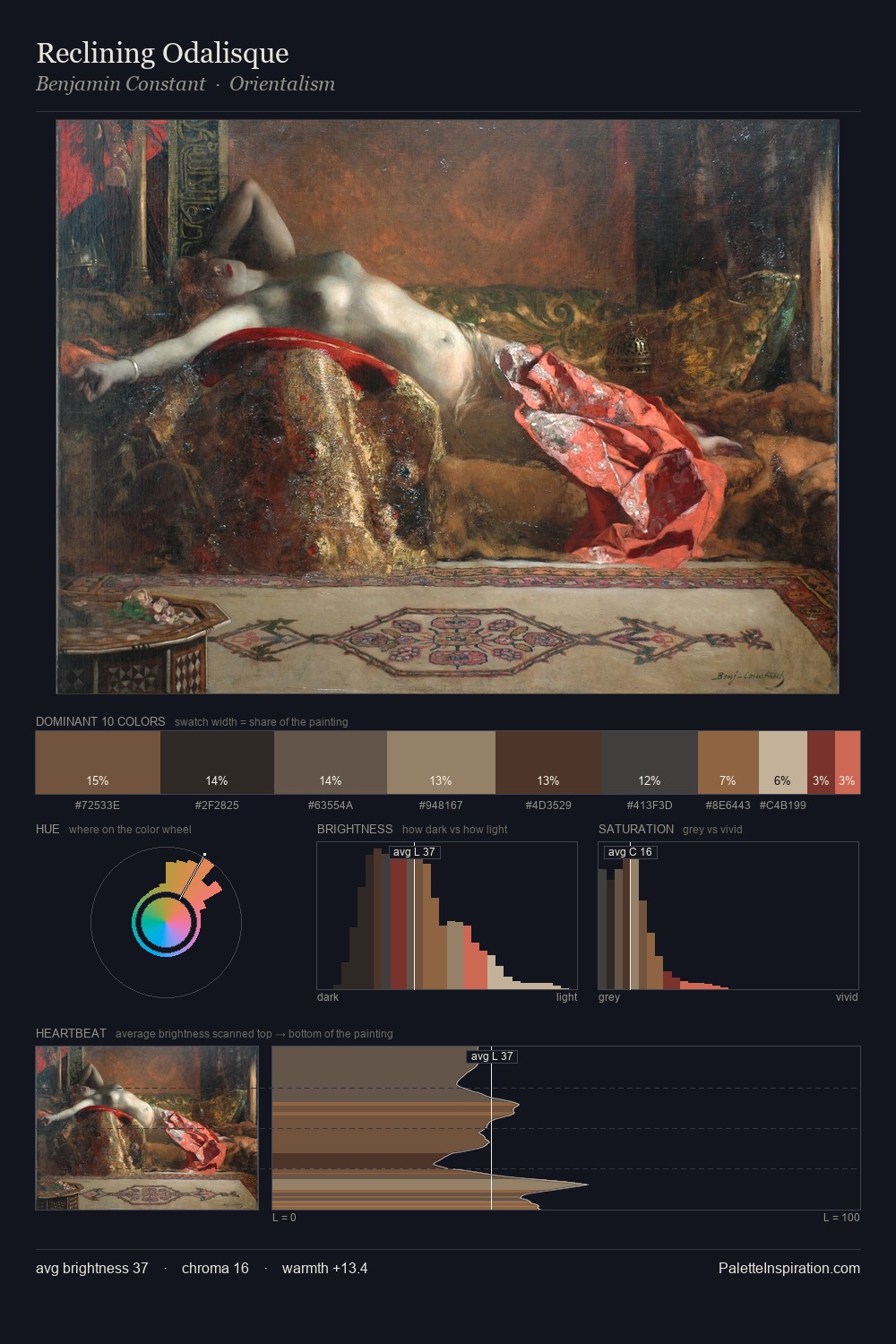
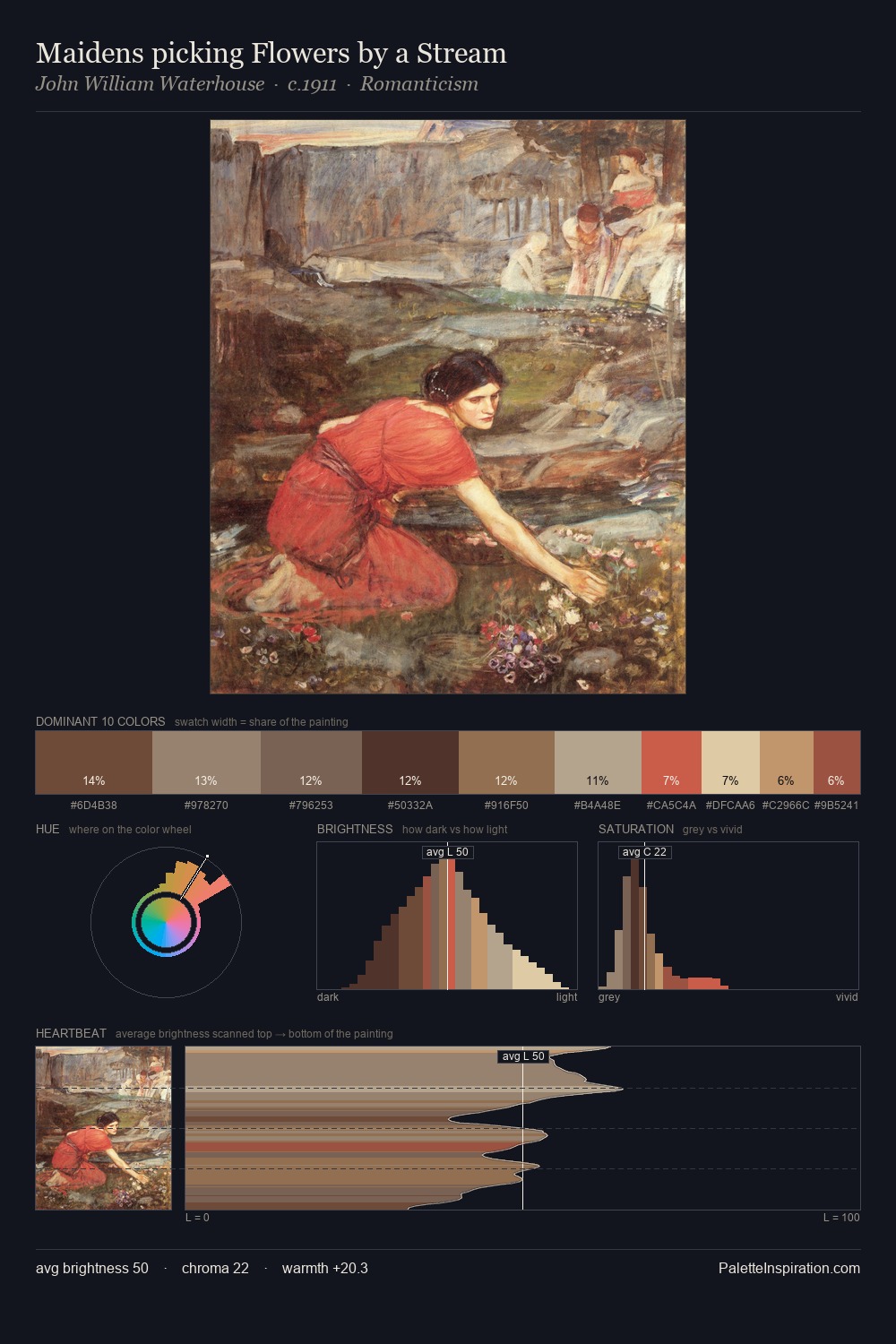
Proto Renaissance Palette 11
Muted Gamboge
Muted Deliberately desaturated - chroma pulled toward gray, the restraint of tonal painting.
Gamboge Deep golden yellow - a traditional warm pigment, rich amber-gold.

Palette Analysis
Proto Renaissance sits in the centre of the value range, lending the palette a sense of even, sustained light. Temperature reads distinctly warm: the reds and earth tones carry the compositional weight. Saturation is deliberately withheld - the beauty here lies in the near-monochromatic gradations rather than colour difference. #A06F50 delivers the chromatic peak at only 10.9% - a small shot of colour with outsized visual impact. The value range of 48 units sits in the comfortable middle: enough depth, enough light, neither extreme.
Example use cases
- ceramics & pottery
- boutique hospitality
- menswear
- heritage food brands
- craft & artisan brands
I Love This!
Use This Palette
Copy, export, or download for your project
Copy, export, or download for your project
Copy:
Download:
Share: