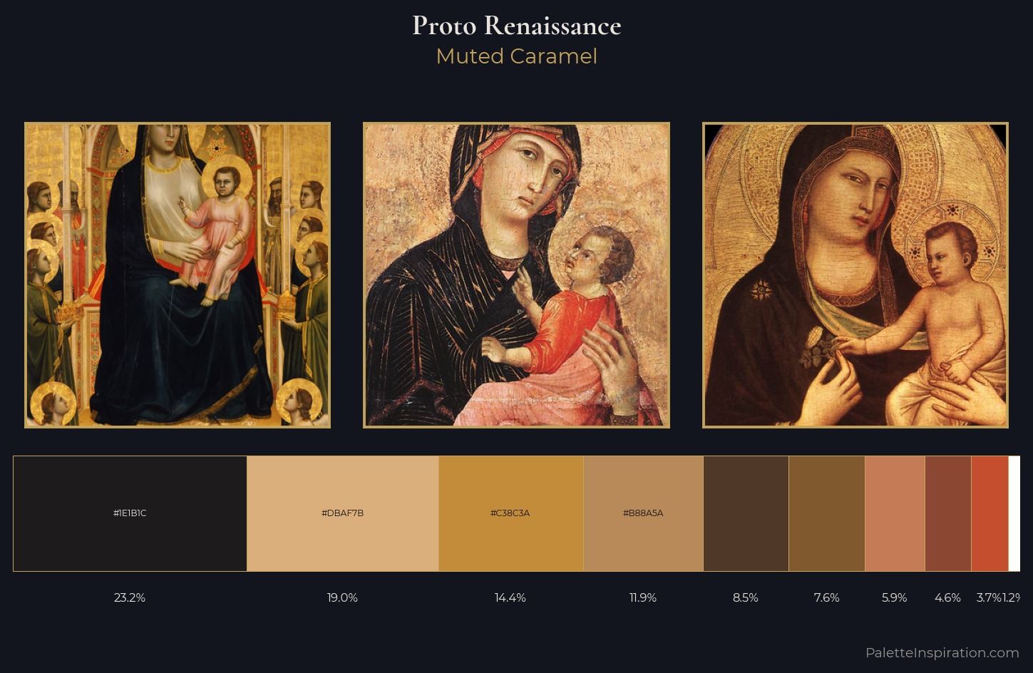
Proto Renaissance Palette 3
Muted Caramel
Muted Deliberately desaturated - chroma pulled toward gray, the restraint of tonal painting.
Caramel Warm mid-brown - the color of cooked sugar, smooth and amber-toned.
Palette Analysis
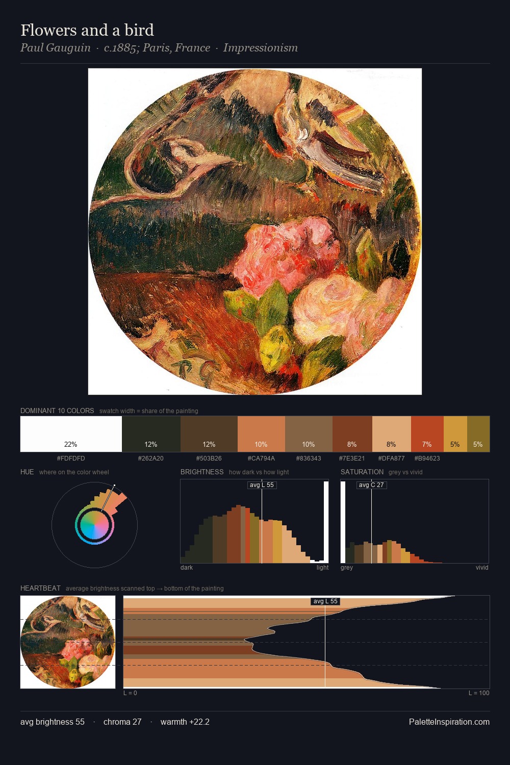
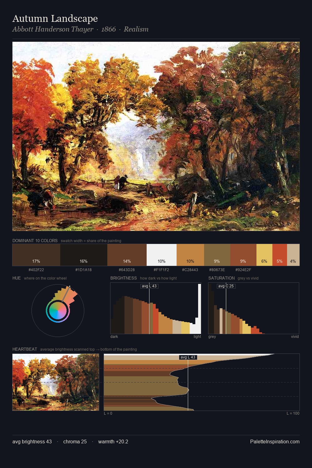
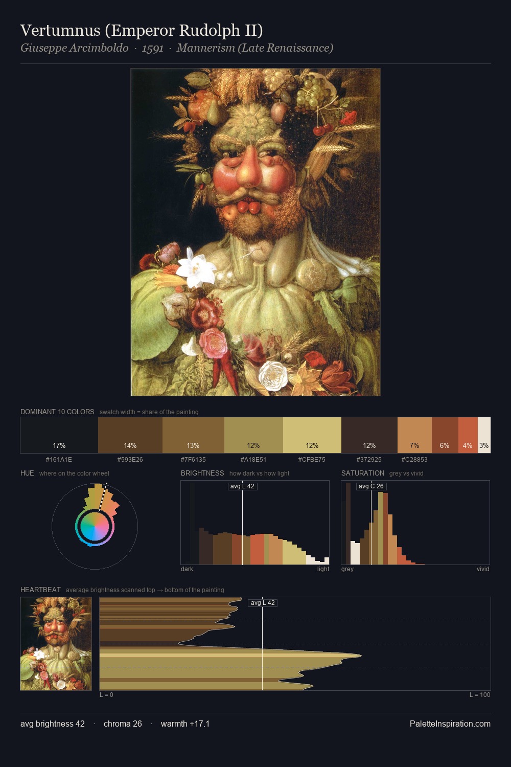
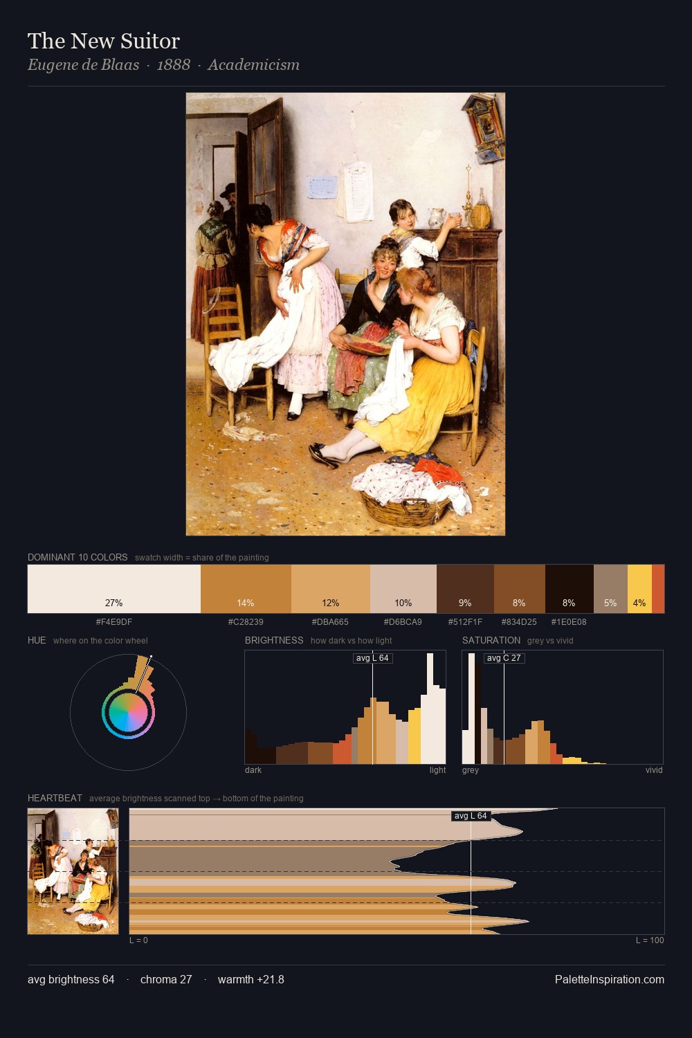
Proto Renaissance keeps values measured and balanced, a hallmark of tonal restraint. The palette orchestrates warmth above all else - reds, ambers, and siennas take the lead. Saturation is measured and controlled, giving the palette presence without visual aggression. The saturated accent, #C57B56, registers at 5.9% - sparse enough to feel like a deliberate surprise. At 77 units of value range, the palette has the tonal breadth to sustain complex spatial readings.
Example use cases
- ceramics & pottery
- boutique hospitality
- menswear
- heritage food brands
- craft & artisan brands
I Love This!
Use This Palette
Copy, export, or download for your project
Copy, export, or download for your project
Copy:
Download:
Share: