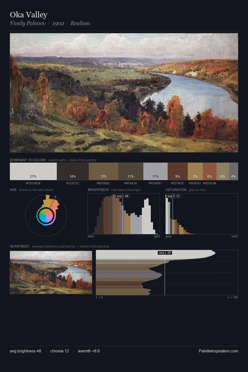
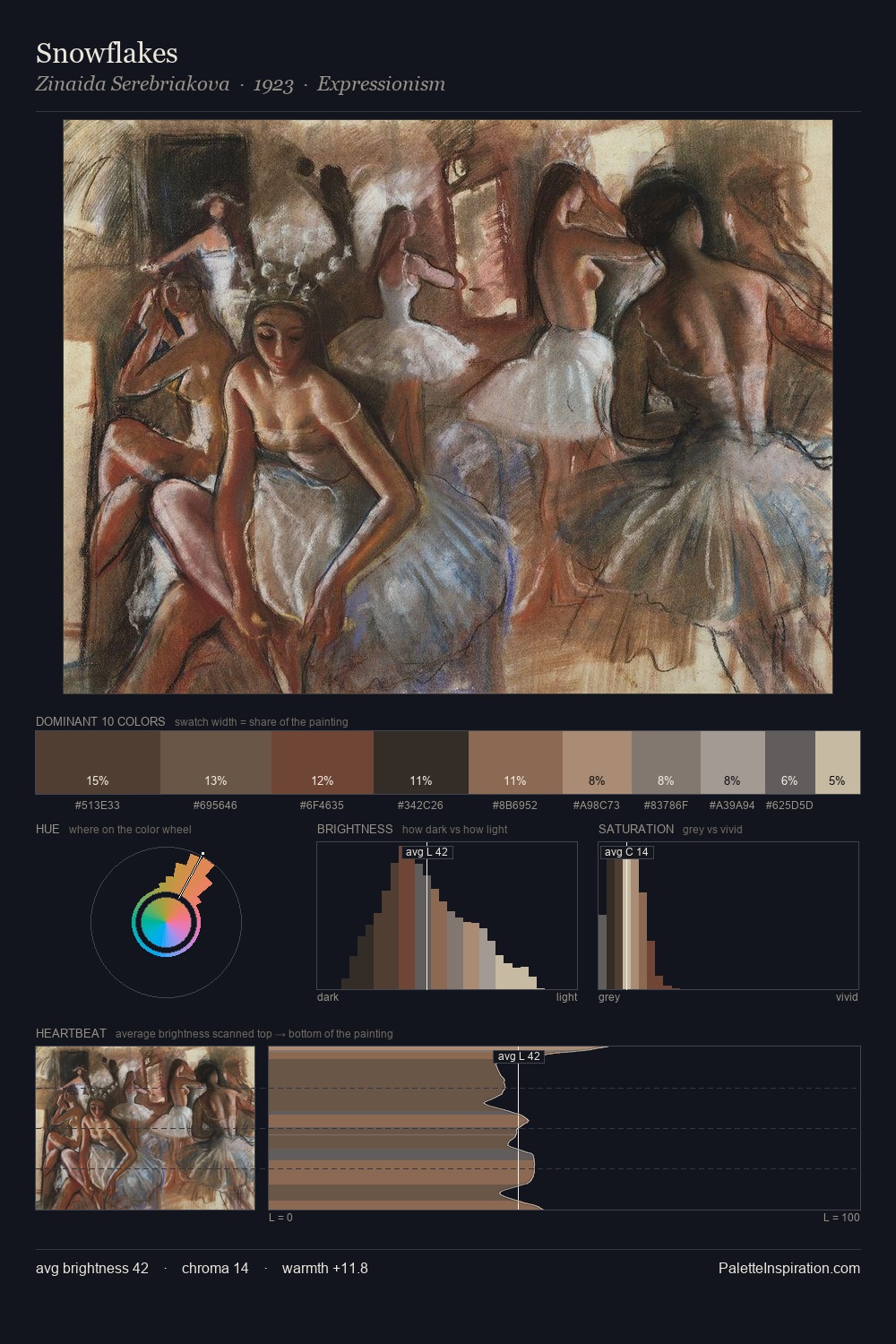
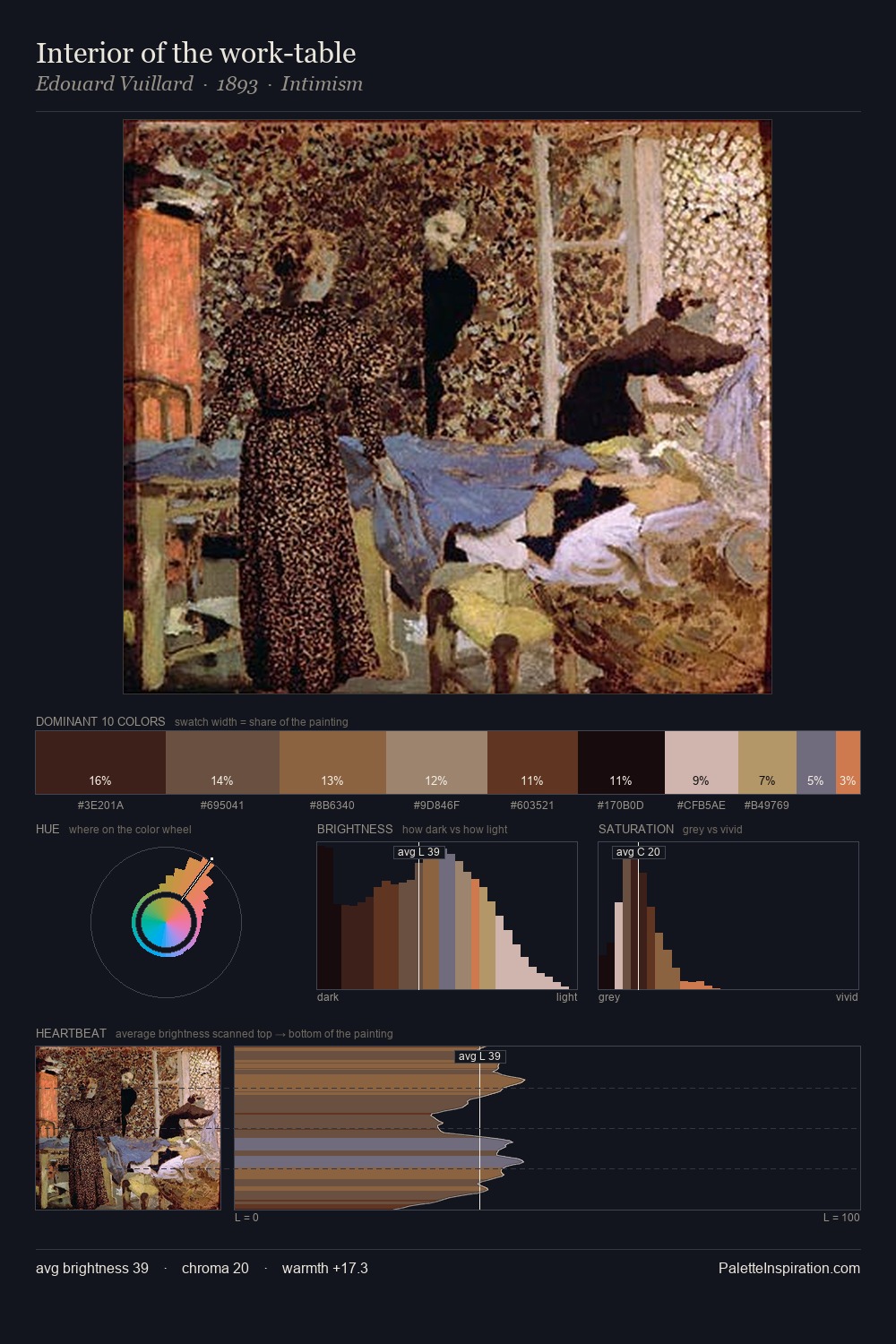
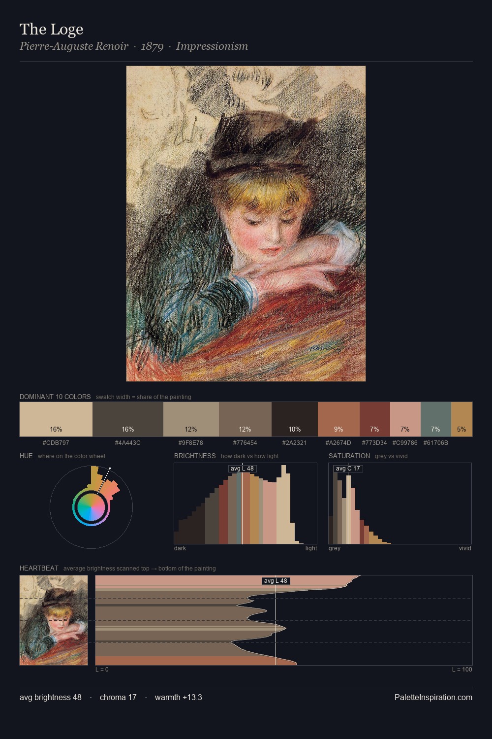
Proto Renaissance Palette 12
Shadowed Tawny
Shadowed Low-key - values weighted toward shadow, the palette of dim interiors and overcast skies.
Tawny Warm orange-brown - a traditional term for the color of tanned leather or lion fur.

Palette Analysis
Mid-key values give Proto Renaissance its characteristic quietness - nothing blazes, nothing disappears. Warmth dominates - the palette leans heavily on the yellow-orange-red arc of the colour wheel. The absence of saturated colour is itself an expressive choice: this is a palette of restraint and atmosphere. #9A674E functions as the palette's exclamation mark: highest chroma, lowest percentage (6.5%). 52 units of value spread create a palette that is varied but unified - contrast in the service of harmony.
Example use cases
- music labels
- luxury hospitality
- editorial photography
- leather goods
- premium streaming
I Love This!
Use This Palette
Copy, export, or download for your project
Copy, export, or download for your project
Copy:
Download:
Share: