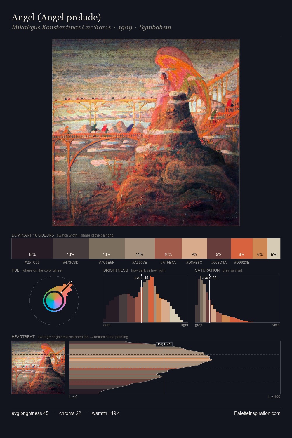
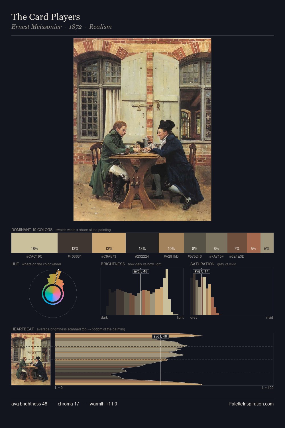
Proto Renaissance Palette 7
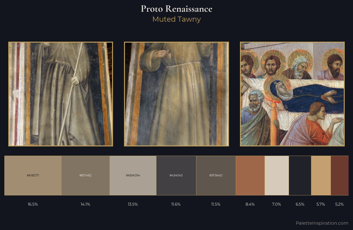
Muted Tawny
Muted Deliberately desaturated - chroma pulled toward gray, the restraint of tonal painting.
Tawny Warm orange-brown - a traditional term for the color of tanned leather or lion fur.
Palette Analysis
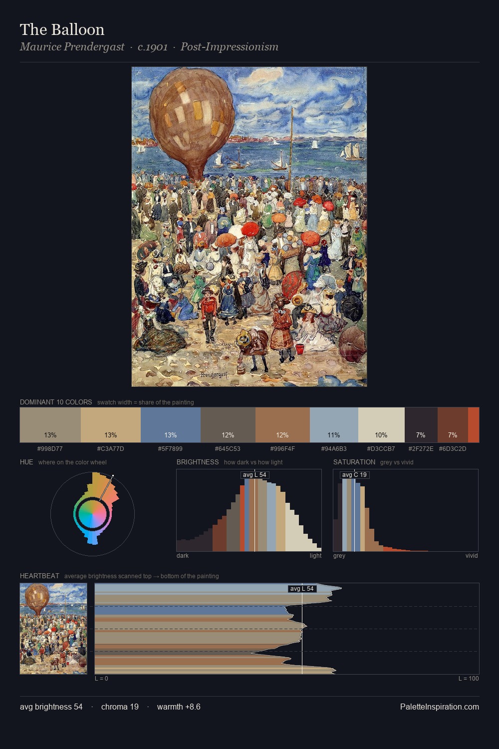
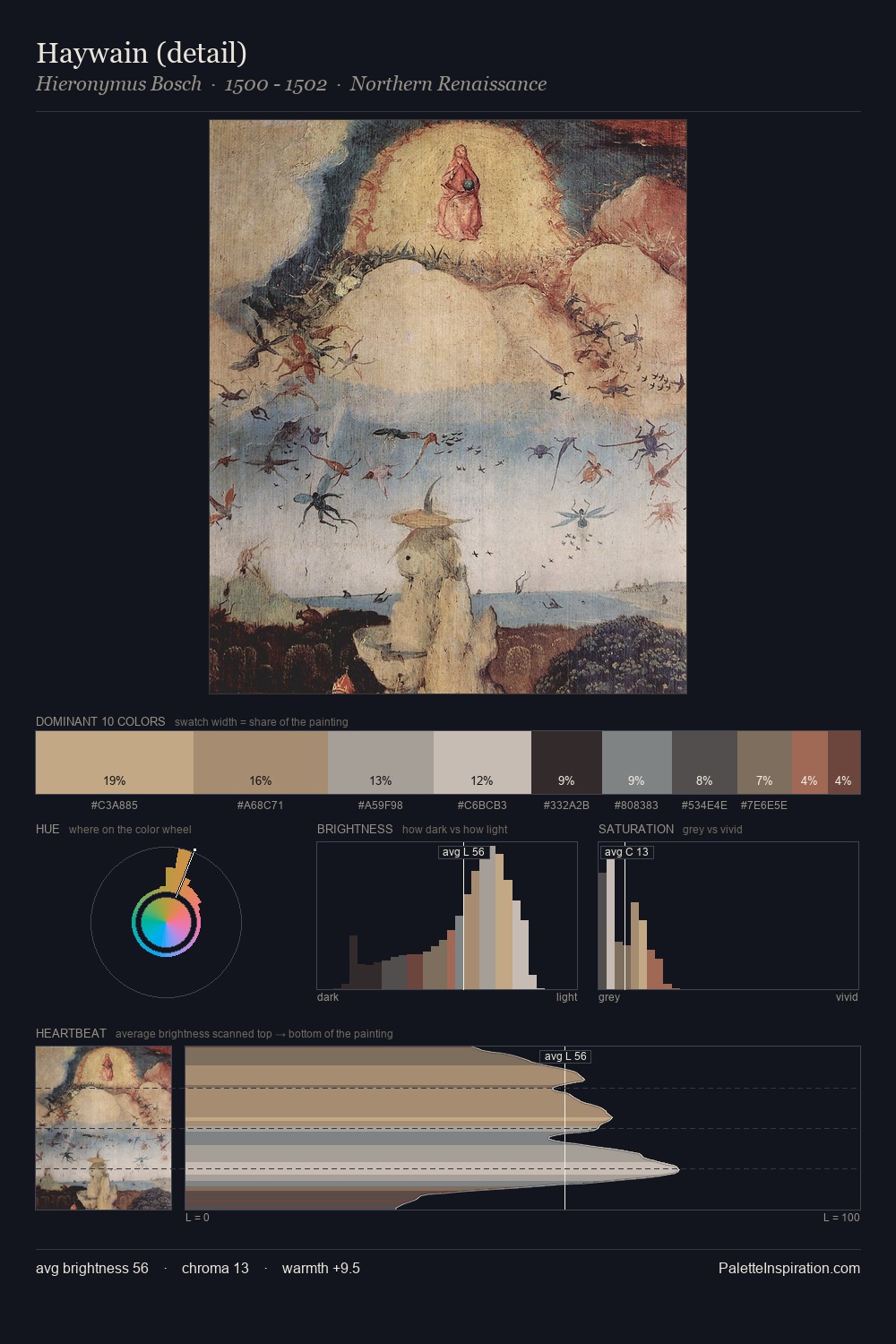
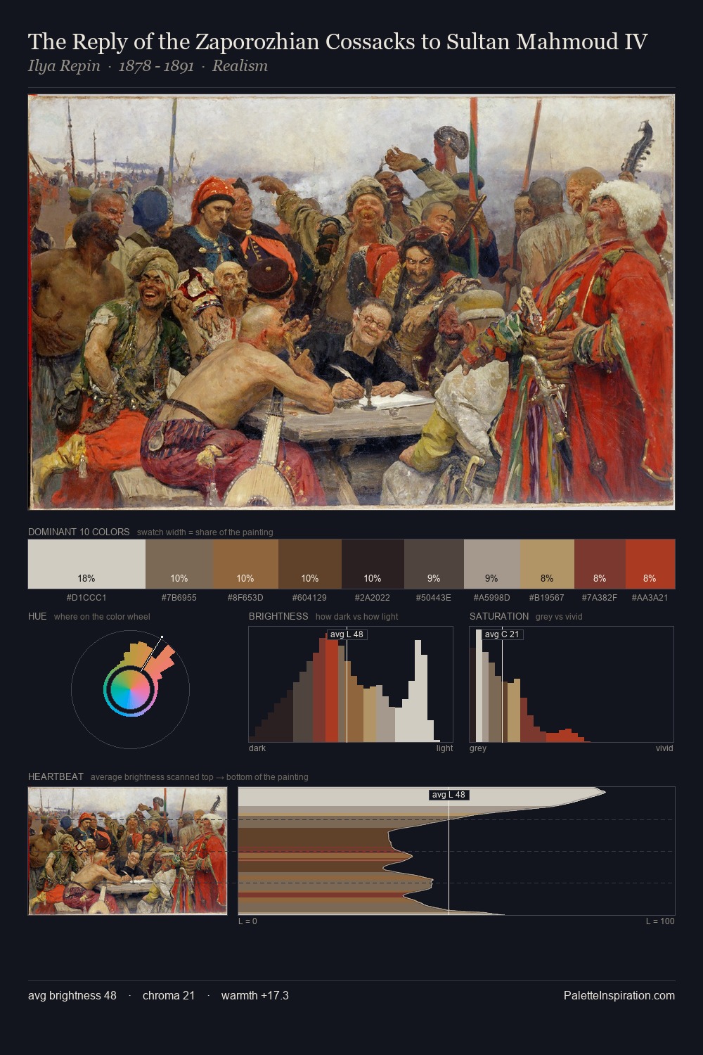
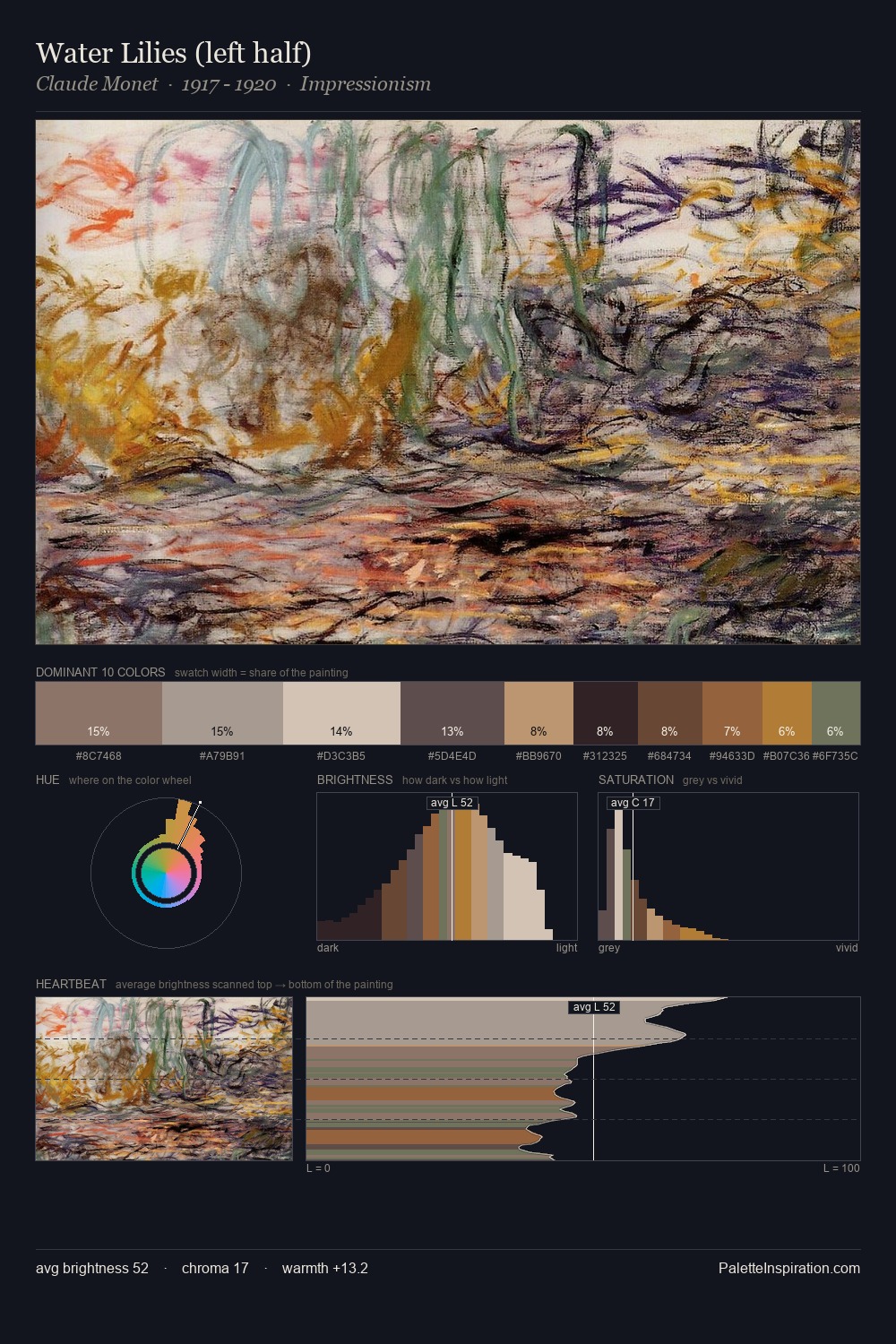
Proto Renaissance keeps values measured and balanced, a hallmark of tonal restraint. Temperature is balanced: the palette pits warm earth against cool sky without declaring a winner. The absence of saturated colour is itself an expressive choice: this is a palette of restraint and atmosphere. The most saturated colour, #6D3A2F, is reserved to 5.2% of the surface, where it acts as a focal punctuation. The value range spans 60 units across the palette, providing the full gamut from deep shadow to near-white and ensuring clear tonal hierarchy.
Example use cases
- exhibition design
- foundation branding
- estate management
- art education
- museums & galleries
I Love This!
Use This Palette
Copy, export, or download for your project
Copy, export, or download for your project
Copy:
Download:
Share: