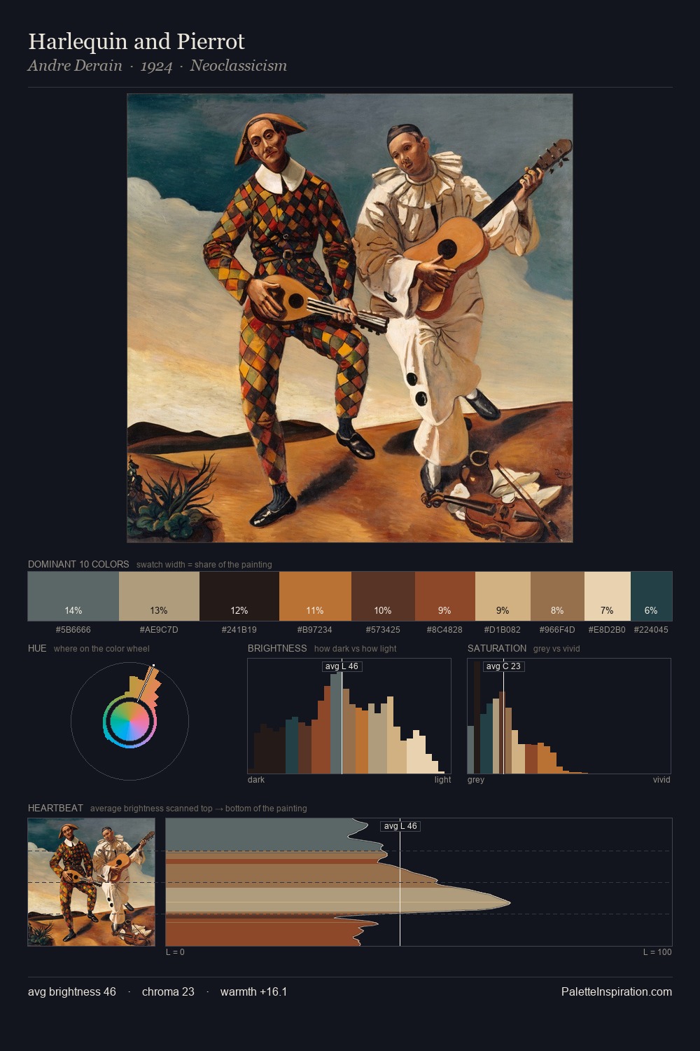
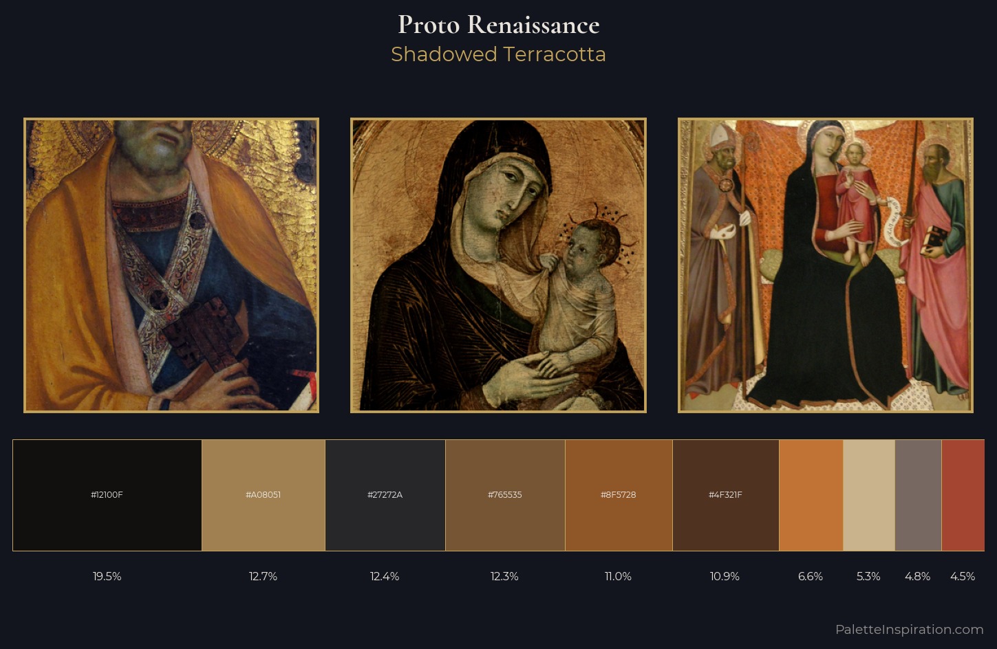
Proto Renaissance Palette 22
Shadowed Terracotta
Shadowed Low-key - values weighted toward shadow, the palette of dim interiors and overcast skies.
Terracotta Fired clay red-orange - the color of unglazed earthenware pottery.
Palette Analysis
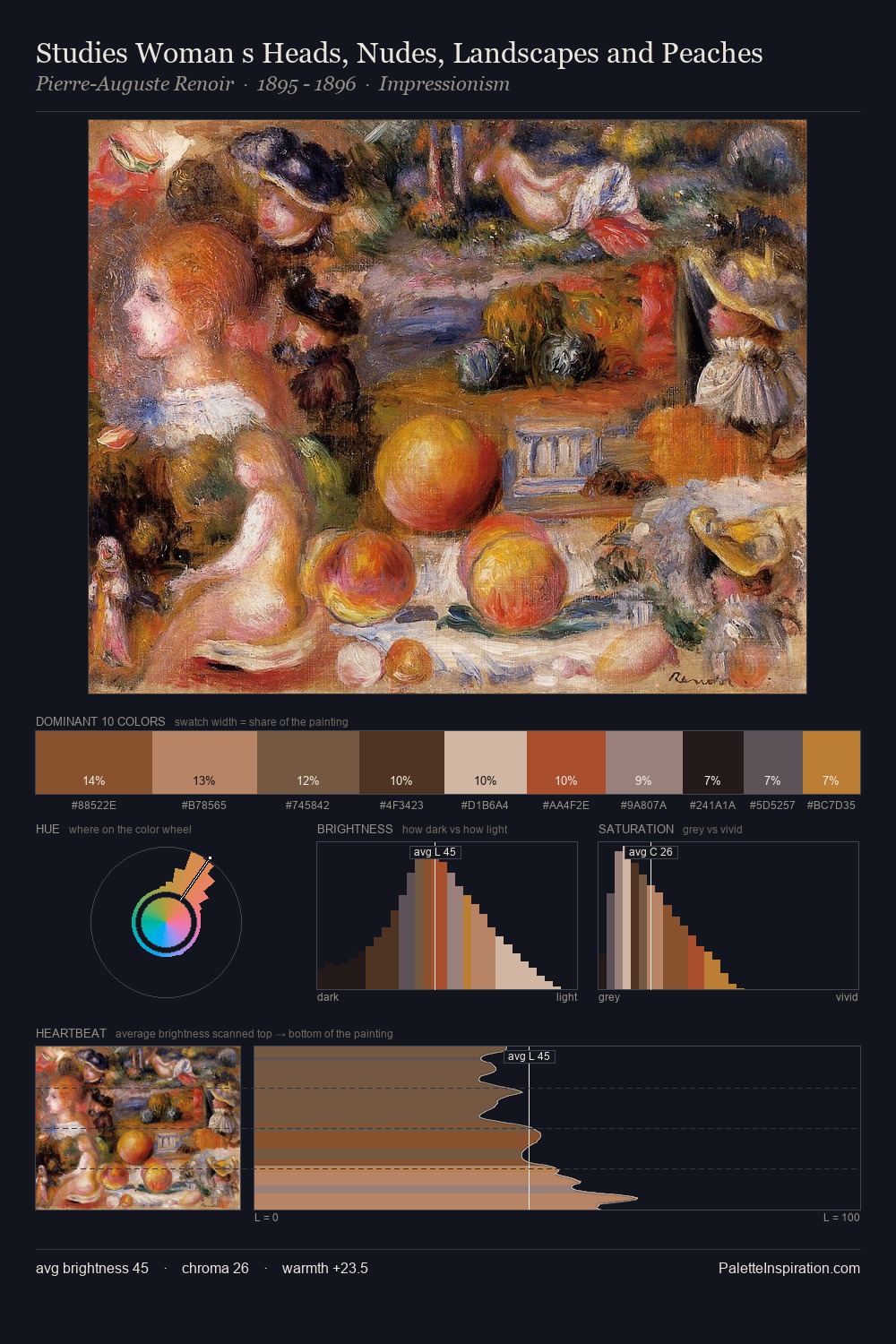
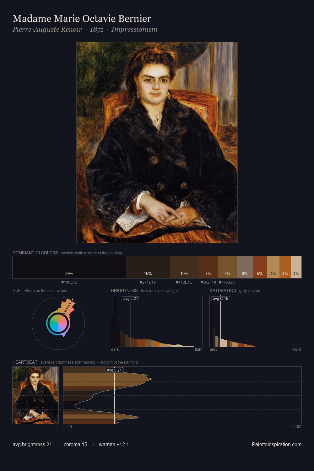
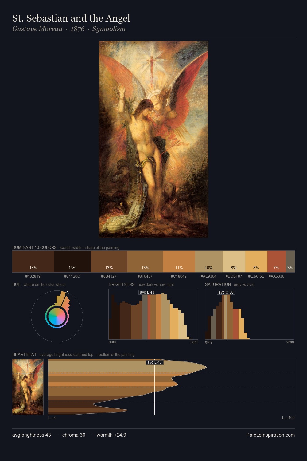
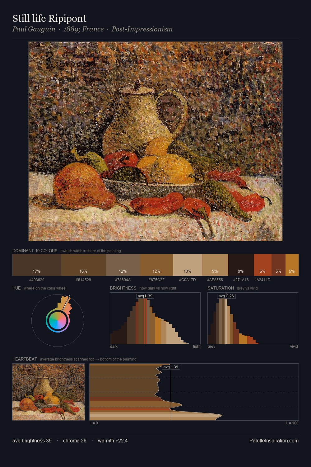
Proto Renaissance occupies the comfortable middle of the value scale, avoiding both extremes to hold the eye in a sustained middle grey. Yellow, ochre, sienna: warm hues deployed as the palette's primary energy. Chroma hovers near zero; colour declares itself through subtle shifts in hue rather than outright saturation. The highest-chroma note - #A34531 - appears at just 4.5%, deployed as a precision accent against the quieter ground. 59 units of value range underpin the palette's structural clarity: the eye always knows where light falls.
Example use cases
- theater design
- jewelry brands
- tobacco-adjacent retail
- event branding
- film & entertainment
I Love This!
Use This Palette
Copy, export, or download for your project
Copy, export, or download for your project
Copy:
Download:
Share: