Proto Renaissance Palette 14
Muted Tawny
Muted Deliberately desaturated - chroma pulled toward gray, the restraint of tonal painting.
Tawny Warm orange-brown - a traditional term for the color of tanned leather or lion fur.

Palette Analysis
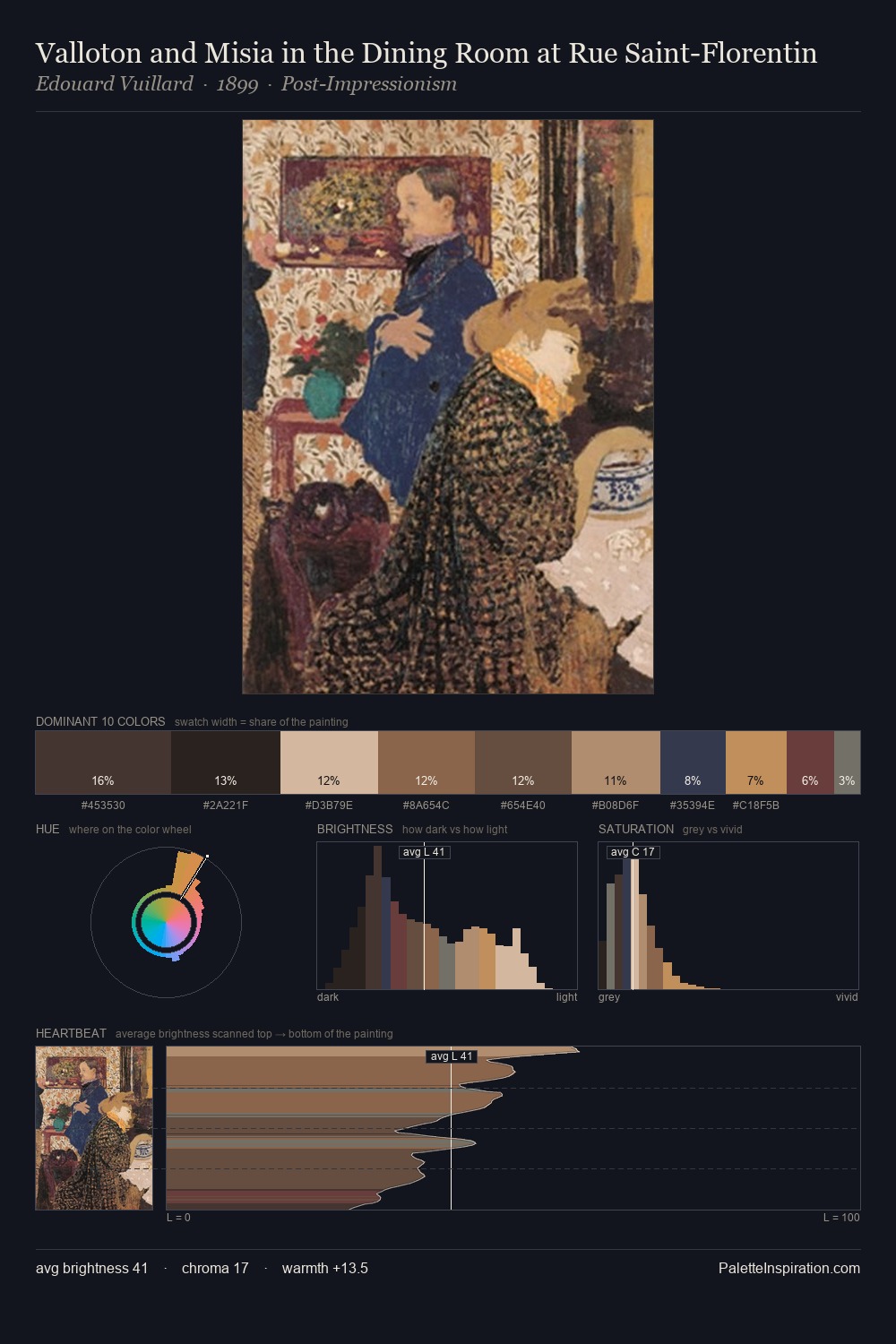
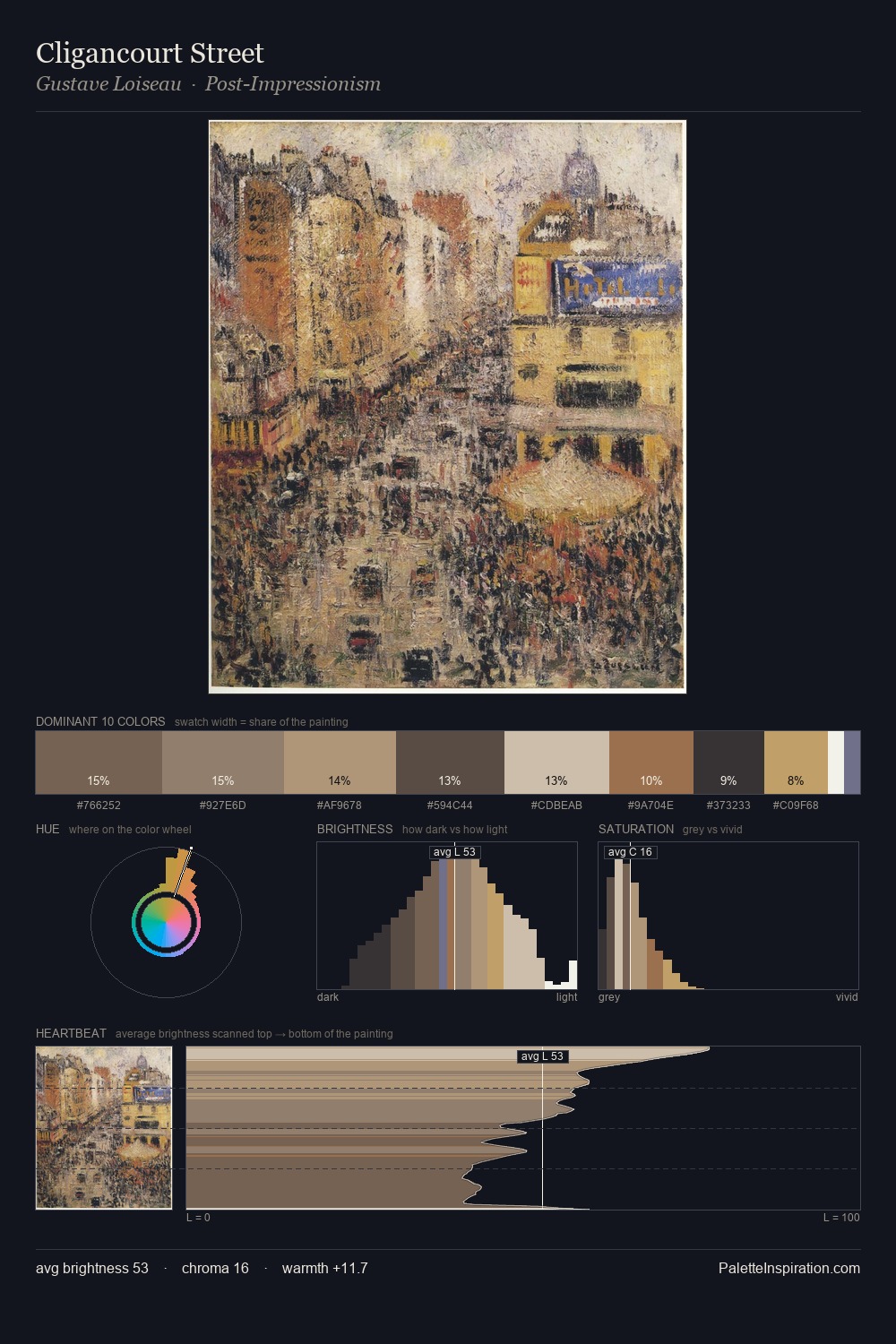
Mid-key values give Proto Renaissance its characteristic quietness - nothing blazes, nothing disappears. Warm hues command this palette; it favours the reds, oranges, and yellows of firelight and earth. Chroma is kept low across all colours, producing the soft, enveloping quality that characterises tonal painting. The most saturated colour, #2A3447, is reserved to 4.2% of the surface, where it acts as a focal punctuation. Spanning 50 units on the value axis, the palette achieves the balance between tonal flatness and fragmentation.
Example use cases
- ceramics & pottery
- boutique hospitality
- menswear
- heritage food brands
- craft & artisan brands
I Love This!
Use This Palette
Copy, export, or download for your project
Copy, export, or download for your project
Copy:
Download:
Share: