Proto Renaissance Palette 21
Shadowed Bister
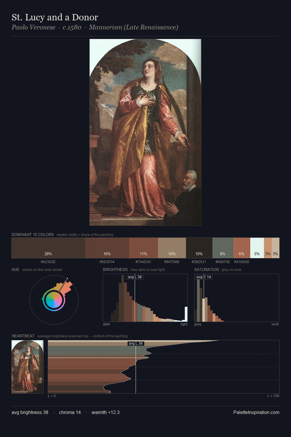
Shadowed Low-key - values weighted toward shadow, the palette of dim interiors and overcast skies.
Bister Dark warm brown - a traditional ink and wash pigment made from wood soot.

Palette Analysis
Proto Renaissance distributes its values across the middle register, creating harmony without high contrast. Yellow, ochre, sienna: warm hues deployed as the palette's primary energy. Chroma hovers near zero; colour declares itself through subtle shifts in hue rather than outright saturation. #723A2D delivers the chromatic peak at only 6.1% - a small shot of colour with outsized visual impact. A value spread of 56 units gives the palette both depth and air - shadows are genuinely dark, lights genuinely light.
Example use cases
- theater design
- jewelry brands
- tobacco-adjacent retail
- event branding
- film & entertainment
I Love This!
Use This Palette
Copy, export, or download for your project
Copy, export, or download for your project
Copy:
Download:
Share: