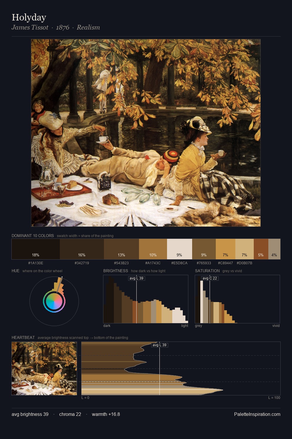
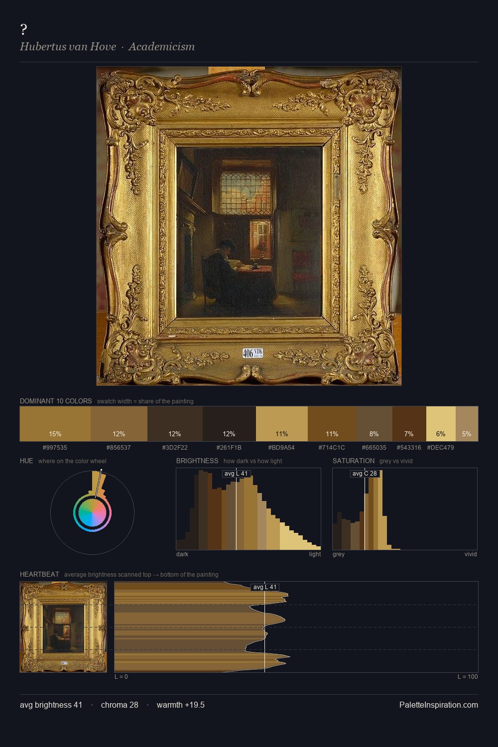
Johannes Moreelse Palette 4

Palette Analysis
Darkness anchors Johannes Moreelse; light is rationed, creating dramatic contrast rather than open air. Cool hues prevail: blues, greens, and greys anchor the palette's emotional temperature. Saturation is deliberately withheld - the beauty here lies in the near-monochromatic gradations rather than colour difference. Johannes Moreelse gives 27.2% of the composition to a single #181816 - a decisive chromatic anchor. The highest-chroma note - #946F31 - appears at just 9.0%, deployed as a precision accent against the quieter ground. Value range is moderate at 53 units - enough contrast for legibility, not so much as to fragment the tonal unity. Together these qualities place Johannes Moreelse firmly in the tonal tradition - concerned with mood and atmosphere rather than chromatic display. In the context of Johannes Moreelse's full range of palettes, group 4 represents one movement in an ongoing chromatic dialogue.
Example use cases
- theater design
- jewelry brands
- tobacco-adjacent retail
- event branding
- film & entertainment
I Love This!
Copy, export, or download for your project