Carl Hertel Palette 3

Palette Analysis
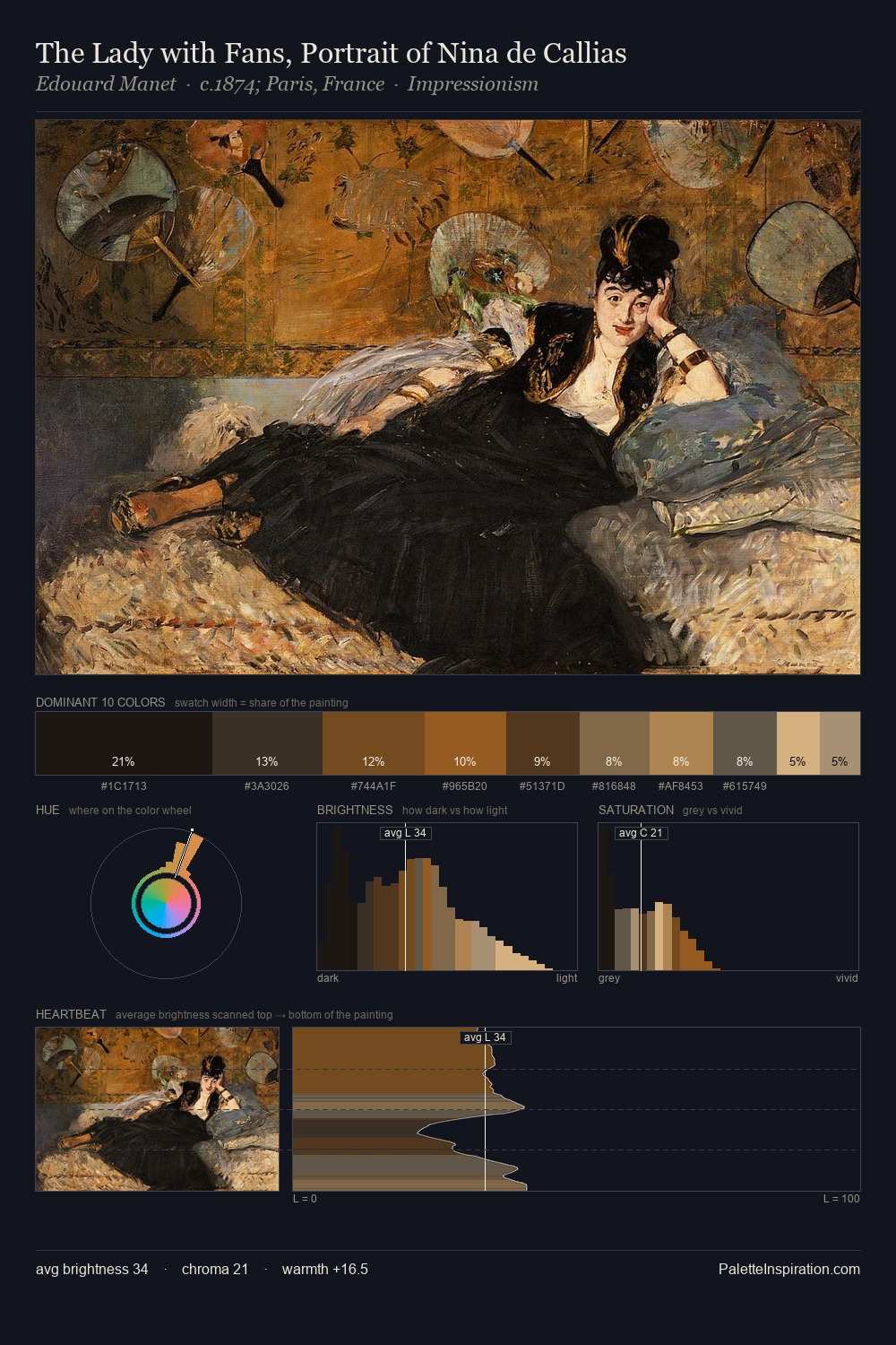
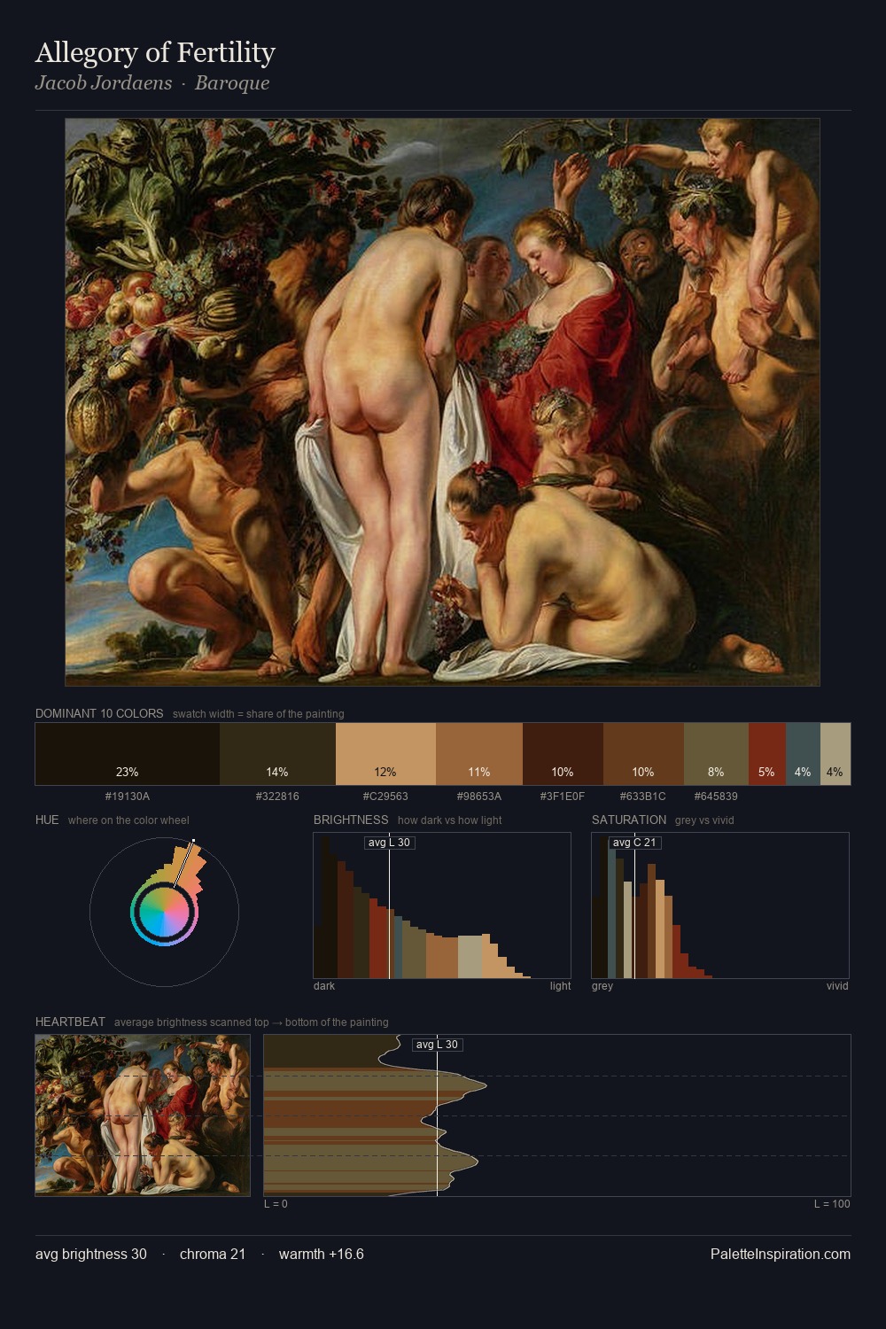
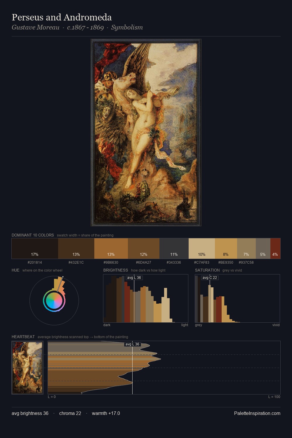
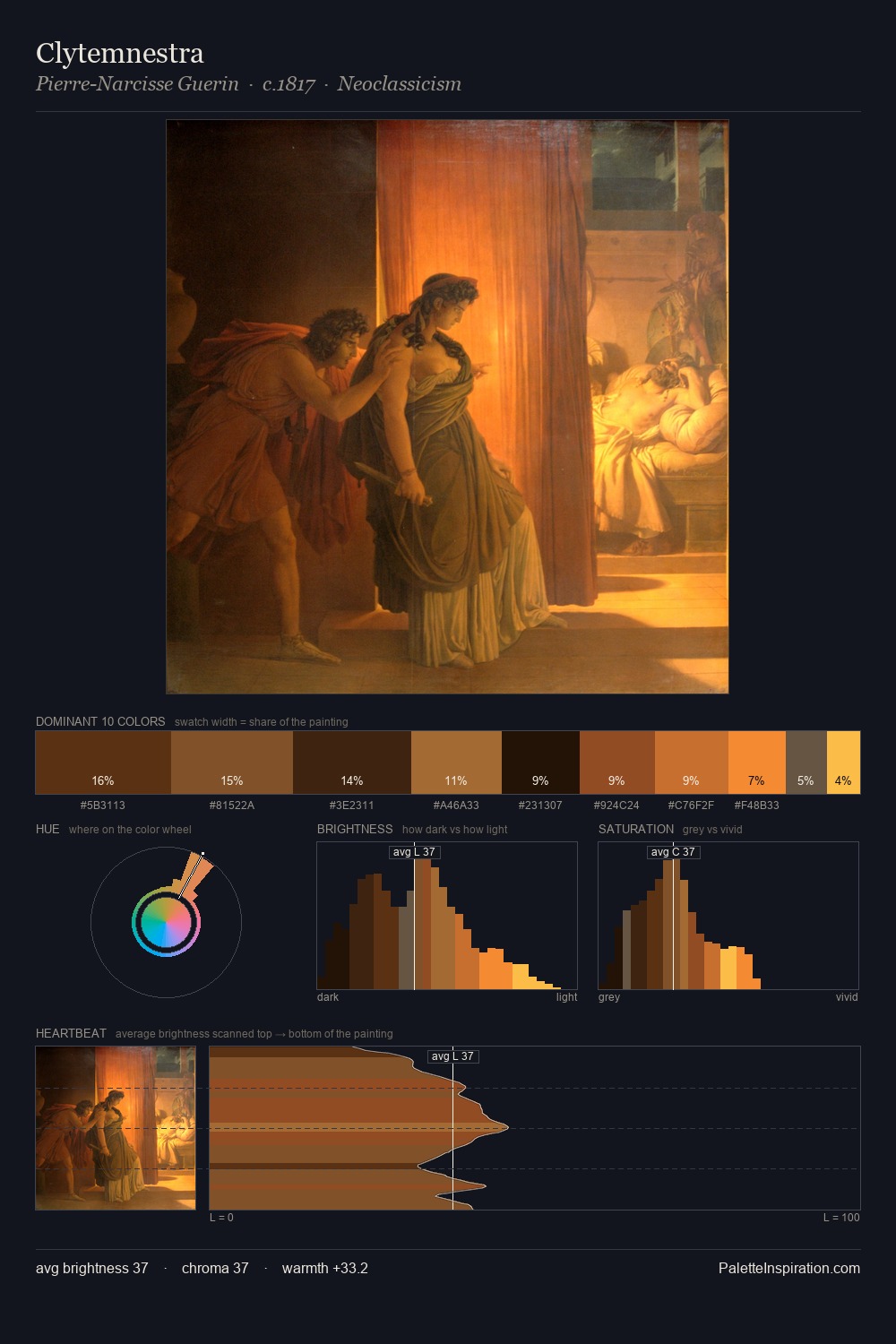
Darkness anchors Carl Hertel; light is rationed, creating dramatic contrast rather than open air. Warm hues command this palette; Carl Hertel favours the reds, oranges, and yellows of firelight and earth. The absence of saturated colour is itself an expressive choice: this is a palette of restraint and atmosphere. At 6.7%, #8D5A2B carries the palette's sharpest chromatic charge: an accent that earns its place precisely because it is withheld. 39 units of value spread create a palette that is varied but unified - contrast in the service of harmony. This tonal restraint is characteristic of the Carl Hertel approach: colour serves light, not the reverse. Carl Hertel's palette 3 carries its own internal logic while remaining in conversation with the artist's broader colour intelligence.
Example use cases
- film & entertainment
- fine dining
- spirits branding
- menswear
- theater design
I Love This!
Copy, export, or download for your project