Johannes Moreelse Palette 2

Palette Analysis
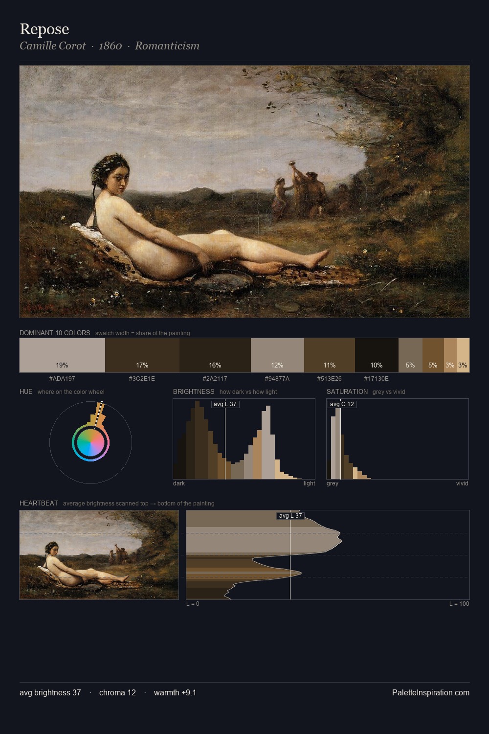
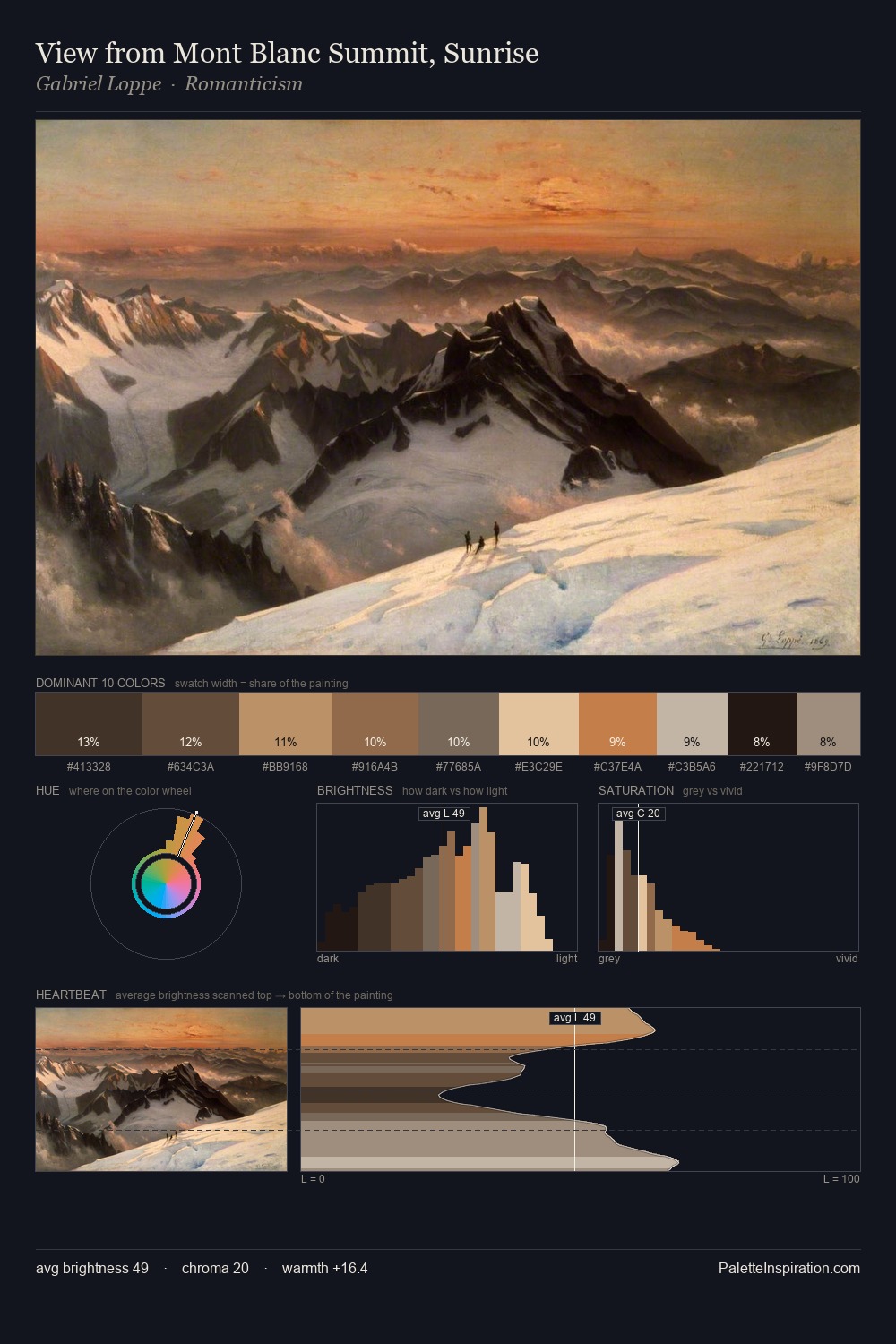
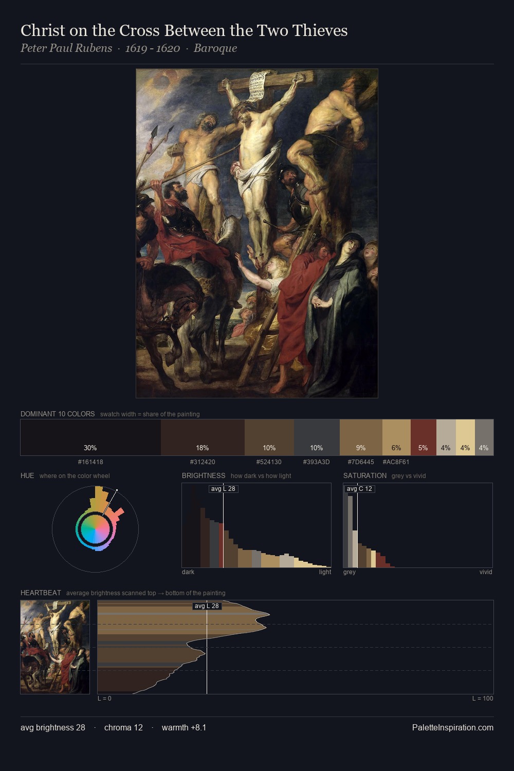
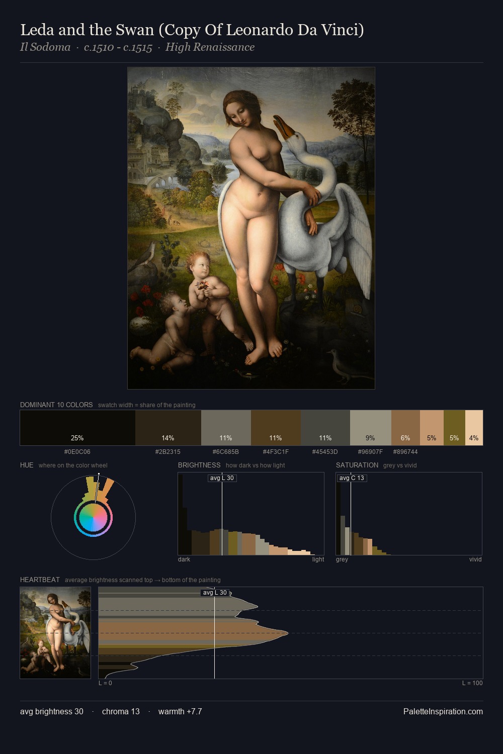
Mid-key values give Johannes Moreelse its characteristic quietness - nothing blazes, nothing disappears. Cool tones set the register here - the blues and greens easily outweigh any warm accents. The absence of saturated colour is itself an expressive choice: this is a palette of restraint and atmosphere. At 3.7%, #E1C097 carries the palette's sharpest chromatic charge: an accent that earns its place precisely because it is withheld. A value spread of 65 units gives the palette both depth and air - shadows are genuinely dark, lights genuinely light. High luminosity and cool temperature suggest the plein-air condition: unfiltered daylight and open sky. Johannes Moreelse's palette 2 carries its own internal logic while remaining in conversation with the artist's broader colour intelligence.
Example use cases
- theater design
- jewelry brands
- tobacco-adjacent retail
- event branding
- film & entertainment
I Love This!
Copy, export, or download for your project