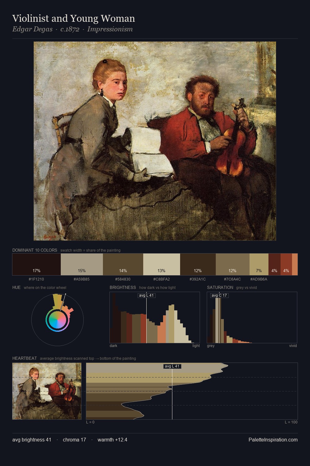
Johannes Moreelse Master Palette
Penumbral Bister
Penumbral Partial shadow - the transitional zone between light and full dark, soft-edged.
Bister Dark warm brown - a traditional ink and wash pigment made from wood soot.

Palette Analysis
Johannes Moreelse sits in the centre of the value range, lending the palette a sense of even, sustained light. Heat pervades this palette; warm chromatic identities outweigh cool ones at almost every weight. Saturation is deliberately withheld - the beauty here lies in the near-monochromatic gradations rather than colour difference. The highest-chroma note - #441A16 - appears at just 2.0%, deployed as a precision accent against the quieter ground. At 60 units of value range, the palette has the tonal breadth to sustain complex spatial readings. The palette is a signature: Johannes Moreelse's particular sense of value, warmth, and colour weight made legible.
Example use cases
- music labels
- luxury hospitality
- editorial photography
- leather goods
- premium streaming
I Love This!
Use This Palette
Copy, export, or download for your project
Copy, export, or download for your project
Copy:
Download:
Share: