Johannes Moreelse Palette 1
Tenebrous Sienna
Tenebrous Dark and murky - low-key values with obscured form, Baroque in temperament.
Sienna Warm red-brown earth - named after the Sienese pigment, a fundamental artist earth color.

Palette Analysis
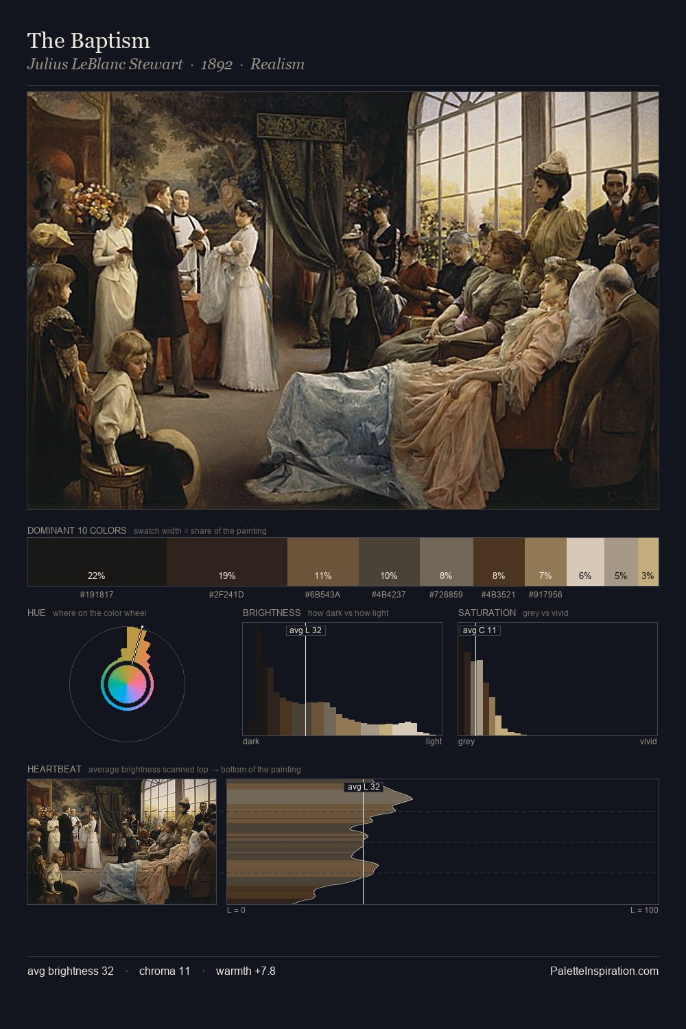
Johannes Moreelse keeps values measured and balanced, a hallmark of tonal restraint. Warmth dominates - the palette of Johannes Moreelse leans heavily on the yellow-orange-red arc of the colour wheel. Chroma hovers near zero; colour declares itself through subtle shifts in hue rather than outright saturation. At 25.1%, #121111 functions less as a colour accent and more as a complete atmospheric environment. At 2.7%, #66452E carries the palette's sharpest chromatic charge: an accent that earns its place precisely because it is withheld. The full value range is 68 units: broad enough to build convincing three-dimensional form. Palette 1 sits within the larger chromatic argument that Johannes Moreelse's complete body of work advances.
Example use cases
- music labels
- luxury hospitality
- editorial photography
- leather goods
- premium streaming
I Love This!
Use This Palette
Copy, export, or download for your project
Copy, export, or download for your project
Copy:
Download:
Share: