Johannes Moreelse Palette 5

Palette Analysis
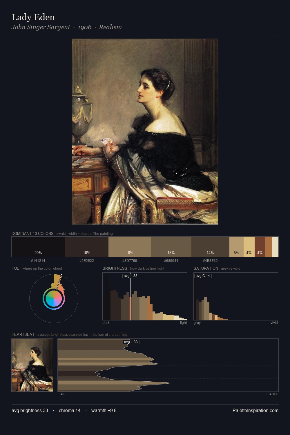
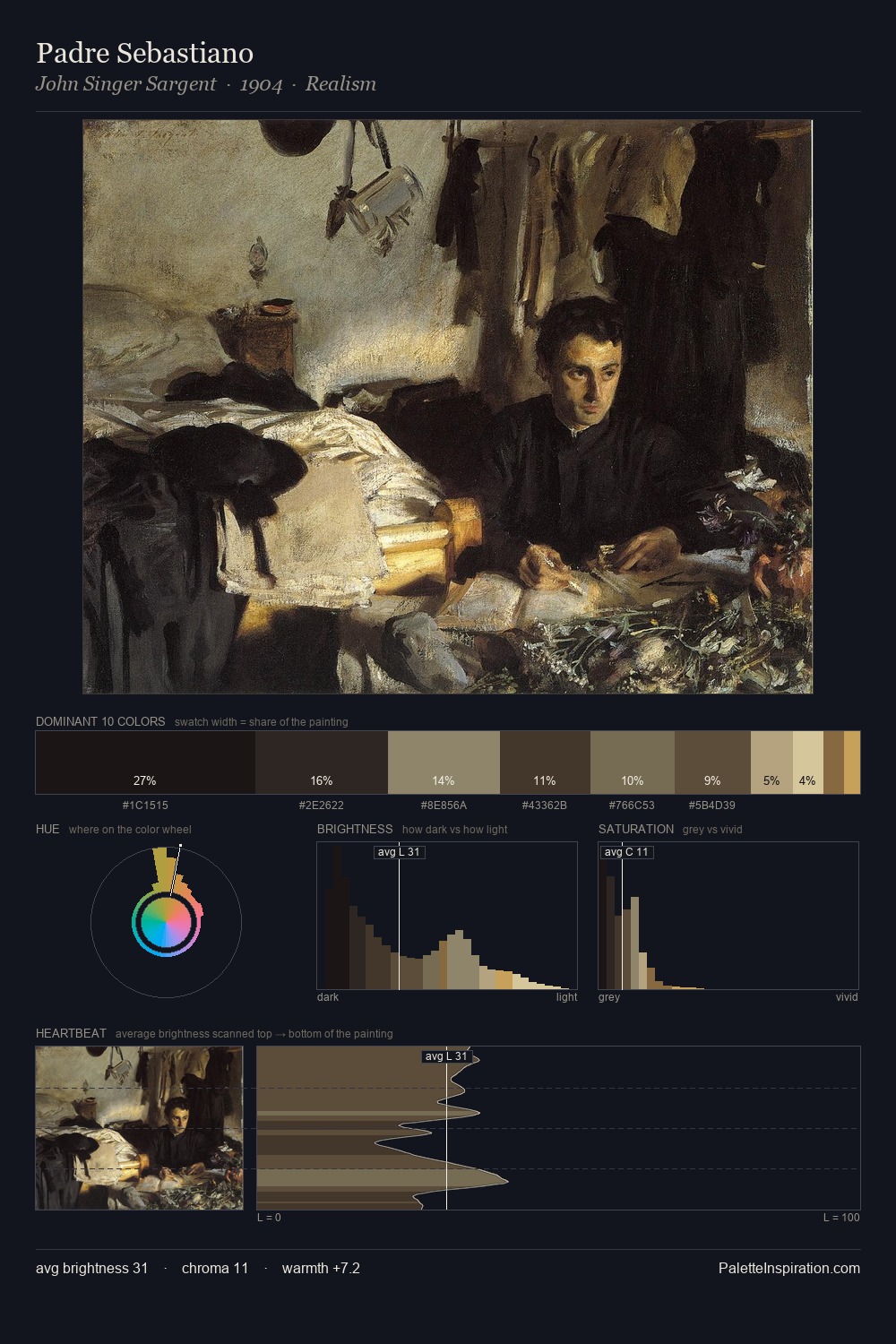
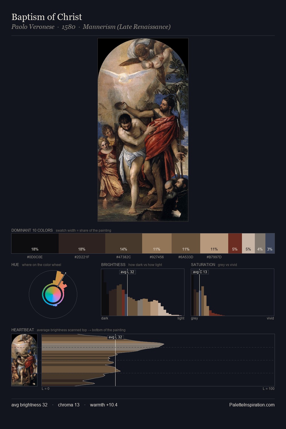
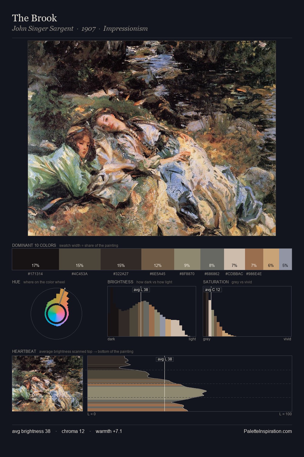
Johannes Moreelse is built on dark foundations, with values clustered toward shadow. Temperature reads distinctly warm: the reds and earth tones from Johannes Moreelse carry the compositional weight. Saturation is deliberately withheld - the beauty here lies in the near-monochromatic gradations rather than colour difference. Johannes Moreelse gives 26.4% of the composition to a single #251B1A - a decisive chromatic anchor. #674A38 delivers the chromatic peak at only 4.0% - a small shot of colour with outsized visual impact. A value spread of 59 units gives the palette both depth and air - shadows are genuinely dark, lights genuinely light. Together these qualities place Johannes Moreelse firmly in the tonal tradition - concerned with mood and atmosphere rather than chromatic display. This is palette 5 of Johannes Moreelse's sequence - a single chapter in a chromatic story told across many works.
Example use cases
- theater design
- jewelry brands
- tobacco-adjacent retail
- event branding
- film & entertainment
I Love This!
Copy, export, or download for your project