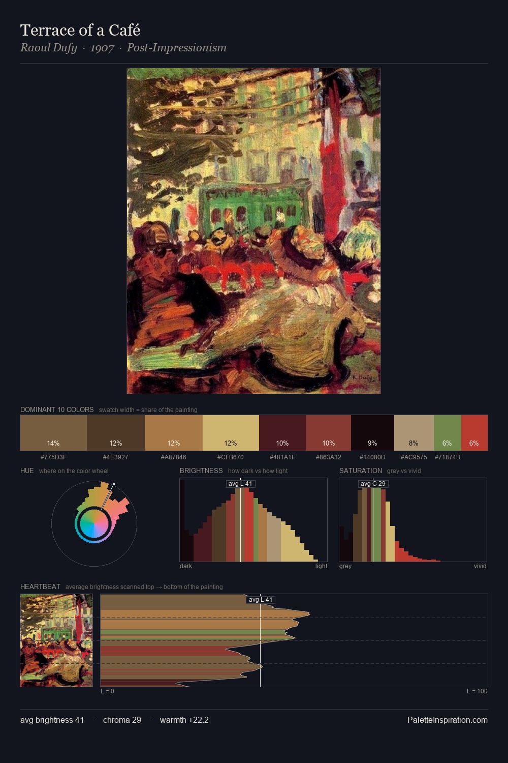
Johannes Moreelse Palette 3

Palette Analysis
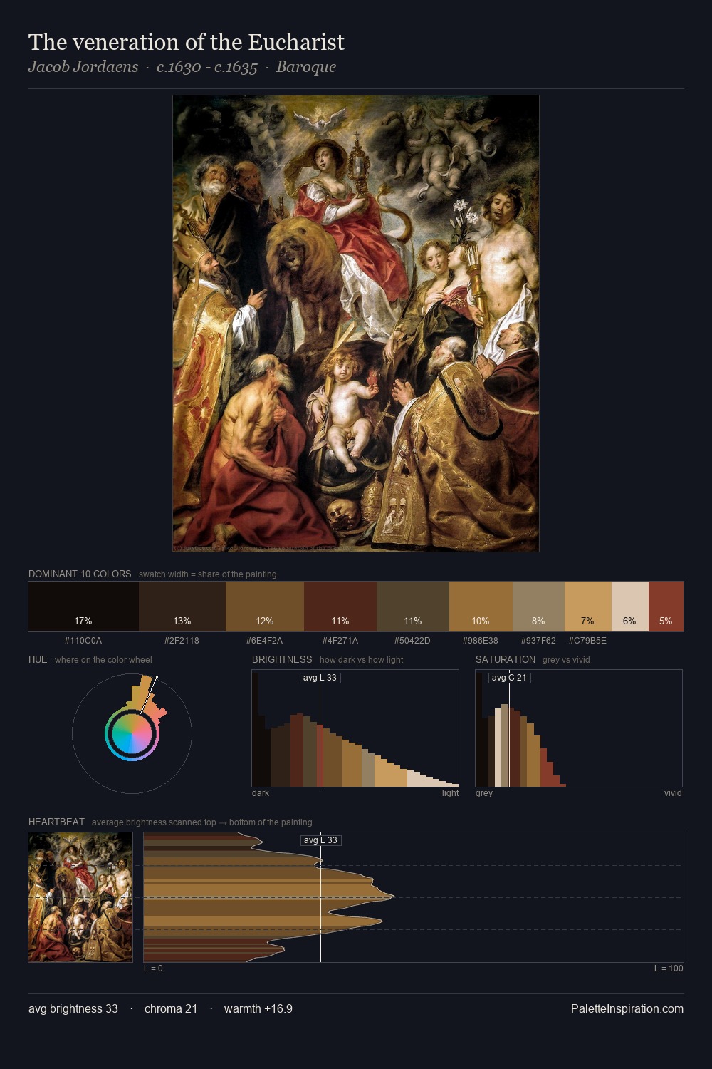
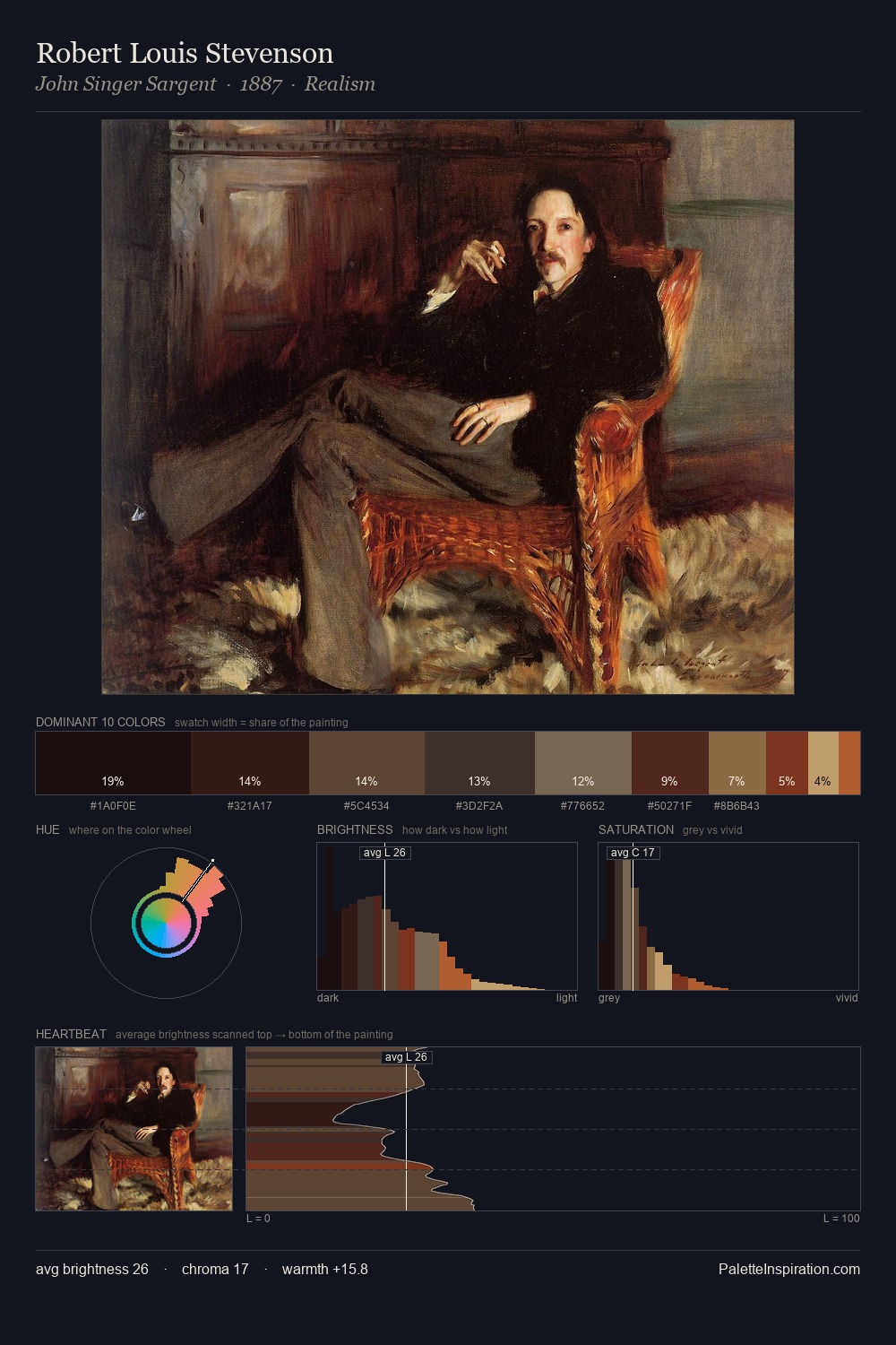
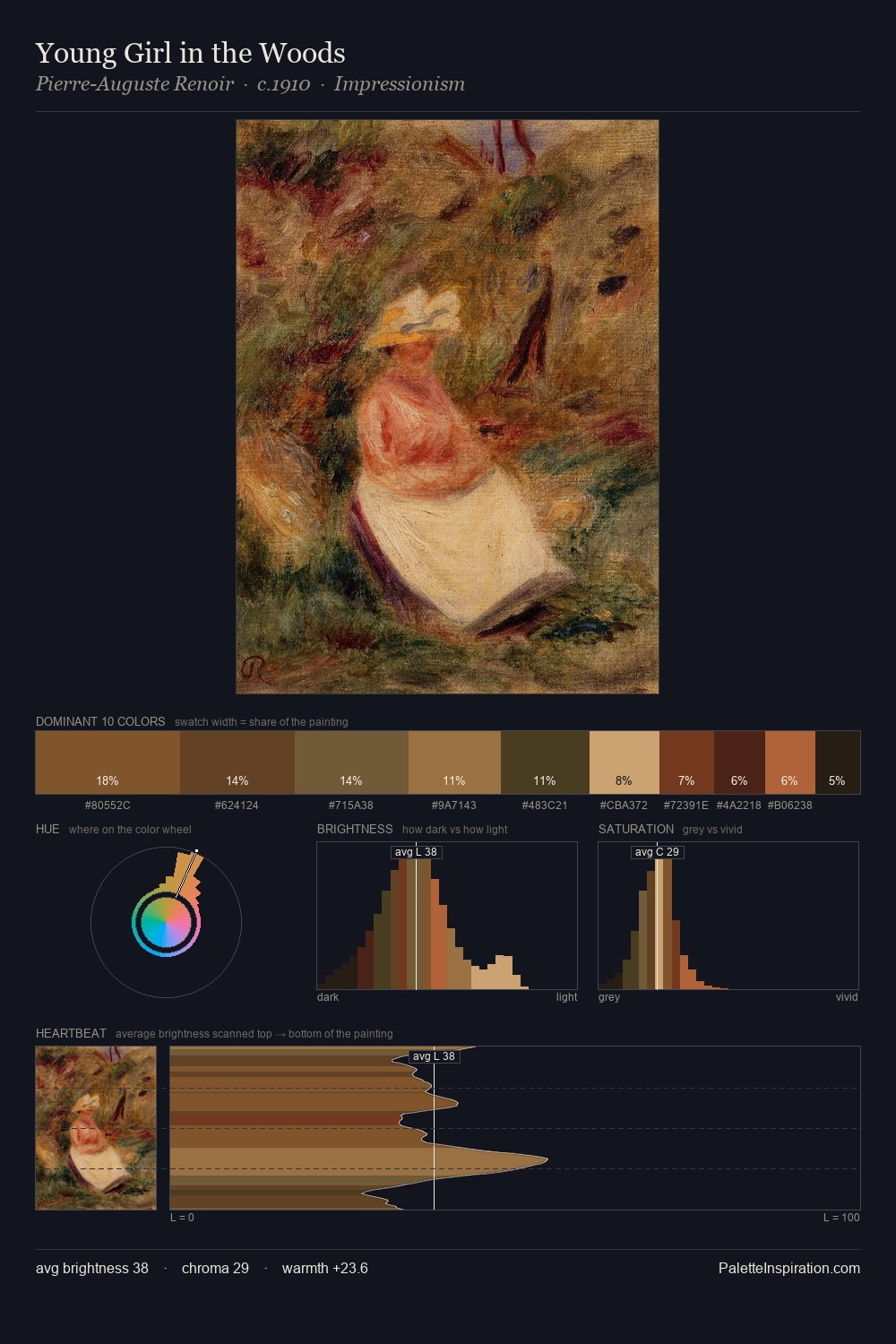
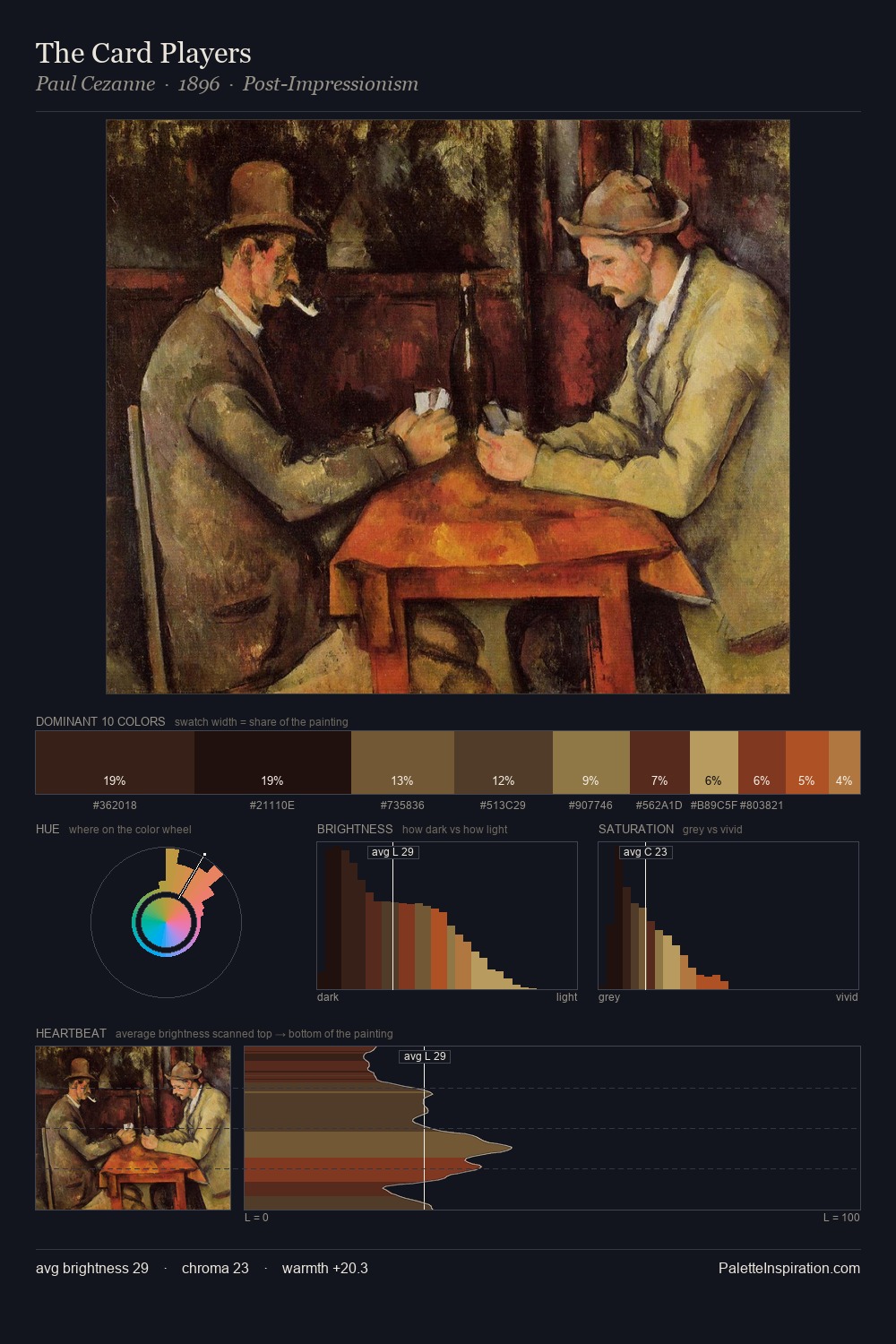
The value structure of Johannes Moreelse is mid-key: quiet, controlled, and cohesive. Temperature reads distinctly warm: the reds and earth tones from Johannes Moreelse carry the compositional weight. Saturation is deliberately withheld - the beauty here lies in the near-monochromatic gradations rather than colour difference. At 26.2%, #776B4E functions less as a colour accent and more as a complete atmospheric environment. The highest-chroma note - #441A16 - appears at just 3.5%, deployed as a precision accent against the quieter ground. The value range spans 56 units across the palette, providing the full gamut from deep shadow to near-white and ensuring clear tonal hierarchy. In the context of Johannes Moreelse's full range of palettes, group 3 represents one movement in an ongoing chromatic dialogue.
Example use cases
- music labels
- luxury hospitality
- editorial photography
- leather goods
- premium streaming
I Love This!
Copy, export, or download for your project