Proto Renaissance Master Palette

Palette Analysis
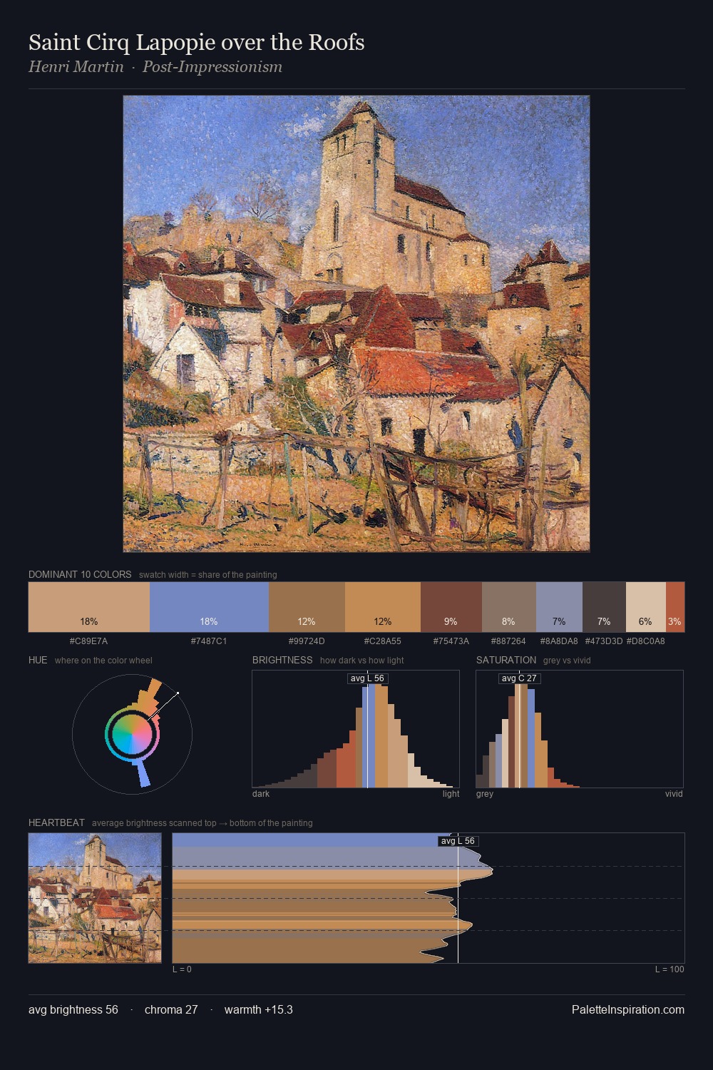
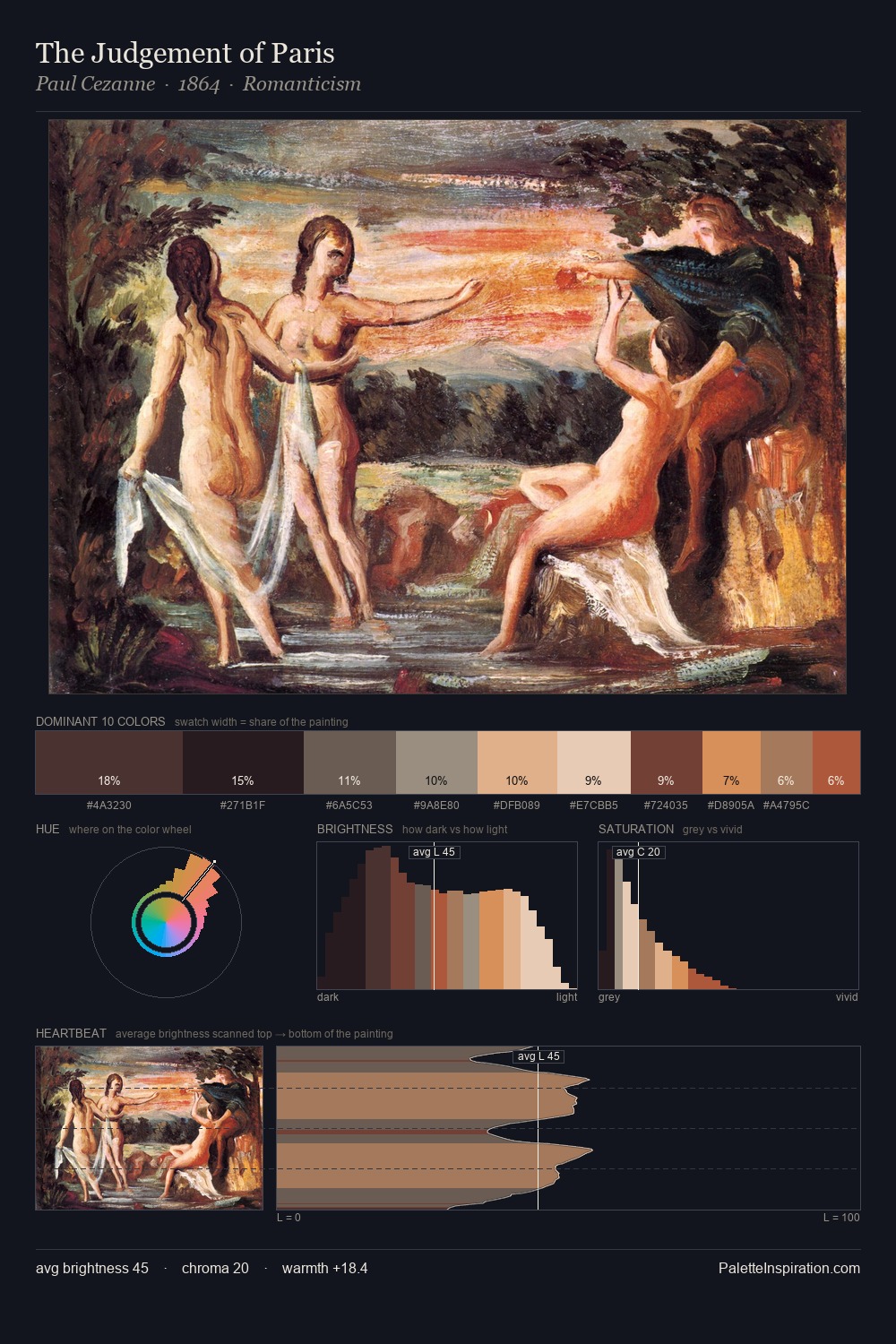
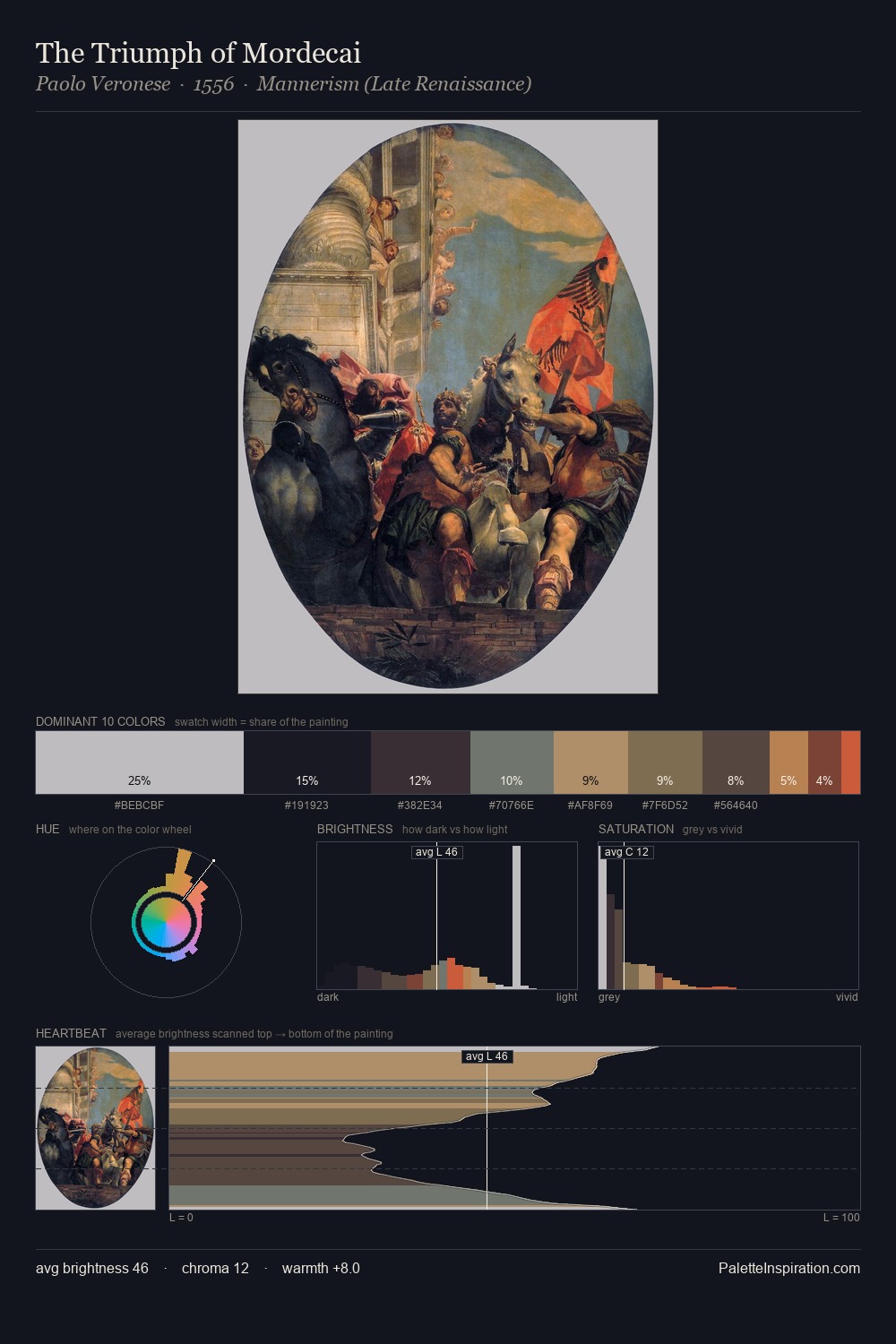
Across the Proto Renaissance movement, certain palette qualities recur - this distillation makes them visible at a glance. Mid-key values give Proto Renaissance its characteristic quietness - nothing blazes, nothing disappears. Heat pervades this palette; warm chromatic identities outweigh cool ones at almost every weight. Saturation is deliberately withheld - the beauty here lies in the near-monochromatic gradations rather than colour difference. At 10.9%, #996840 carries the palette's sharpest chromatic charge: an accent that earns its place precisely because it is withheld. Spanning 53 units on the value axis, the palette achieves the balance between tonal flatness and fragmentation. This is the light that Proto Renaissance painters chose to live inside.
Example use cases
- ceramics & pottery
- boutique hospitality
- menswear
- heritage food brands
- craft & artisan brands
I Love This!
Copy, export, or download for your project