Proto Renaissance Palette 5
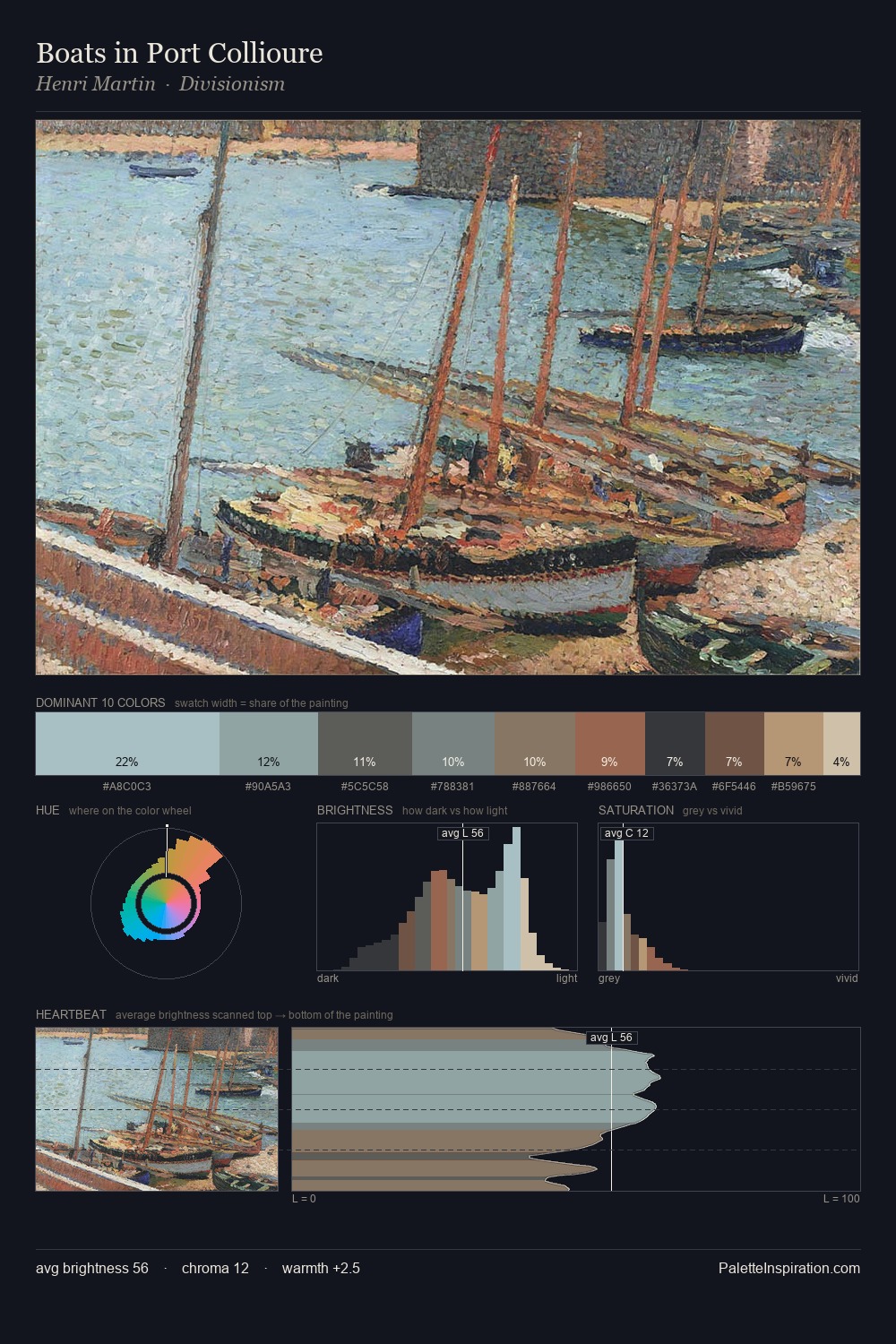
Muted Tawny
Muted Deliberately desaturated - chroma pulled toward gray, the restraint of tonal painting.
Tawny Warm orange-brown - a traditional term for the color of tanned leather or lion fur.

Palette Analysis
Mid-key values give Proto Renaissance its characteristic quietness - nothing blazes, nothing disappears. Temperature reads distinctly warm: the reds and earth tones carry the compositional weight. Chroma hovers near zero; colour declares itself through subtle shifts in hue rather than outright saturation. Only 10.8% is devoted to #694233, yet that small allocation delivers the palette's entire chromatic tension. 53 units of value spread create a palette that is varied but unified - contrast in the service of harmony.
Example use cases
- exhibition design
- foundation branding
- estate management
- art education
- museums & galleries
I Love This!
Use This Palette
Copy, export, or download for your project
Copy, export, or download for your project
Copy:
Download:
Share: