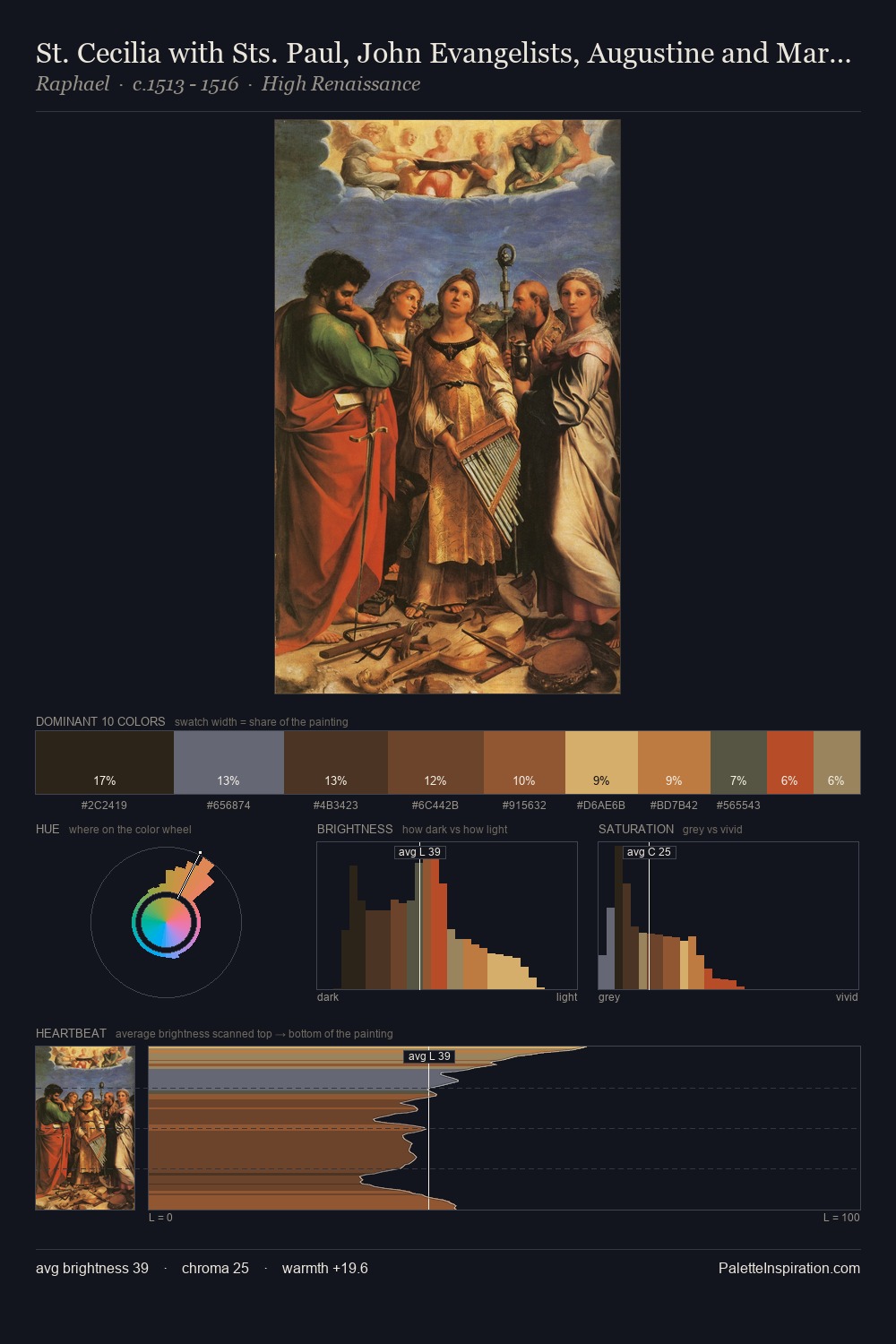
Proto Renaissance Palette 17
Muted Vermillion
Muted Deliberately desaturated - chroma pulled toward gray, the restraint of tonal painting.
Vermillion Brilliant red-orange - the classic mercury sulfide pigment, vivid and warm.

Palette Analysis
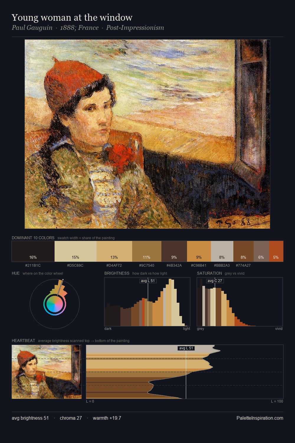
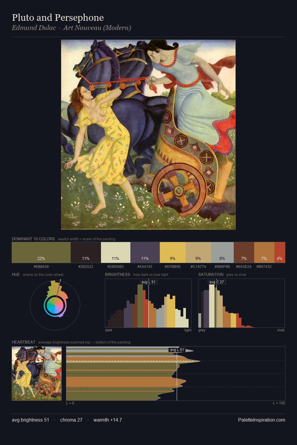
Proto Renaissance distributes its values across the middle register, creating harmony without high contrast. Heat pervades this palette; warm chromatic identities outweigh cool ones at almost every weight. Mid-range chroma keeps the palette grounded - colourful but not strident. The highest-chroma note - #76411E - appears at just 9.7%, deployed as a precision accent against the quieter ground. From deepest dark to palest light, the palette traverses 57 units of the value scale - a span that creates natural depth.
Example use cases
- publishing
- corporate identity
- consumer apps
- hospitality
- design agencies
I Love This!
Use This Palette
Copy, export, or download for your project
Copy, export, or download for your project
Copy:
Download:
Share: