James Webb Palette 9

Palette Analysis
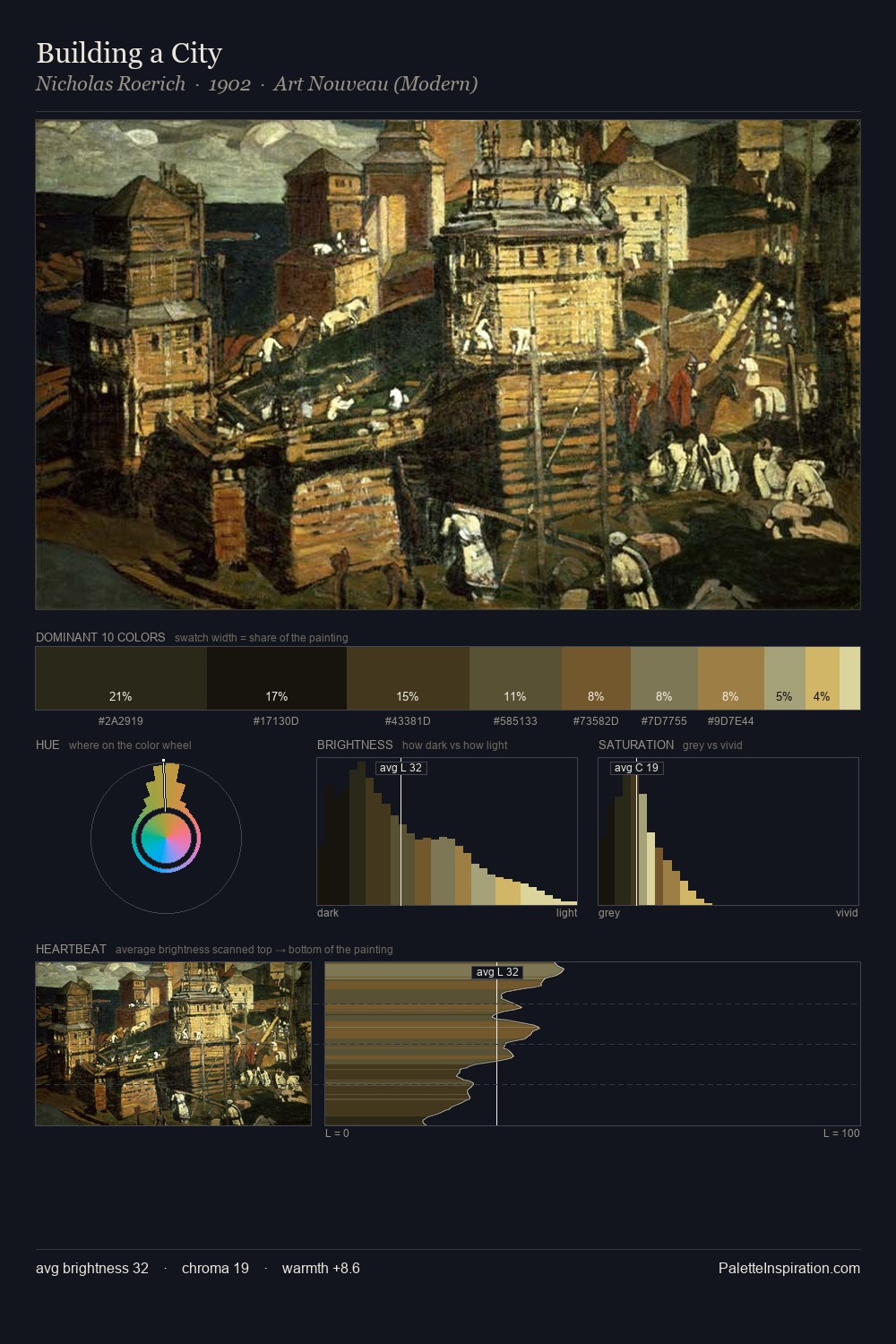
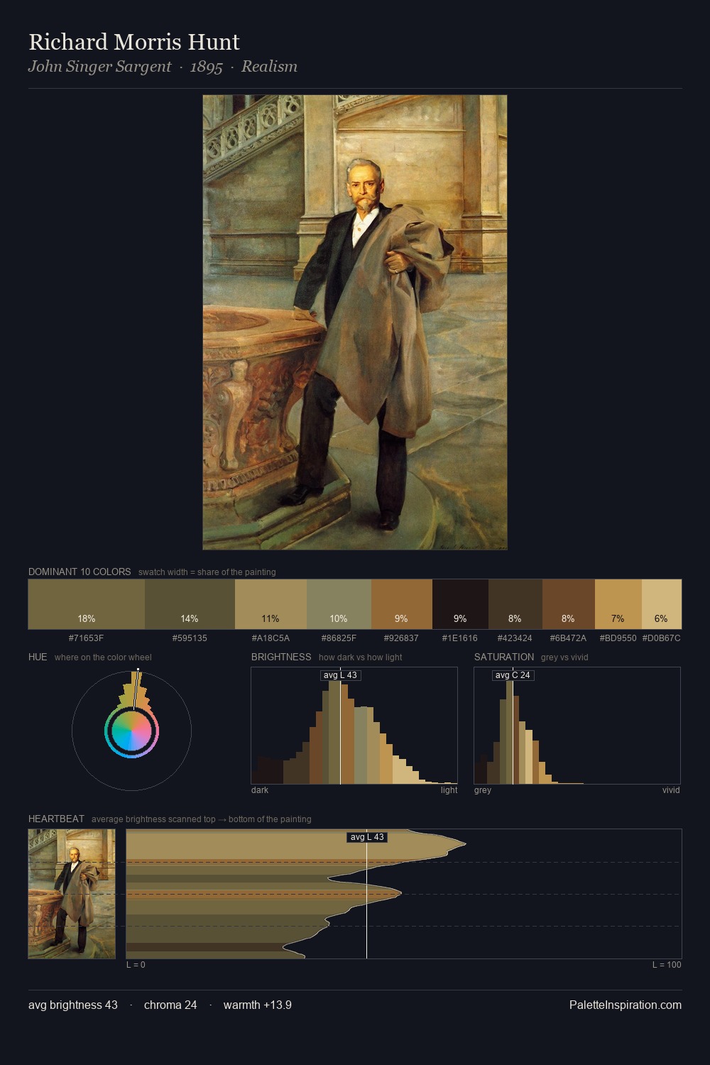
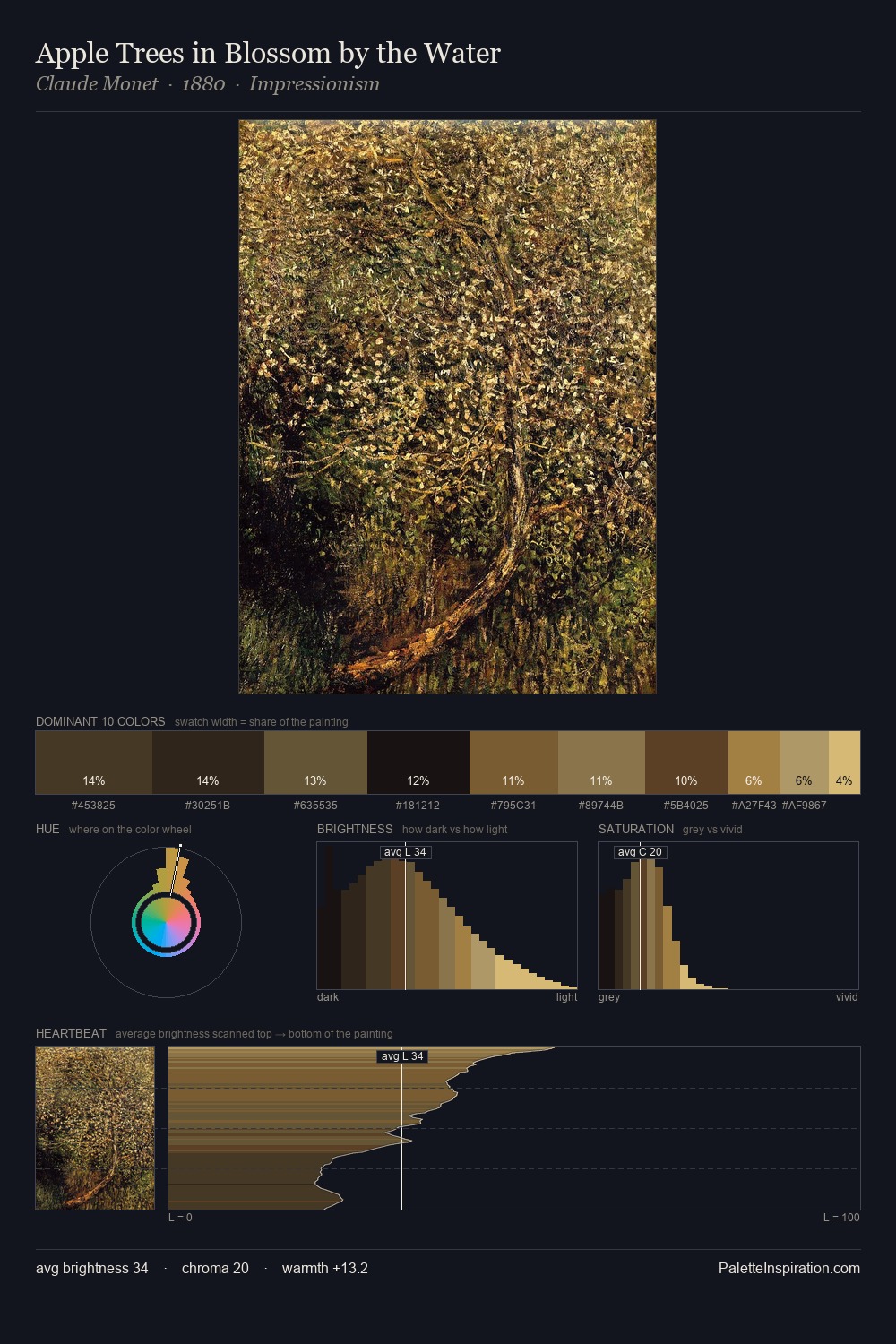
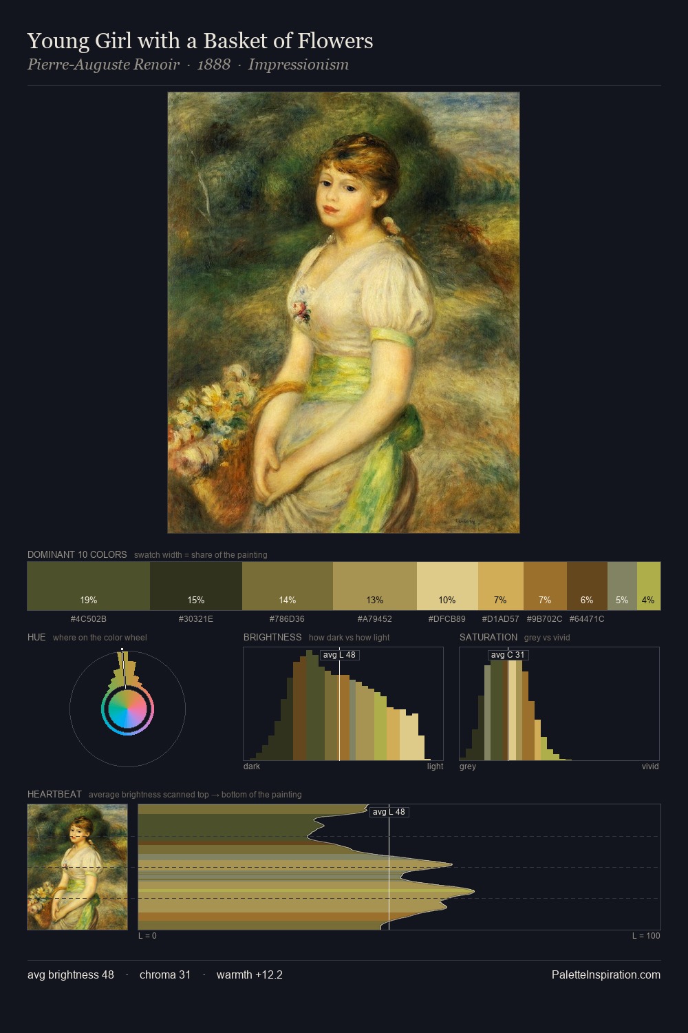
Mid-key values give James Webb its characteristic quietness - nothing blazes, nothing disappears. James Webb tilts toward cool - blues and silver-greys carry the structural weight. Colours are neither washed out nor blazing; they occupy the productive middle ground of the chroma scale. The most saturated colour, #765324, is reserved to 6.2% of the surface, where it acts as a focal punctuation. The value range of 51 units sits in the comfortable middle: enough depth, enough light, neither extreme. The palette has the character of outdoor light: cool, mid-bright, with colour rendered faithfully rather than expressively. James Webb's palette 9 carries its own internal logic while remaining in conversation with the artist's broader colour intelligence.
Example use cases
- craft & artisan brands
- specialty coffee
- home goods
- lifestyle retail
- ceramics & pottery
I Love This!
Copy, export, or download for your project