James Webb Palette 2

Palette Analysis
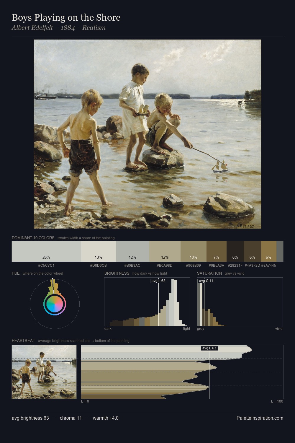
James Webb is high-key - luminous, open, and weighted toward light. Cool tones set the register here - the blues and greens easily outweigh any warm accents. The absence of saturated colour is itself an expressive choice: this is a palette of restraint and atmosphere. #E0E1D1 claims 25.4% of the surface, functioning as the work's tonal foundation. The highest-chroma note - #3A301F - appears at just 6.0%, deployed as a precision accent against the quieter ground. 58 units of value range underpin the palette's structural clarity: the eye always knows where light falls. High luminosity and cool temperature suggest the plein-air condition: unfiltered daylight and open sky. Palette 2 sits within the larger chromatic argument that James Webb's complete body of work advances.
Example use cases
- florist branding
- event design
- real estate
- jewelry retail
- hospitality branding
I Love This!
Copy, export, or download for your project