James Webb Palette 3

Palette Analysis
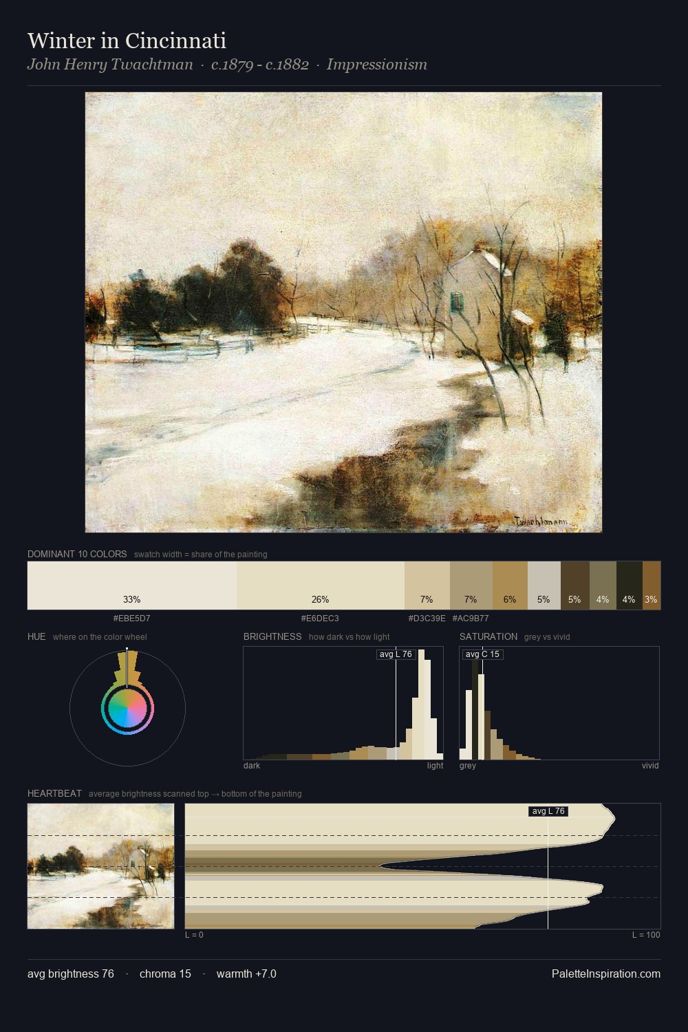
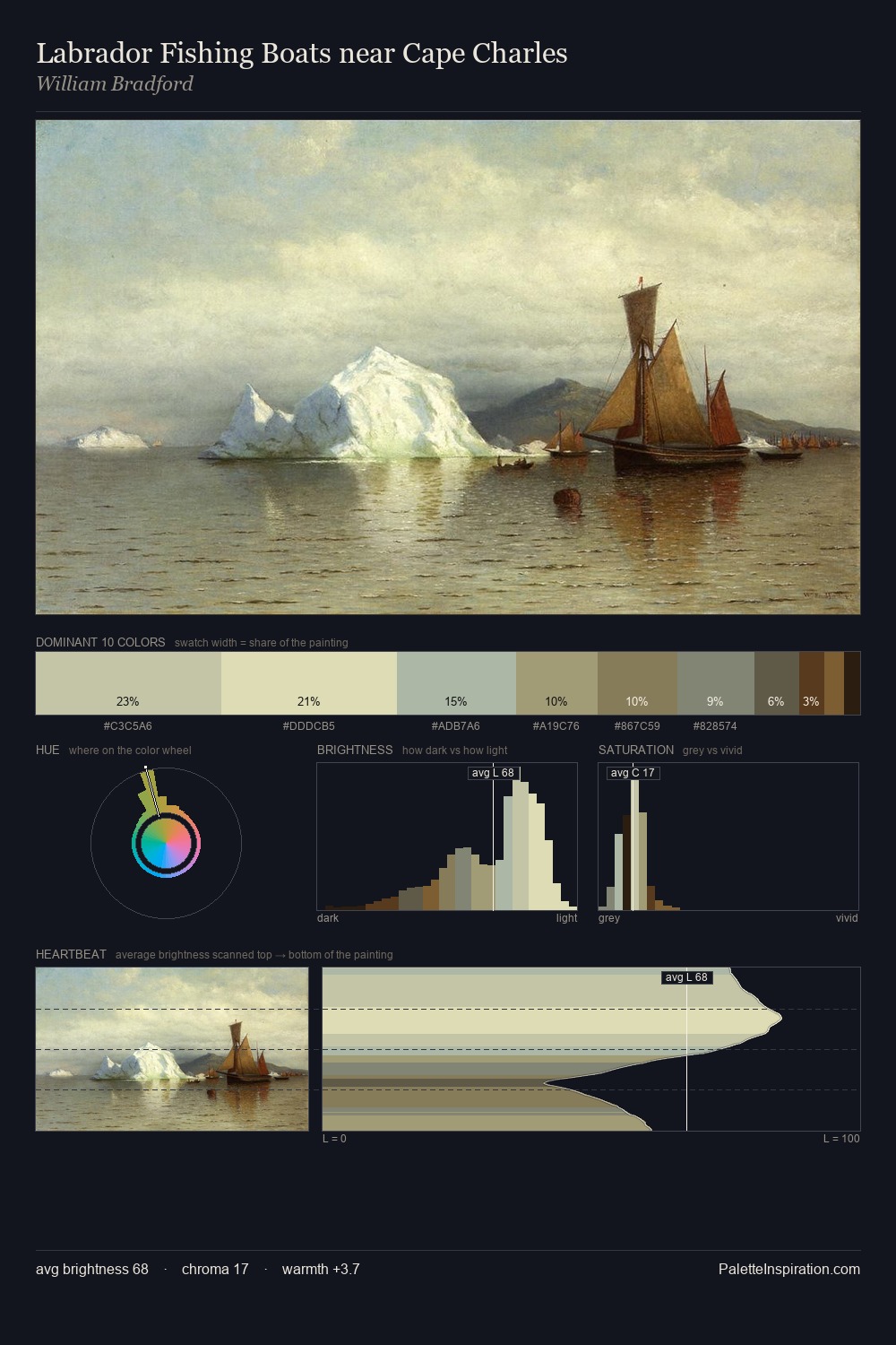
James Webb is high-key - luminous, open, and weighted toward light. Cool hues prevail: blues, greens, and greys anchor the palette's emotional temperature. Chroma is kept low across all colours, producing the soft, enveloping quality that characterises tonal painting. James Webb gives 30.1% of the composition to a single #ECE5C1 - a decisive chromatic anchor. The most saturated colour, #24180E, is reserved to 4.5% of the surface, where it acts as a focal punctuation. At 70 units of value range, the palette has the tonal breadth to sustain complex spatial readings. The mid-to-high key, cool bias, and moderate chroma point to outdoor observation - sky and diffused daylight as the dominant light source. In the context of James Webb's full range of palettes, group 3 represents one movement in an ongoing chromatic dialogue.
Example use cases
- design agencies
- product brands
- e-commerce
- editorial sites
- publishing
I Love This!
Copy, export, or download for your project