James Webb Palette 13

Palette Analysis
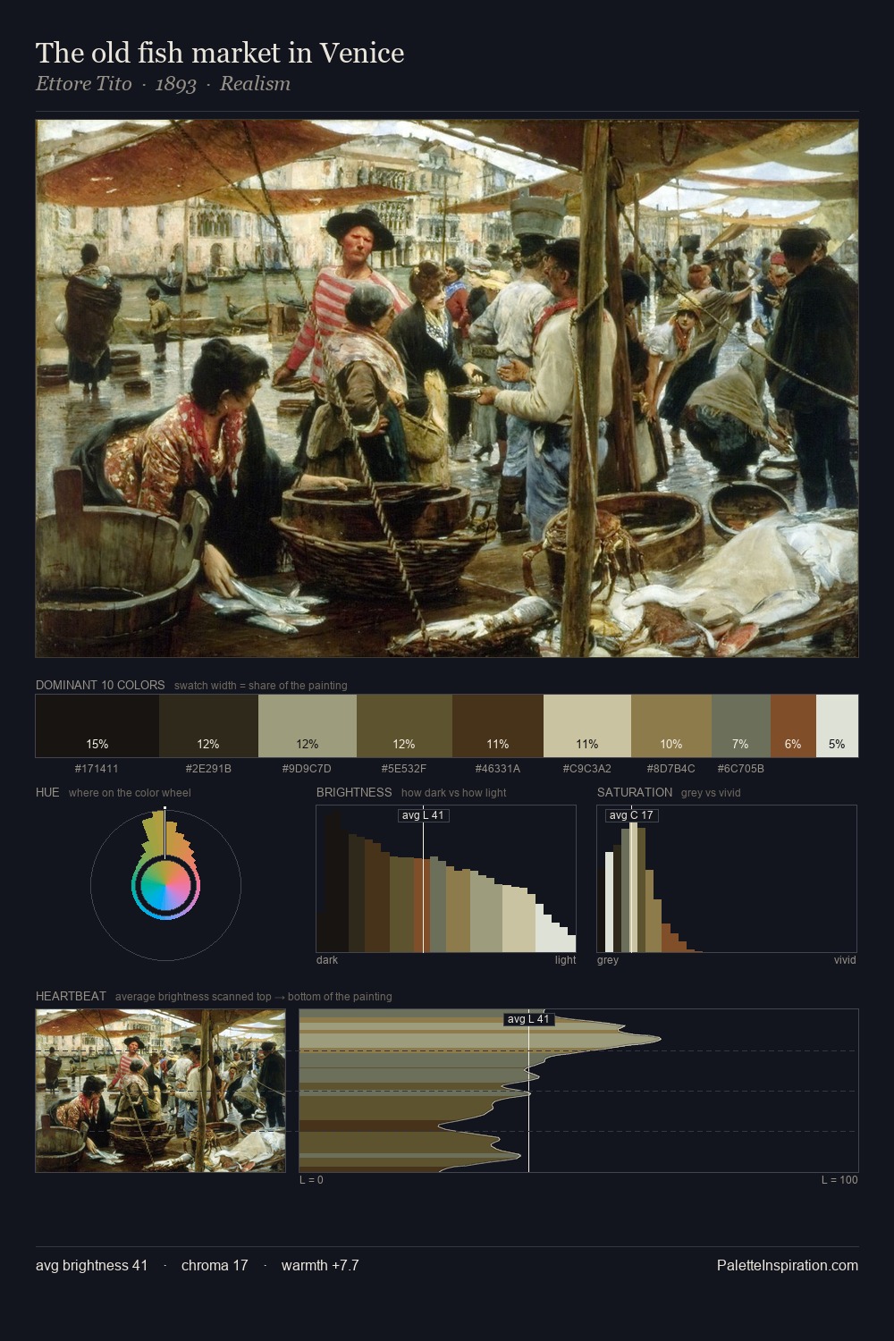
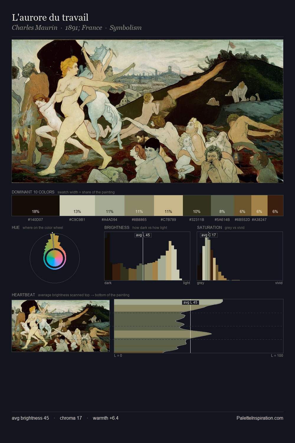
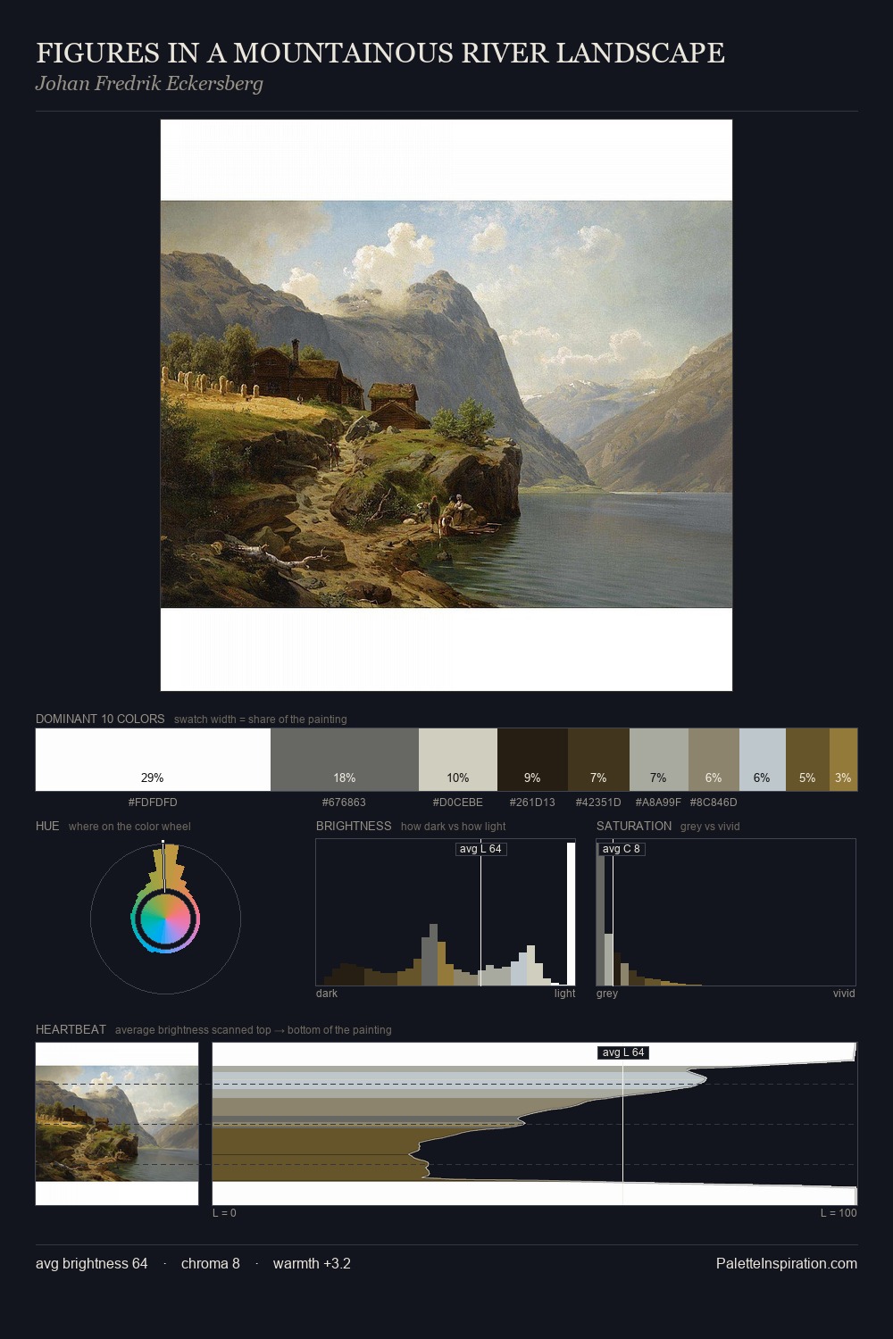
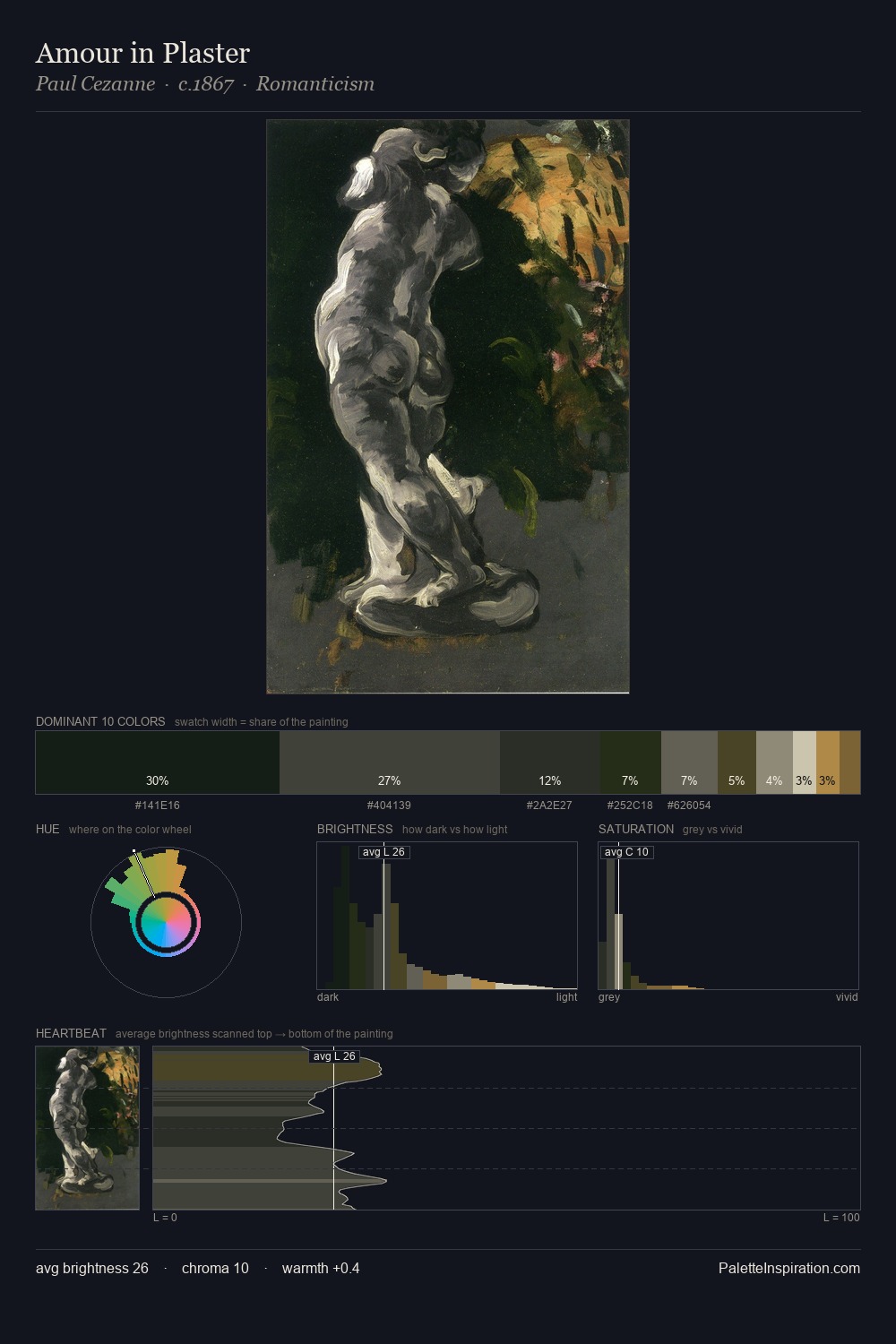
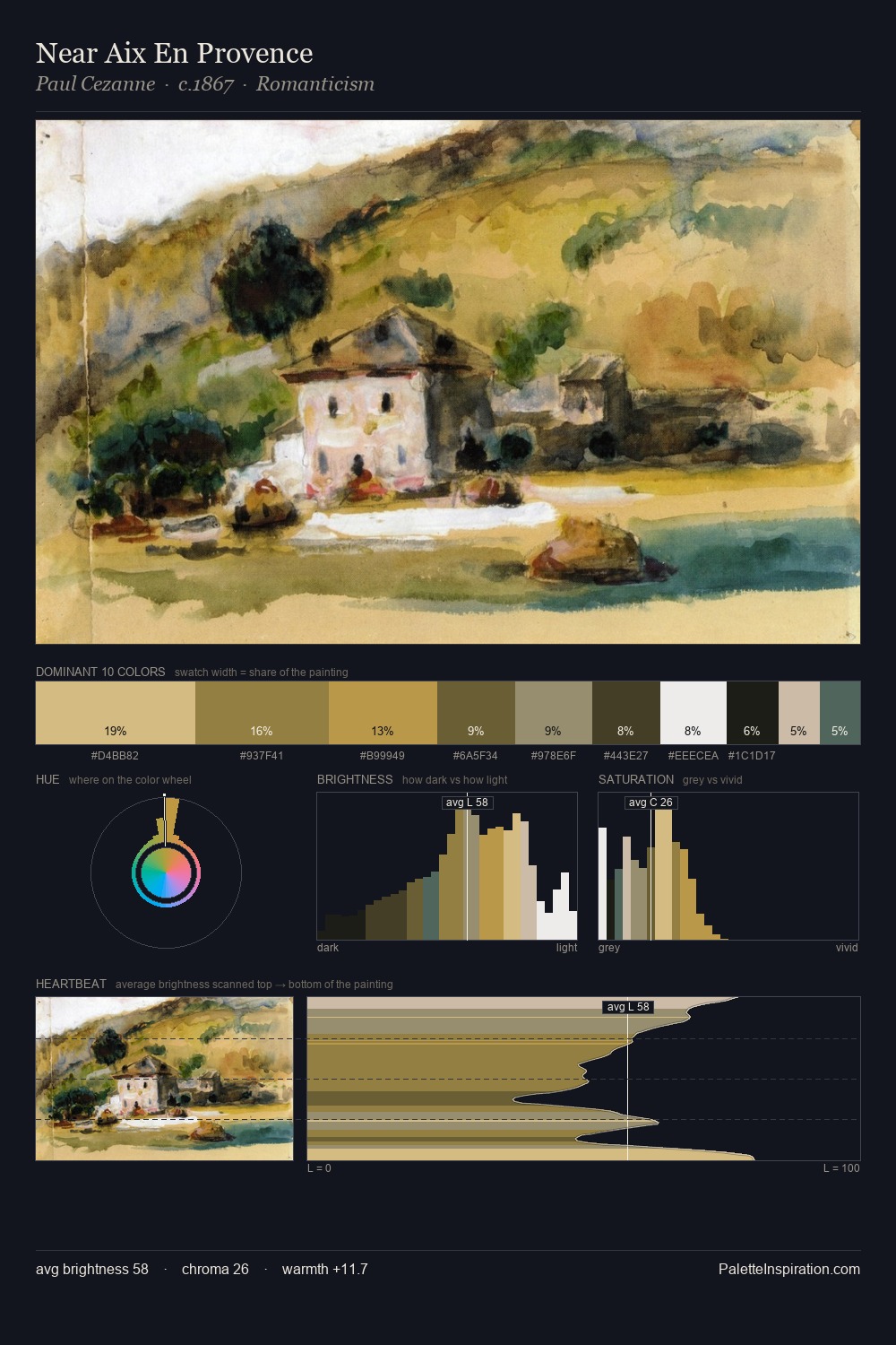
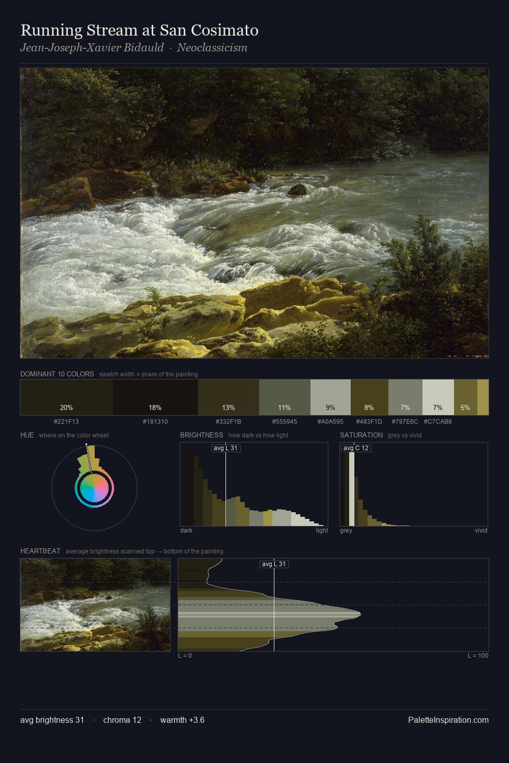
The value structure of James Webb is mid-key: quiet, controlled, and cohesive. Temperature is cool-dominant, with blue and green families claiming the largest areas. Saturation is deliberately withheld - the beauty here lies in the near-monochromatic gradations rather than colour difference. At 2.1%, #987E3D carries the palette's sharpest chromatic charge: an accent that earns its place precisely because it is withheld. At 60 units of value range, the palette has the tonal breadth to sustain complex spatial readings. The mid-to-high key, cool bias, and moderate chroma point to outdoor observation - sky and diffused daylight as the dominant light source. Palette 13 sits within the larger chromatic argument that James Webb's complete body of work advances.
Example use cases
- theater design
- jewelry brands
- tobacco-adjacent retail
- event branding
- film & entertainment
I Love This!
Copy, export, or download for your project