James Webb Palette 8

Palette Analysis
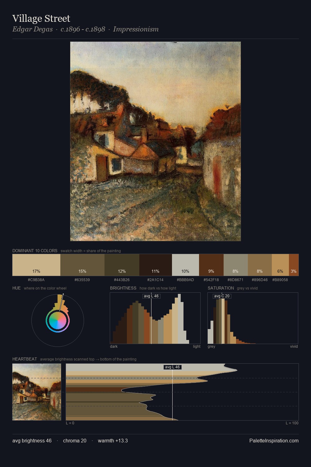
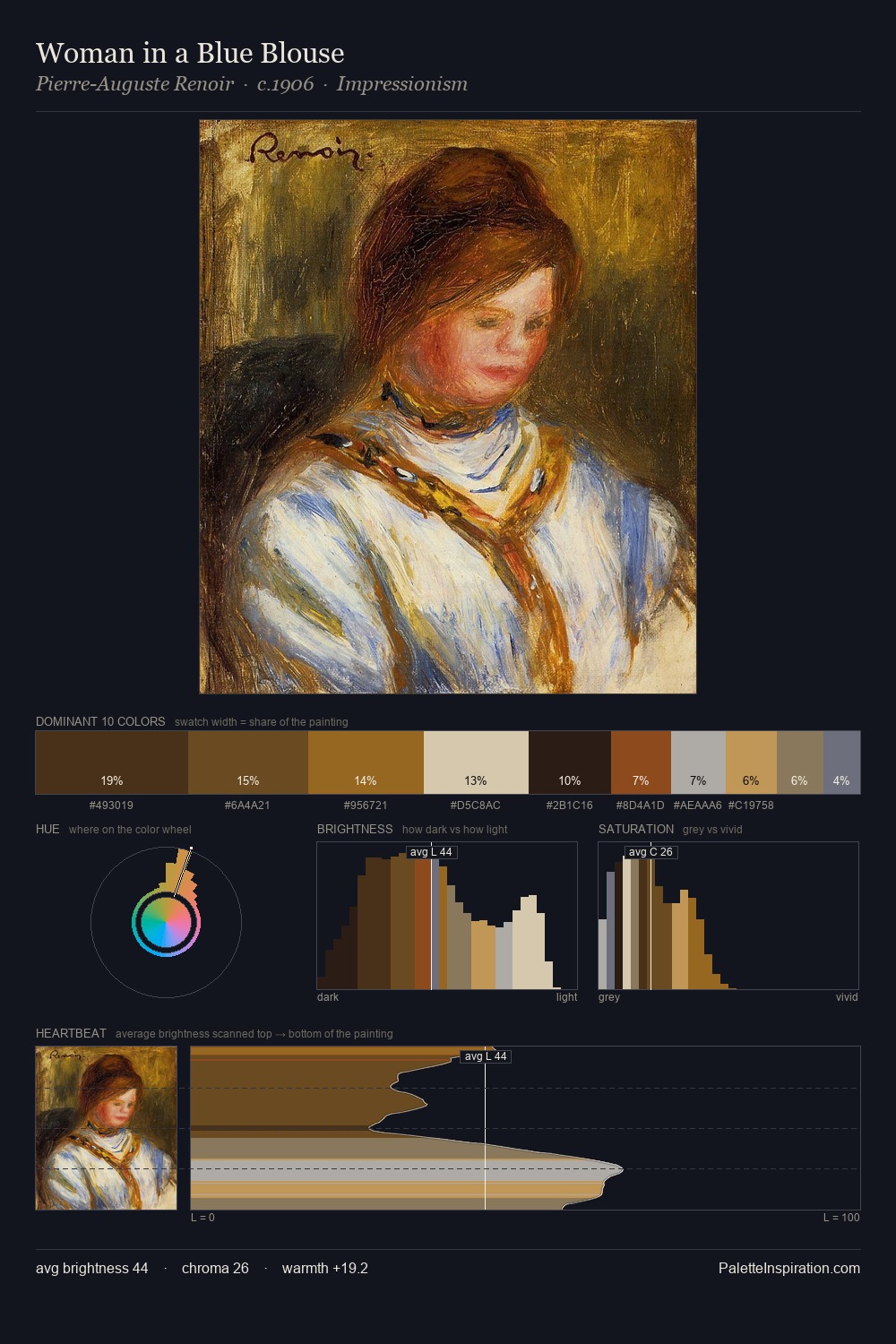
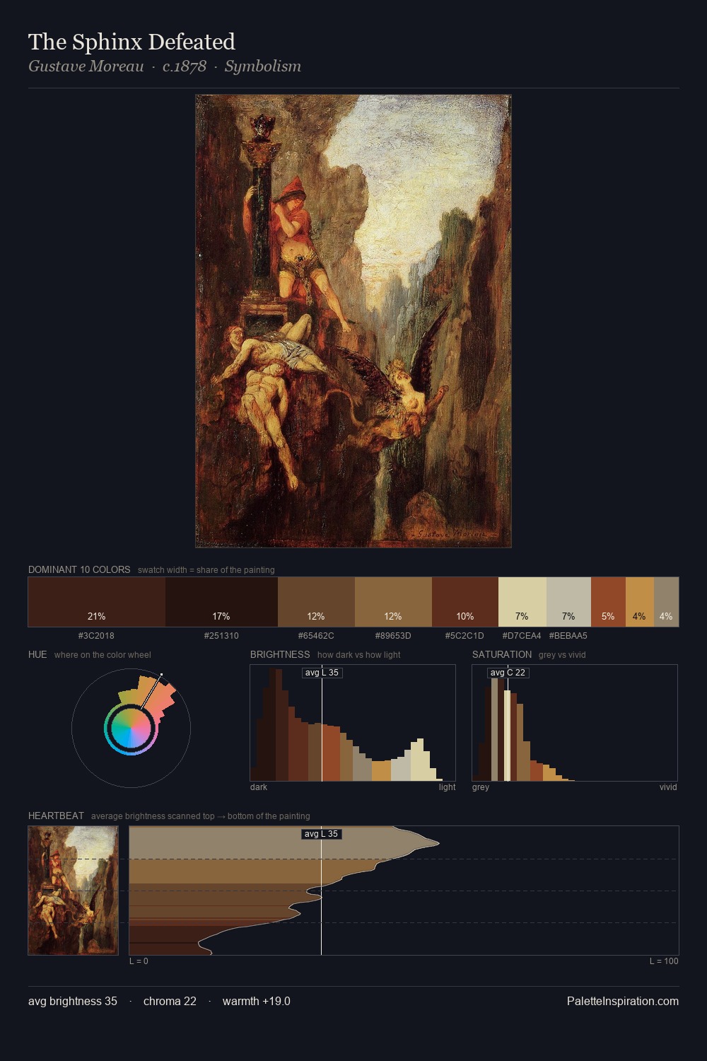
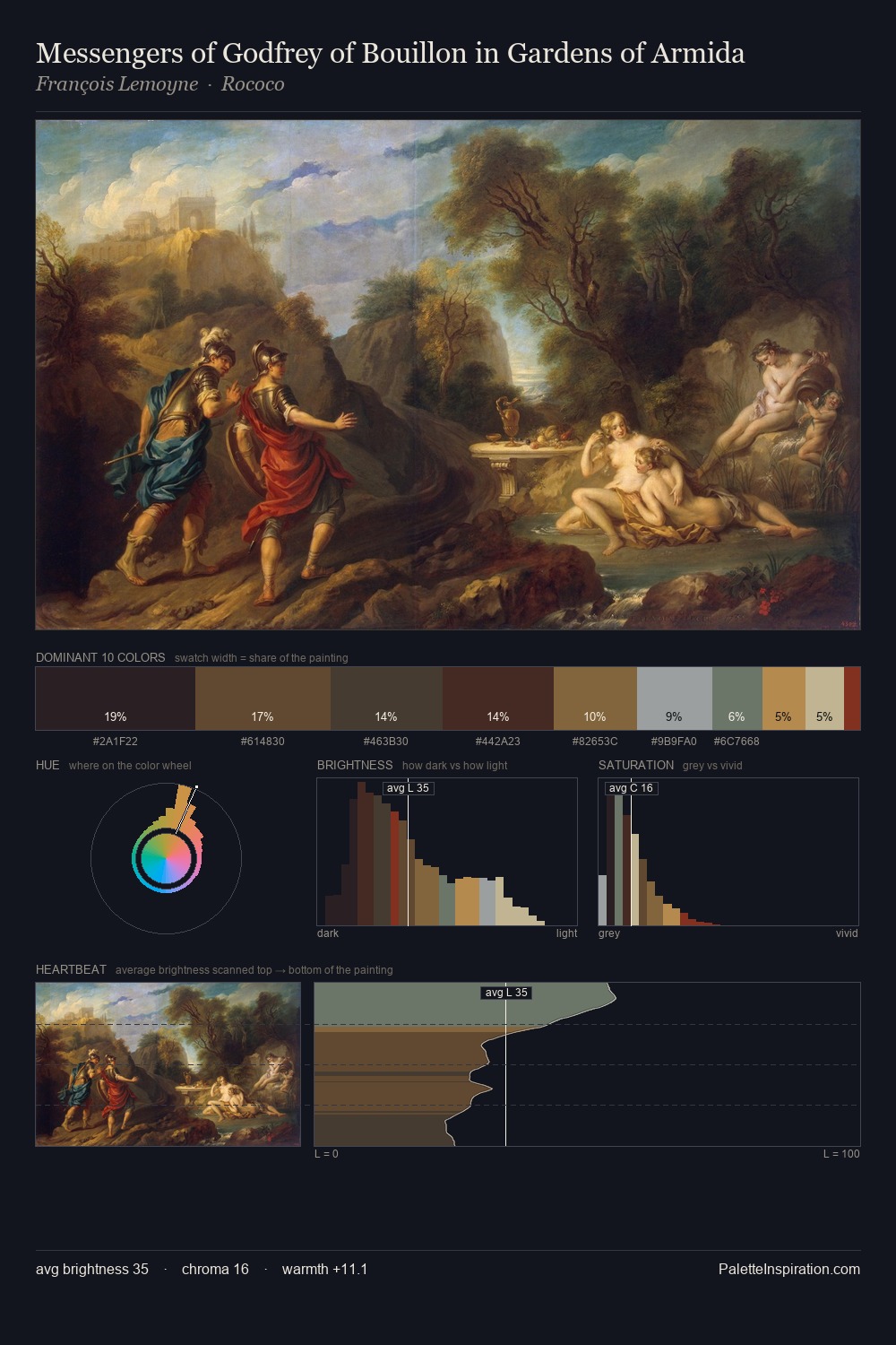
James Webb is high in key: pale, luminous, and filled with optical air. Cool hues prevail: blues, greens, and greys anchor the palette's emotional temperature. Every colour is desaturated; the palette proceeds through near-neutrals and gently-coloured greys. The dominant colour, #C7C6B4, takes 26.7% of the total area, establishing the overall mood before any other hue is introduced. #201109 functions as the palette's exclamation mark: highest chroma, lowest percentage (2.8%). 65 units of value range underpin the palette's structural clarity: the eye always knows where light falls. The mid-to-high key, cool bias, and moderate chroma point to outdoor observation - sky and diffused daylight as the dominant light source. Palette 8 sits within the larger chromatic argument that James Webb's complete body of work advances.
Example use cases
- ceramics & pottery
- boutique hospitality
- menswear
- heritage food brands
- craft & artisan brands
I Love This!
Copy, export, or download for your project