James Webb Palette 5

Palette Analysis
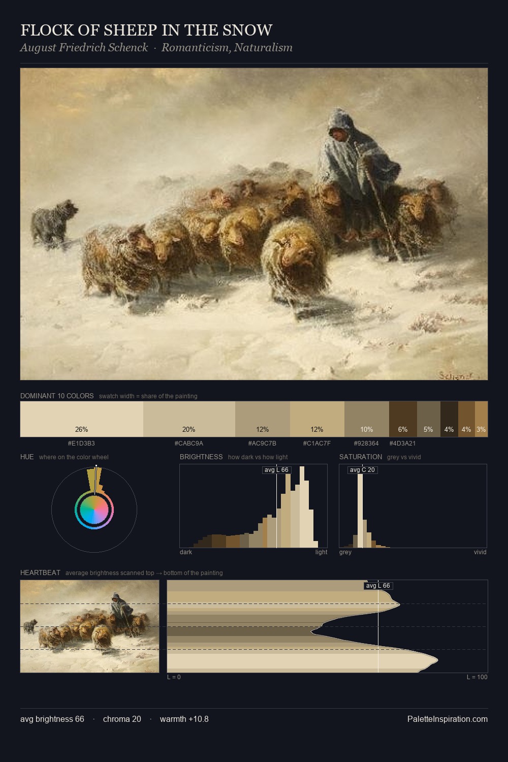
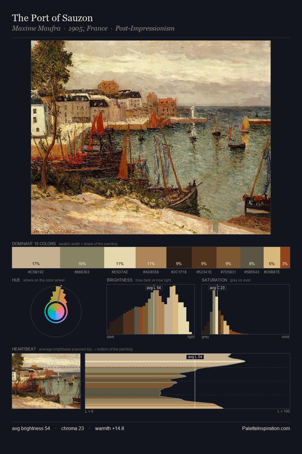
James Webb is strongly light-biased - shadow is suggested rather than declared. Temperature is cool-dominant, with blue and green families claiming the largest areas. Chroma hovers near zero; colour declares itself through subtle shifts in hue rather than outright saturation. The dominant colour, #E8E7CD, takes 42.9% of the total area, establishing the overall mood before any other hue is introduced. At 2.8%, #835F36 carries the palette's sharpest chromatic charge: an accent that earns its place precisely because it is withheld. A value spread of 67 units gives the palette both depth and air - shadows are genuinely dark, lights genuinely light. The mid-to-high key, cool bias, and moderate chroma point to outdoor observation - sky and diffused daylight as the dominant light source. James Webb's palette 5 carries its own internal logic while remaining in conversation with the artist's broader colour intelligence.
Example use cases
- publishing
- corporate identity
- consumer apps
- hospitality
- design agencies
I Love This!
Copy, export, or download for your project