James Webb Palette 1

Palette Analysis
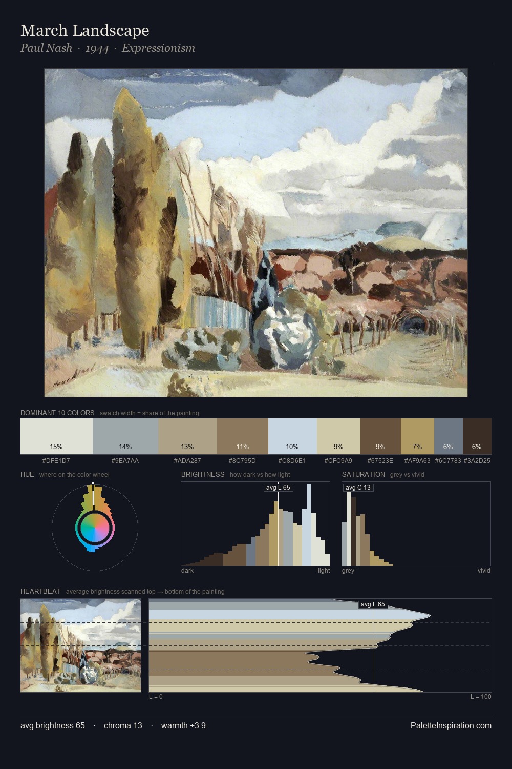
Light floods James Webb; the palette keeps values pale and airy across its range. Cool tones set the register here - the blues and greens easily outweigh any warm accents. Chroma hovers near zero; colour declares itself through subtle shifts in hue rather than outright saturation. At 5.0%, #BF836E carries the palette's sharpest chromatic charge: an accent that earns its place precisely because it is withheld. The value range spans 61 units across the palette, providing the full gamut from deep shadow to near-white and ensuring clear tonal hierarchy. The mid-to-high key, cool bias, and moderate chroma point to outdoor observation - sky and diffused daylight as the dominant light source. Palette 1 sits within the larger chromatic argument that James Webb's complete body of work advances.
Example use cases
- florist branding
- event design
- real estate
- jewelry retail
- hospitality branding
I Love This!
Copy, export, or download for your project