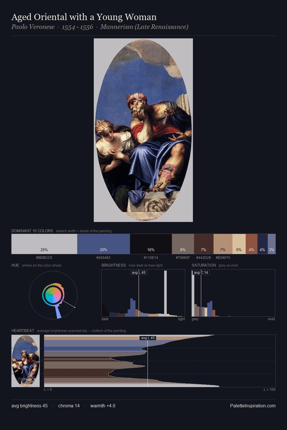
Paolo Veronese Master Palette
Shadowed Bister
Shadowed Low-key - values weighted toward shadow, the palette of dim interiors and overcast skies.
Bister Dark warm brown - a traditional ink and wash pigment made from wood soot.

Palette Analysis
Paolo Veronese sits in the centre of the value range, lending the palette a sense of even, sustained light. Temperature reads distinctly warm: the reds and earth tones from Paolo Veronese carry the compositional weight. The absence of saturated colour is itself an expressive choice: this is a palette of restraint and atmosphere. At 7.1%, #8A462F carries the palette's sharpest chromatic charge: an accent that earns its place precisely because it is withheld. At 65 units of value range, the palette has the tonal breadth to sustain complex spatial readings. The palette is recognisably Paolo Veronese's own: particular in its temperature, chroma, and the economy of its brightest note.
Example use cases
- theater design
- jewelry brands
- tobacco-adjacent retail
- event branding
- film & entertainment
I Love This!
Use This Palette
Copy, export, or download for your project
Copy, export, or download for your project
Copy:
Download:
Share: