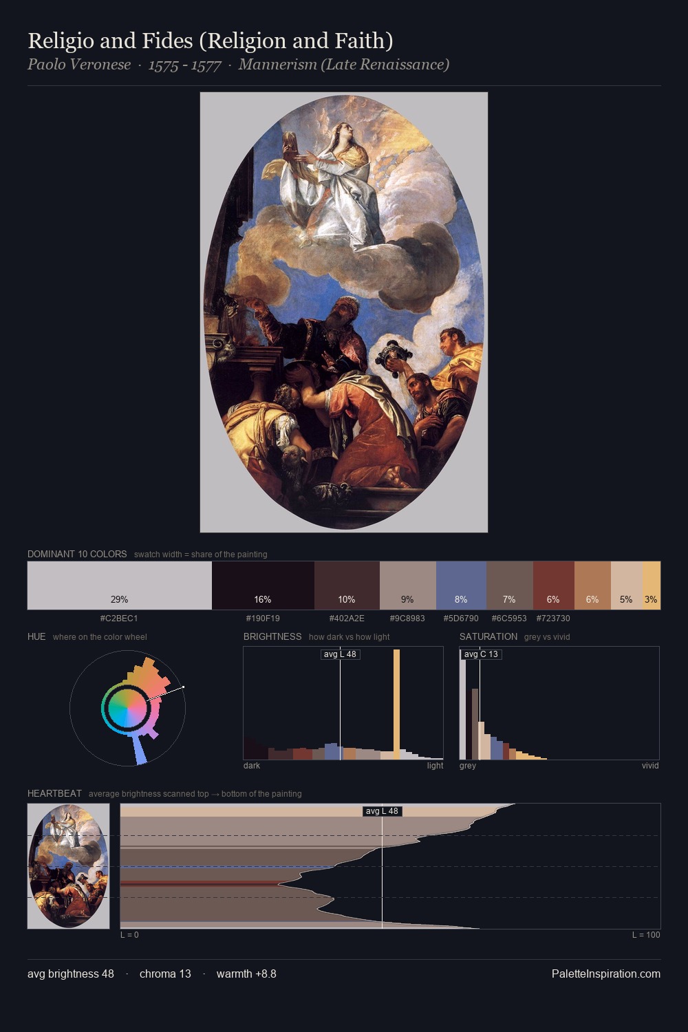
Paolo Veronese Palette 4
Shadowed Tawny
Shadowed Low-key - values weighted toward shadow, the palette of dim interiors and overcast skies.
Tawny Warm orange-brown - a traditional term for the color of tanned leather or lion fur.

Palette Analysis
Paolo Veronese distributes its values across the middle register, creating harmony without high contrast. Warmth dominates - the palette of Paolo Veronese leans heavily on the yellow-orange-red arc of the colour wheel. Every colour is desaturated; the palette proceeds through near-neutrals and gently-coloured greys. The highest-chroma note - #713A2D - appears at just 6.6%, deployed as a precision accent against the quieter ground. At 67 units of value range, the palette has the tonal breadth to sustain complex spatial readings. This is palette 4 of Paolo Veronese's sequence - a single chapter in a chromatic story told across many works.
Example use cases
- ceramics & pottery
- boutique hospitality
- menswear
- heritage food brands
- craft & artisan brands
I Love This!
Use This Palette
Copy, export, or download for your project
Copy, export, or download for your project
Copy:
Download:
Share: