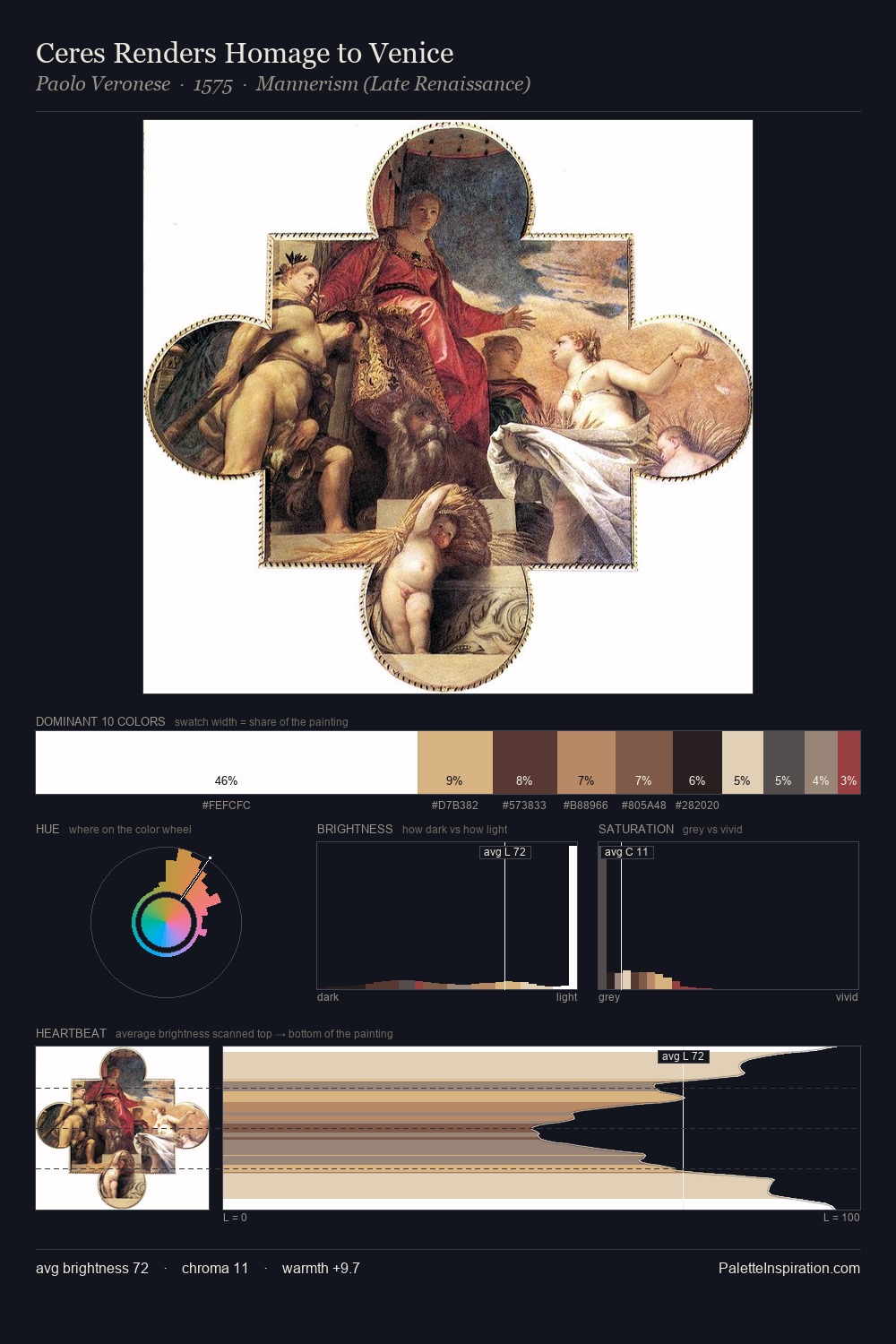
Paolo Veronese Palette 1
Pale Ecru
Pale High-key and low-chroma - delicate, bleached, washed with light.
Ecru Unbleached linen - warm mid-neutral, slightly grayed, raw and natural.

Palette Analysis
Light floods Paolo Veronese; the palette keeps values pale and airy across its range. Yellow, ochre, sienna: warm hues that Paolo Veronese deploys as the palette's primary energy. Muted throughout, the palette achieves its effects through value and temperature rather than chromatic force. At 33.4%, #FEFCFC functions less as a colour accent and more as a complete atmospheric environment. #E0C9AA functions as the palette's exclamation mark: highest chroma, lowest percentage (7.4%). At 73 units of value range, the palette has the tonal breadth to sustain complex spatial readings. This is palette 1 of Paolo Veronese's sequence - a single chapter in a chromatic story told across many works.
Example use cases
- art galleries
- creative studios
- consumer goods
- lifestyle media
- professional services
I Love This!
Use This Palette
Copy, export, or download for your project
Copy, export, or download for your project
Copy:
Download:
Share: