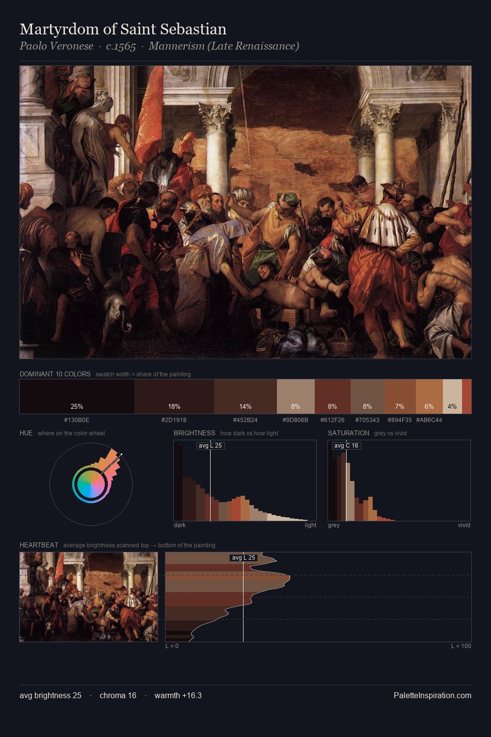
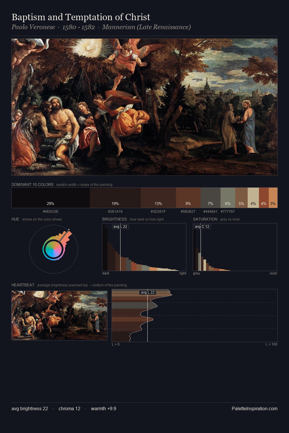
Paolo Veronese Palette 12
Shadowed Umber
Shadowed Low-key - values weighted toward shadow, the palette of dim interiors and overcast skies.
Umber Dark earthy brown - raw or burnt umber, a foundational old-master earth pigment.

Palette Analysis
Paolo Veronese sits in the centre of the value range, lending the palette a sense of even, sustained light. Temperature reads distinctly warm: the reds and earth tones from Paolo Veronese carry the compositional weight. Saturation is deliberately withheld - the beauty here lies in the near-monochromatic gradations rather than colour difference. #B77849 delivers the chromatic peak at only 5.3% - a small shot of colour with outsized visual impact. The value range spans 64 units across the palette, providing the full gamut from deep shadow to near-white and ensuring clear tonal hierarchy. Paolo Veronese's palette 12 carries its own internal logic while remaining in conversation with the artist's broader colour intelligence.
Example use cases
- film & entertainment
- fine dining
- spirits branding
- menswear
- theater design
I Love This!
Use This Palette
Copy, export, or download for your project
Copy, export, or download for your project
Copy:
Download:
Share: