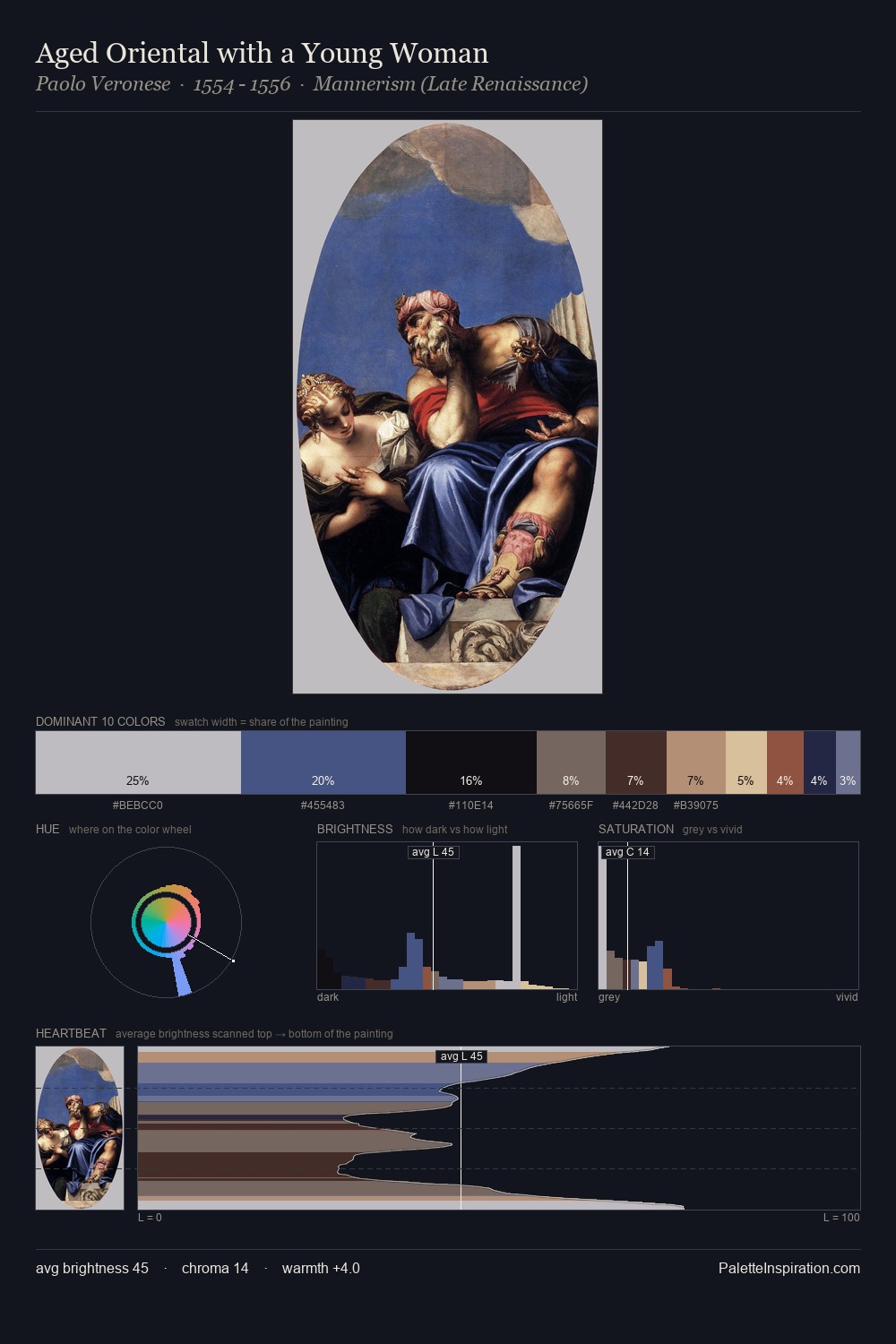
Paolo Veronese Palette 8
Somber Bister
Somber Subdued and serious - low-key, low-chroma, emotionally weighted toward gravity.
Bister Dark warm brown - a traditional ink and wash pigment made from wood soot.

Palette Analysis
Paolo Veronese keeps values measured and balanced, a hallmark of tonal restraint. Temperature reads distinctly warm: the reds and earth tones from Paolo Veronese carry the compositional weight. Every colour is desaturated; the palette proceeds through near-neutrals and gently-coloured greys. A single dominant - #49578A at 31.8% - sets the character of the whole composition. The saturated accent, #A26347, registers at 8.2% - sparse enough to feel like a deliberate surprise. A value spread of 60 units gives the palette both depth and air - shadows are genuinely dark, lights genuinely light. This is palette 8 of Paolo Veronese's sequence - a single chapter in a chromatic story told across many works.
Example use cases
- publishing
- corporate identity
- consumer apps
- hospitality
- design agencies
I Love This!
Use This Palette
Copy, export, or download for your project
Copy, export, or download for your project
Copy:
Download:
Share: