Paolo Veronese Palette 10
Shadowed Bister
Shadowed Low-key - values weighted toward shadow, the palette of dim interiors and overcast skies.
Bister Dark warm brown - a traditional ink and wash pigment made from wood soot.

Palette Analysis
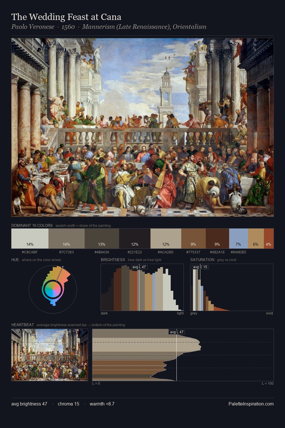
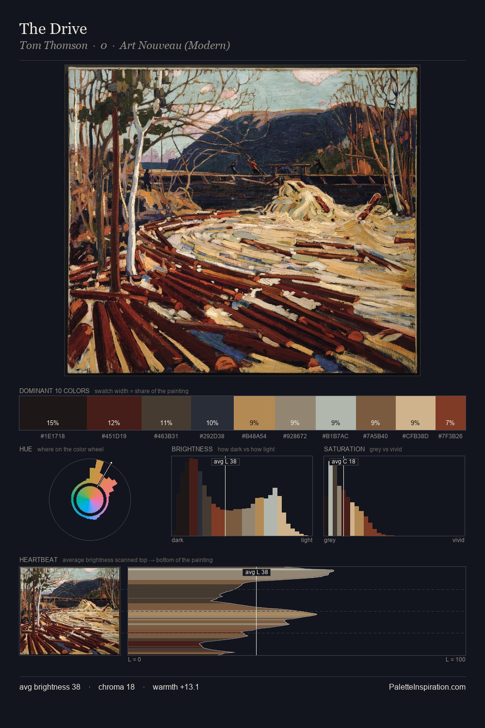
Paolo Veronese keeps values measured and balanced, a hallmark of tonal restraint. Paolo Veronese orchestrates warmth above all else - reds, ambers, and siennas take the lead. Every colour is desaturated; the palette proceeds through near-neutrals and gently-coloured greys. The saturated accent, #BAA381, registers at 8.7% - sparse enough to feel like a deliberate surprise. From deepest dark to palest light, the palette traverses 61 units of the value scale - a span that creates natural depth. Palette 10 sits within the larger chromatic argument that Paolo Veronese's complete body of work advances.
Example use cases
- theater design
- jewelry brands
- tobacco-adjacent retail
- event branding
- film & entertainment
I Love This!
Use This Palette
Copy, export, or download for your project
Copy, export, or download for your project
Copy:
Download:
Share: