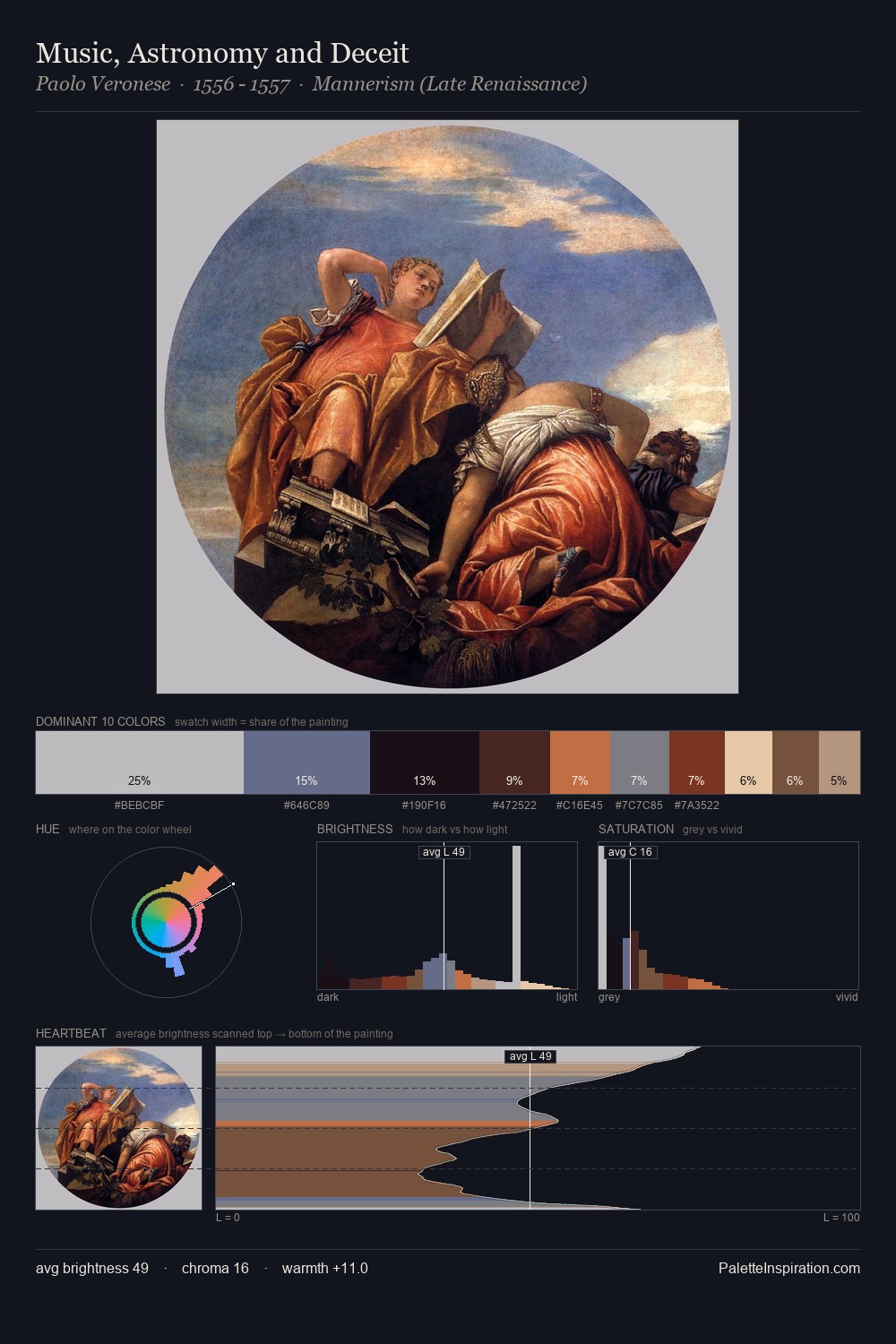
Paolo Veronese Palette 7
Shadowed Tawny
Shadowed Low-key - values weighted toward shadow, the palette of dim interiors and overcast skies.
Tawny Warm orange-brown - a traditional term for the color of tanned leather or lion fur.

Palette Analysis
Paolo Veronese occupies the comfortable middle of the value scale, avoiding both extremes to hold the eye in a sustained middle grey. Paolo Veronese orchestrates warmth above all else - reds, ambers, and siennas take the lead. Chroma is kept low across all colours, producing the soft, enveloping quality that characterises tonal painting. The highest-chroma note - #DBBB9C - appears at just 8.3%, deployed as a precision accent against the quieter ground. The full value range is 62 units: broad enough to build convincing three-dimensional form. This is palette 7 of Paolo Veronese's sequence - a single chapter in a chromatic story told across many works.
Example use cases
- ceramics & pottery
- boutique hospitality
- menswear
- heritage food brands
- craft & artisan brands
I Love This!
Use This Palette
Copy, export, or download for your project
Copy, export, or download for your project
Copy:
Download:
Share: